Introduction
In data visualization, the size and shape of the canvas that's available is always a key factor. It's a topic I've addressed in another recent article with a chart I call the Crystal Bar Chart that uses a two-axis approach as a means to conserve space.
In this article, I'll explore an axis-free approach I've developed to visualize a set of values as squares and conserve space by packing a container in the form of a convex or simple concave polygon. I've also done my best to fill up this exploration with code, so I hope it can serve as a fun tutorial for some other kinds of techniques and visualizations that might be useful.
The goal to accomplish by the end of this article will be to consider standard and unconventional container shapes (as shown below) and present a set of values as similar shapes within them in a way that optimizes the available space, offers intuitive size comparisons, and squarifies your data!
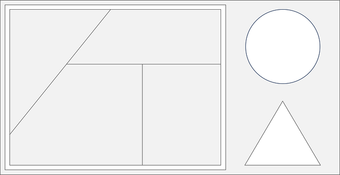
Before we get into the new axis-free approach, let's reflect on some existing axis-based and axis-free methods to see if we can find a good competitor to measure results against. For example data, I'll leverage some information from Wikipedia that represents the top 20 fastest animal speeds¹.
Axis-Based Data Series Visualization
Given a y-axis to represent an item's value, it's hard to compete with a sorted bar chart. Let's plot that first, followed by a couple more axis-based charts using my vizmath package.
Bar Chart
# https://en.wikipedia.org/wiki/Fastest_animals (as of 1/26/2024)
# 20 fastest animals (top speed, mph)

data = {
    'id' : [str(i) for i in range(1, 21)],
    'speed' : [242,200,105,100,100,95,92.5,88,80,79,
        75,67.85,61.06,60,56,55,55,55,50,50]
}

# Bar Chart (data is already sorted)
import matplotlib.pyplot as plt

plt.figure(figsize=(7, 1.5))
bars = plt.bar(range(1, 21), data['speed'], edgecolor='black',
    color='white', linewidth=1)
plt.xticks([])
plt.grid(False)
plt.show()
Crystal Bar Chart
from vizmath.crystal_bar_chart import crystals
import pandas as pd

# data: refer to the above

df = pd.DataFrame(data)
cbc = crystals(df, 'id', 'speed', height_range=5, width_override=5,
    rotation=90, offset=50, bottom_up=True)
cbc.cbc_plot(legend=False, alternate_color=True, color=False)
Beeswarm Plot
from vizmath.beeswarm import swarm
import pandas as pd

# data: refer to the above

df = pd.DataFrame(data)
diameter = 5
bs = swarm(df, 'id', 'speed', None, size_override=pi*(diameter/2)**2)
bs.beeswarm_plot(color=False)
Each of these methods offers a unique way to analyze a set of values with shapes and positions that reflect the value's magnitude while also providing insight into the density profile of the set.
Now let's move on to some axis-free examples that focus on relative size comparisons with the same set of values and preview the Quad-Tile Chart algorithm by plotting some semi-packed Bubble Charts!
Axis-Free Data Series Visualization
For the axis-free domain, let's include some one-level Treemaps (check out the article on my Radial Treemap if you're interested!) followed by some Bubble Charts.
Treemap (one-level pie, donut, and rectangular)
from vizmath.radial_treemap import rad_treemap as rt
import pandas as pd

# data: refer to the above

# Pie Treemap
df = pd.DataFrame(data)
o_rt = rt(df, ['speed'], 'speed', r1=0)
o_rt.plot_levels()

# Donut Treemap
df = pd.DataFrame(data)
o_rt = rt(df, ['speed'], 'speed')
o_rt.plot_levels()

# Treemap
df = pd.DataFrame(data)
o_rt = rt(df, ['speed'], 'speed', r1=0, r2=1,
    a1=0, a2=1, rectangular=True)
o_rt.plot_levels()
Bubble Chart (grid)
import numpy as np
import pandas as pd

# data: refer to the above

df = pd.DataFrame(data)

def grid_bubbles(values, size_by='area', rows=2, cols=10, buffer=0.1):
    fig, ax = plt.subplots(rows, cols, figsize=(7, 1.5))
    sorted_values = np.sort(values)[::-1]
    if size_by == 'area':
        sizes = np.sqrt(sorted_values) # account for radius input
    elif size_by == 'diameter':
        sizes = sorted_values # proportional to radius
    max_size = np.max(sizes)
    b = max_size*buffer
    max_size += b
    index = 0
    for i in range(rows):
        for j in range(cols):
            # radius input for Matplotlib's Circle
            circle = plt.Circle((0.5, 0.5), sizes[index]/max_size/2,
                color='black', fill=False, linewidth=2)
            ax[i, j].add_artist(circle)
            ax[i, j].set_xlim(0, 1)
            ax[i, j].set_ylim(0, 1)
            ax[i, j].axis('off')
            index += 1
    plt.tight_layout()
    plt.show()

grid_bubbles(data['speed'], size_by='area')
grid_bubbles(data['speed'], size_by='diameter')
Bubble Chart (semi-packed using my new Quad-Tile Chart algorithm)
from vizmath.quadtile_chart import polyquadtile as pq
import pandas as pd

# data: refer to the above

# size by area
df = pd.DataFrame(data)
df['speed'] = df['speed']/df['speed'].max()*3.5
o_pq = pq(df,'id','speed',buffer=0.0, collapse=True,
    constraints=[(2,1)], auto=False)
o_pq.polyquadtile_plot(show_constraints=True, poly_color='w',
    poly_line='black', squares_off=True, circles=True)
print(o_pq.multiplier)

#size by diameter
df = pd.DataFrame(data)
df['speed'] = df['speed']**2 # adjust for diameter proportions
df['speed'] = df['speed']/df['speed'].max()*3.5
o_pq = pq(df,'id','speed',buffer=0.0, collapse=True,
    constraints=[(2,1)], auto=False)
o_pq.polyquadtile_plot(show_constraints=True, poly_color='w',
    poly_line='black', squares_off=True, circles=True)
For these methods, position changes function without an axis to provide a direct reference to a value's magnitude, so the value's shape, size, and layout are paramount to gathering data insights. Tuning these parameters in a way that conserves space between value representations is what makes these charts useful.
Value shapes that may be spread far apart on a number line with axis-based charts can be shown next to one another with axis-free charts so, depending on the data and use-case, the visualization compression of axis-free methods can be a significant advantage over axis-based methods.
In the Bubble Charts above, I've also included sizing by area and diameter since the sizing mechanism can often be overlooked, but the differences between the two outcomes can be substantial! Depending on the nature of the data and narrative context of the visualization, it's always a good idea to know what the sizing is based on in your visualization tools so you can make an informed choice.
Base Case (Competitor)
It's clear from reviewing the examples above that the Bubble Chart is a contender for our initial goal to represent a set of values with similar shapes, sized accordingly, in a way that conserves the available space.
A (container) packed Bubble Chart, therefore, would be our competitor to measure results against, but unfortunately, the available implementations that I've found (shown below) seem to only result in circular layouts so we won't have a perfect case for comparison when looking into different container shapes.
# circlify
import circlify
circles_circlify = circlify.circlify(data['speed'], show_enclosure=False)
circles = [c for c in circles_circlify]
max_radius = max(circle.r for circle in circles)
xlim = max(abs(circle.x) + max_radius for circle in circles)
ylim = max(abs(circle.y) + max_radius for circle in circles)
limit = max(xlim, ylim)
fig, axs = plt.subplots(figsize=(8, 8))
axs.axis('off')
plt.xlim(-limit, limit)
plt.ylim(-limit, limit)
for circle in circles:
    axs.add_patch(plt.Circle((circle.x, circle.y), circle.r,
        edgecolor='black', facecolor='white', linewidth=2))
plt.show()

# packcircles
import packcircles
circles_packcircles = packcircles.pack(data['speed'])
circles = [c for c in circles_packcircles]
# circles
max_radius = max(radius for (_, _, radius) in circles)
xlim = max(abs(x) + max_radius for (x, _, _) in circles)
ylim = max(abs(y) + max_radius for (_, y, _) in circles)
limit = max(xlim, ylim)
fig, axs = plt.subplots(figsize=(8, 8))
axs.axis('off')
plt.xlim(-limit, limit)
plt.ylim(-limit, limit)
for (x, y, radius) in circles:
    axs.add_patch(plt.Circle((x, y), radius,
        edgecolor='black', facecolor='white', linewidth=2))
plt.show()

# Tableau Public:
import pandas as pd
import os
df = pd.DataFrame(data)
df.to_csv(os.path.dirname(__file__) + '/circles.csv',
    encoding='utf-8', index=False)
# select packed bubbles -> Size by [Speed], [Id] on Detail
With our competitor chosen, let's see if the packed Bubble Chart stands alone or if there is another simple shape that can be exploited for relative value comparisons that meets our container packing objective. Let's explore the application of a square!
Why Squarify?
Now that we've set the stage for investigating packed squares, it's worth a brief pause to ask—why look into squares at all when packed circles exist?
The prevalence of packed circles in data visualization would indicate that people like circles, and various packed bubble chart implementations can be found easily across different programming languages and software. In fact, the first thing I did after creating the Quad-Tile Chart was to use it to plot circles (as shown in the introduction), so the appeal is real!
But what about squares? Packed squares seem harmless enough relative to other possible shapes, but it's a struggle to find a solid implementation of a packed squares chart. I wonder why…
Let's review a simple comparison and see what we find:

Neither shape seems to provide a more intuitive basis for comparison of areas or lengths than the other in the case above using 1:2 ratios, but the circles are certainly softer whereas the squares are sharper.
That being said, my motivation to squarify is as follows:
- Packed squares implementations don't seem to exist, so it's hard to know how visually appealing they might be (as a substitute for packed circles), so it's worth investigating
- There's a general lack of ability to utilize a container within available packed circles implementations in python (all seem to only provide a circular layout as the number of circles increases)
- The simplicity of the square suggests that mathematical operations should be straightforward if an algorithm is attempted to pack squares, so maybe rapid proof of concepts are achievable
With the motives set forth for pursuing squarification, let's move on to the critical component of our square packing endeavor, packing, and see how squares stand up to circles.
Shape Packing & Container Packing
With Tessellation
It's worth mentioning the obvious for investigation purposes—squares have edges while circles do not. This property enables tessellation of similarly sized squares which may be a useful notion for packing.
import matplotlib.pyplot as plt
import matplotlib.patches as patches

# let's simulate square tessellation with shapes and void spaces
def diamond_tessellation(rows, cols):
    fig, ax = plt.subplots()
    ax.set_aspect('equal', adjustable='box')
    plt.axis('off')
    for row in range(rows):
        for col in range(cols):
            diamond = patches.Polygon([
                (col + 0.5, row),
                (col + 1, row + 0.5),
                (col + 0.5, row + 1),
                (col, row + 0.5)
                ], edgecolor='grey', facecolor='whitesmoke')
            ax.add_patch(diamond)
    ax.set_xlim(0, cols)
    ax.set_ylim(0, rows)
    plt.show()

diamond_tessellation(2, 9)
Unfortunately, tessellation is not a general solution of course since it would not be practical to assume that values in a dataset would be the same value or have convenient ratios, but the concept of gapless edges is worth exploring further as a potential advantage over circles.
With Optimization
An optimization approach seems like a worthy next step as a mechanism to compare the two shapes in question, so let's focus on a simple objective function that can be applied as evenly as possible between circles and squares and review the results.
First, we need to identify the ingredients for an objective function. We'll need a mechanism that prevents overlap in the shapes and an opposite force that attempts to closely pack them. Let's detail each one.
- Prevent Overlap (push apart) - to prevent overlap we can take into account the total overlap area of the shapes and add an extra penalty for shapes that get completely contained within other shapes to encourage overlap prevention for smaller shapes
- Encourage Packing (pull together) - to encourage packing, we'll simply reward pulling the shapes to a common point of interest
Let's ignore containers for now and focus on shape packing to observe the raw contributes of each shape's geometry. Now, with the ingredients identified, let's set up some functions to implement them.
from shapely.geometry import Point, Polygon
from shapely.ops import unary_union

# Let's set up the pull force by adding up the distance from a point
# of interest to each shape's centroid
def calc_distance_from_point(shapes, shape_type, origin):
    penalty = 0
    ref_point = Point(origin)
    if shape_type == 'circle':
        for x, y, _ in shapes:
            centroid = Point(x, y)
            penalty += centroid.distance(ref_point)
    elif shape_type == 'square':
        for x, y, side in shapes:
            centroid = Polygon([(x, y), (x + side, y),
                (x + side, y + side), (x, y + side)]).centroid
            penalty += centroid.distance(ref_point)
    return penalty

# Now let's set up the first push force, capturing whether or not a shape
# is contained within another and add up the number of times it occurs
def calc_containment(shapes, shape_type):
    penalty = 0
    shapely_shapes = []
    if shape_type == 'circle':
        shapely_shapes = [Point(x, y).buffer(r)
            for x, y, r in shapes]
    elif shape_type == 'square':
        shapely_shapes = [Polygon([(x, y), (x + side, y),
            (x + side, y + side), (x, y + side)])
            for x, y, side in shapes]
    for i, shape1 in enumerate(shapely_shapes):
        for j, shape2 in enumerate(shapely_shapes):
            if i != j and shape1.contains(shape2):
                penalty += 1
    return penalty

# To complete the push force, let's calculate the total shape overlap area
def calc_overlap_area(shapes, shape_type):
    if shape_type == 'circle':
        shapely_shapes = [Point(s[0], s[1]).buffer(s[2])
            for s in shapes]
    elif shape_type == 'square':
        shapely_shapes = [Polygon([(s[0], s[1]), (s[0] + s[2], s[1]),
            (s[0] + s[2], s[1] + s[2]), (s[0], s[1] + s[2])])
            for s in shapes]
    merged_area = unary_union(shapely_shapes).area
    individual_areas = sum(shape.area for shape in shapely_shapes)
    return abs(individual_areas - merged_area)

# Finally, let's combine the forces into an objective function
def objective_function(variables, shapes, shape_type,
    origin=(0,0), prevent_overlap_factor=2):
    for i, shape in enumerate(shapes):
        shapes[i] = (variables[i*2], variables[i*2 + 1], shape[2])
    overlap_area = calc_overlap_area(shapes, shape_type)
    contained = calc_containment(shapes, shape_type)
    sum_distance = calc_distance_from_point(shapes, shape_type, origin)
    return overlap_area*prevent_overlap_factor*(1+contained)+sum_distance
For the objective function, I opted to multiply the overlap area by the number of contained shapes to concentrate the push penalty, with the addition of a weight 'prevent_overlap_factor' to control the level of push.
Our objective function is now in place, so let's use our previous example data to setup the optimization routine for circle and square packing.
# previous example data:
data = {
    'id' : [str(i) for i in range(1, 21)],
    'speed' : [242,200,105,100,100,95,92.5,88,80,79,
        75,67.85,61.06,60,56,55,55,55,50,50]
}

# Let's establish a size windpw (multiplier) and a seed for repeatable
# randomized positioning of the shapes

multiplier = 10
position_seed = 123

max_v = np.max(data['speed'])
np.random.seed(position_seed)

shapes = [(np.random.uniform(0, multiplier*1.5),
    np.random.uniform(0, multiplier*1.5),
    v/max_v*multiplier) for v in data['speed']]
Next, let's split up the inputs for circles and squares and add some bounds to pass to the optimization method.
import numpy as np
import copy
from math import sqrt

# Let's create some copies to optimize for each shape
circles = copy.deepcopy(shapes)
squares = copy.deepcopy(shapes)

# To optimize the positions, let's flattent the coordinates
initial_positions = [val for s in shapes for val in s[:2]]

# Now let's calculate the bounds for each shape to pass to
# the optimization function
def calc_bounds(shapes, shape_type):
    total_area = 0
    if shape_type == 'circle':
        total_area = sum(np.pi * (r**2) for _, _, r in shapes)
    elif shape_type == 'square':
        total_area = sum(side**2 for _, _, side in shapes)
    estimated_side_length = sqrt(total_area)
    padding = estimated_side_length / 2
    lower_bound = 0 - padding
    upper_bound = estimated_side_length + padding
    return (lower_bound, upper_bound)

# Calculate bounds for circles and squares
bounds_circle = calc_bounds(circles, 'circle')
bounds_square = calc_bounds(squares, 'square')

# Apply the bounds to each shape for the optimization
bounds_circles = [(bounds_circle[0], bounds_circle[1])
    for _ in range(len(initial_positions))]
bounds_squares = [(bounds_square[0], bounds_square[1])
    for _ in range(len(initial_positions))]

# Let's use the bounds to set a collapse point for the pull force
origin_circle = (bounds_circle[1]-bounds_circle[0])/2+bounds_circle[0]
origin_square = (bounds_square[1]-bounds_square[0])/2+bounds_square[0]
origin_circles = (origin_circle, origin_circle)
origin_squares = (origin_square, origin_square)
Finally, let's set up a plotting function for visualizing the results and run the optimization for each shape.
import matplotlib.pyplot as plt
import matplotlib.patches as patches
from math import inf
from scipy.optimize import minimize

# Let's create a plotting function to view the results
def plot_shapes(shapes, shape_type):
    fig, ax = plt.subplots()
    min_x, min_y, max_x, max_y = 0.,0.,0.,0.
    for s in shapes:
        if shape_type == 'circle':
            circle = patches.Circle((s[0], s[1]), s[2],
                facecolor='lightgrey', edgecolor='black')
            ax.add_patch(circle)
            min_x = min(min_x, s[0] - s[2])
            min_y = min(min_y, s[1] - s[2])
            max_x = max(max_x, s[0] + s[2])
            max_y = max(max_y, s[1] + s[2])
        elif shape_type == 'square':
            square = patches.Rectangle((s[0], s[1]), s[2], s[2],
                facecolor='lightgrey', edgecolor='black')
            ax.add_patch(square)
            min_x = min(min_x, s[0])
            min_y = min(min_y, s[1])
            max_x = max(max_x, s[0] + s[2])
            max_y = max(max_y, s[1] + s[2])
    padding = 1
    ax.set_xlim(min_x - padding, max_x + padding)
    ax.set_ylim(min_y - padding, max_y + padding)
    ax.set_aspect('equal', 'box')
    plt.show()

# Lastly, let's setup a callback function to monitor the iterations
def callback(i):
    global iteration
    iteration += 1
    print(f'Iteration {iteration}')

# Optimization run for circles:
iteration = 0
optimized_circles = minimize(objective_function, initial_positions,
    args=(circles, 'circle', origin_circles), method='L-BFGS-B',
    bounds=bounds_circles, callback=callback,
    options={'maxiter': 300, 'maxfun': inf, 'ftol': 0, 'gtol': 0})
packed_circles = [(optimized_circles.x[i*2],
    optimized_circles.x[i*2 + 1], circles[i][2])
    for i in range(len(circles))]
# plot_shapes(shapes, 'circle') # if you want to see the initial positions
plot_shapes(packed_circles, 'circle')

# Optimization run for squares:
iteration = 0
optimized_squares = minimize(objective_function, initial_positions,
    args=(squares, 'square', origin_squares), method='L-BFGS-B',
    bounds=bounds_squares, callback=callback,
    options={'maxiter': 300, 'maxfun': inf, 'ftol': 0, 'gtol': 0})
packed_squares = [(optimized_squares.x[i*2],
    optimized_squares.x[i*2 + 1], squares[i][2])
    for i in range(len(squares))]
# plot_shapes(shapes, 'square') # if you want to see the initial positions
plot_shapes(packed_squares, 'square')
In the above, I selected the 'L-BFGS-B' method within scipy's 'minimize' function and set the iterations to 300. The random seed that controls the initial positions will affect the results, so let's take a look at 3 different seeds for both shapes.
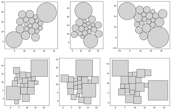
It took about 5 minutes on my laptop to generate each test case above, so the time requirement for this approach is an unsettling factor to consider. Adding a container overlap cost to the objective function to review container packing insights didn't seem necessary at this point due to the lack of practicality in already long wait time.
Regarding the layout, the circles seem to be arranged more cohesively which may be our first bit of evidence to explain the prevalence of packed circles over packed squares in data visualization.
But before we give up, let's move on to our final evaluation using an algorithm that's customized to the square!
With an Algorithm
The key takeaways from the experiment above are:
- Creating a general optimization implementation for generating packed shapes based on a simple objective function kind of works
- It's really slow and not equipped to handle large datasets
- The circle arrangements seemed more cohesive than the square ones (at least in a free-form state without container packing)
It's clear that we need a specialized algorithm that's performant with larger datasets, can create more attractive square arrangements, and implements container packing. To differentiate this approach from a general optimization framework, we need to leverage the specific characteristics of a square and investigate potential packing opportunities.
Let's start by listing a couple geometric elements of the square to take advantage of:
- Shape: four sides of equal length enclosing four right angles, with the ability to rotate relative to a viewing window for a different look
- Packing: ability to have gapless, square to square, neighbors
- Layout: each side of a square, starting from 1 of the 4 available corners, offers an unbounded 2 dimensional plane of available space for adjoining squares to be neighbors
In the following, I'll describe an algorithm that utilizes these elements for a new visualization technique I call the Quad-Tile Chart and attempt to understand if packed squares can compete with packed circles!
Quad-Tile Chart
Inspiration
A couple years ago someone mentioned that packed bubbles charts are mostly worthless. For some reason that inspired me to make a packed squares chart.
I set off to build a first version and tested what I came up with in a Tableau Public visualization, in conjunction with a few other techniques. Here's an excerpt showing a (v1) Quad-Tile Chart with 18 squares containing Voronoi Treemaps (the Voronoi Treemaps calculated with D3.js).
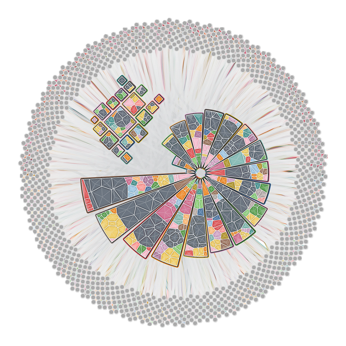
Below I'll describe this algorithm, followed by the final approach I ended up taking just a few days ago when I picked it up again.
(Initial) Algorithm v1
My initial approach in early 2022 didn't consider a container. It simply attempted to arrange squares, starting with the largest at the center, and continuing down the list until all squares were wrapped around the central square, with the smallest squares furthest from the center.
The trick was how to arrange each subsequent square, and these are the concepts that came to me from sketching out square arrangements:
- Quadrants — upon investigation, a square provides 4 offset planes for dispersing subsequent squares
- Self-organizing square placement — relating one plane's potential width to an offset plane's occupied height enables self organization by implementing shared boundaries (executed as segments)
- Switching sides — to evenly distribute squares by size, switch sides after one is placed in a desired order (I defaulted to top-right-bottom-left)
- Customization — this method rules out value sorting, but enables the ability to implement next-side selection based on a set of rules
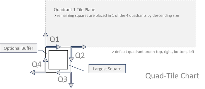
Here's the v1 algorithm:
- Begin with a set of positive values and sort them in descending order, for example: 9.4, 7.4 , 1.5, 0.2
- Add an optional buffer (0.5 for example) to the values to pad the space around each square
- Set the first (largest) square and create a storage mechanism of segments for each quadrant around the central square
- Set the initial segments to be the sides of the central square, one to each quadrant
- Given a side order (defaulted to top, right bottom, left), iterate through each side, placing smaller and smaller squares, with the first square in each quadrant placed in alignment with their quadrant plane's origin, at the starting position of each quadrant's initial segment
- To place a square on the top side (adjusting for sorting and placement criteria by side), sort the segments by the lowest y-value with the longest length and place a square in the first segment found in the sorted list where the square's width ≤ the segment length
- When a square is placed, remove the space taken up by that square from the segment by adjusting the segment's start position and length, and create a new segment that was created by the placed square
- If a placed square's starting position is aligned with the offset boundary of its quadrant plane (boundary perpendicular to the central square's axis), extend the segment length of the affected segment from the adjacent quadrant to enable self organizing growth around the central square
- Implement side selection mechanisms as needed for the desired stacking
- Transform the squares back to their original size using the buffer and rotate the squares with a desired rotation (defaulted to 45 degrees)
The diagram below shows this segment based approach. Each segment will either be:
- Effectively shifted in one direction from its original position (if the square width is equal to the segment length)
- Split into two sections (one assuming the placed square's width and the other being the original segment with a shifted starting position and length)
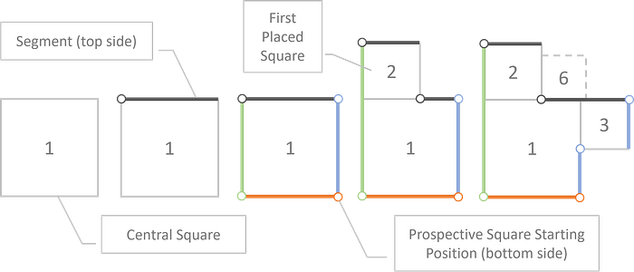
For fun, I implemented a couple side selection options including a 'constraints' input that accepts a polygon and attempts to switch sides when outside of the perimeter, encouraging growth in certain areas that overlap with the polygon.

This leads us to my second bit of inspiration. When I was incorporating the Quad-Tile Chart v1 into my vizmath package, I started to wonder if there was more I could do with the polygon input.
After some dabbling, I decided that a fully functional container packing implementation that fits squares neatly inside a given polygon would be fun and set out to do a total overhaul of the algorithm from scratch! Let's check out that algorithm next: the Quad-Tile Chart v2
(Final) Algorithm v2
The second version of the algorithm extends some of the core elements of v1 and uses a similar quadrant-segment approach with a few modifications and some new features to accommodate container packing.
Here are the key details regarding v2 that make it special:
- Bridge Segments (container filling)
- Backward Segment Extension (the 'collapse' option)
- Value Multiplier Bisection Optimization (container packing)
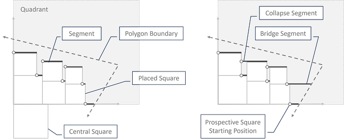
Here's the v2 algorithm:
- Steps 1-5 are the same as v1, with the addition of 2 segment properties (segment height and whether or not the segment is active), 3 quadrant-level properties (minimum floor and ceiling and whether or not the entire quadrant is out of room), and properties for placed squares (left-bottom corner coordinates and width)
- While the iterator (set to 0 initially) is less than the count of squares needing to be placed, the following procedure is carried out: - locate the last floor segment (LFS): max(segments: {y=floor}, sort: {x}) - create a list a sorted segments: (segments: {is active}, sort: {height, x}) - loop through the sorted segments (referred to as 'segments' and the loop iteration's 'segment' below) and proceed
- If the square's corners are within the polygon and the {width} and {height} of the square fit within the {width} and {height} of the segment then the square will be placed, otherwise set the segment to {not active}
- If the segment's {y} value is equal to the quadrant's {floor} then update the {floor} by adding the square's {width}
- If the square is placed, create 1 or 2 new segments (depending on the square's width vs the segment length) to replace the current segment
- If collapse is enabled, the following procedure is carried out: - set the segment to the left-most of the new segment(s) created (NLS) - look for a segment to extend: max(segments: {x + length=NLS.x}, {y=NLS.y}, sort: {x}) - if the segment to extend exists, add the NLS.length to it and remove the NLS - otherwise, look for a placed square to the left: max(squares: {x+w≤NLS.x}, {y≤NLS.y}, {y+x≥NLS.y}, sort: {x}) - if a left square (LS) exists, check if there is a gap by checking whether LS.x + LS.w < NLS.x - if so, check for a covered segment (CS): max(segments: {y=LS.y}, {x<NLS.x}, sort: {x}) - if the covered segment exists, set its height equal to the square width and look for a merge segment: max(segments: {x+length+CS.length=NLS.x}, {y=NLS.y}, sort: x) - if a merge segment exists, then extend it's length by adding the square width and CS.length - otherwise, if the LS.x + LS.w > NLS.x - square width then adjust the NLS with NLS.x = LS.x+LS.w and NLS.length = CS.length
- Check whether the segment equals the LFS, is not placed, and the quadrant's floor is not equal to its ceiling, and if so, create a bridge segment, with the following procedure: - update the LFS.height and quadrant's floor to the quadrant's ceiling - check if a ceiling segment (CS) exists at the ceiling: max(segments: {y=ceiling}, sort: x) - if so, extend its length to the polygon boundary - otherwise create a new segment at (segment.x, ceiling) with a length set to the distance between that point and the polygon boundary - finally, set all of the segments to {is active} and break out of the loop
- Otherwise, if the square was placed, add the square to the square list and set its properties, set the quadrant to {has room}, if the segment is the last segment then set all segments to {is active}, increase the iterator by 1, set the next side, and break out of the loop
- Otherwise, if the last segment is reached, attempt to add more bridge segments if possible with the following procedure: - check for a bridge square (BS): first(squares: {x+w=LFS.x}, {y=LFS.y}) - if one exists, set the LFS.height = BS.x, increase the quadrant floor by the BS.w, and set the quadrant ceiling to the floor - check for a bridge square segment: max(segments: {y=floor}, sort: x) - if one exists, extend its length by the length to the polygon boundary - otherwise, create a new segment at (BS.x+BS.w, floor) with a length set to the distance between that point and the polygon boundary - finally, set all of the segments to {is active} and break out of the loop - if no BS was found, set the quadrant to {no room}, set all segments to {is active}, set the next side, and if the all quadrants have no room then set the iterator to the count of squares needing to be placed (effectively breaking out of the outer while loop)
- Repeat Step 10 from v1 in addition to rotating all quadrants to their correct orientation
- If the automatic arrangement option is selected (container packing), bisection optimization is performed to adjust transformed values (>0, ≤1) of the squares with a multiplier such that the maximum multiplier is found that fits all squares into a given polygon container, within a set number of iterations (making sure to take the most recent solution where all squares fit)
The v2 algorithm obviously ended up being much more of a heavy lift to accommodate container packing relative to the simplicity of the v1 algorithm that focused on self organization — but totally worth it! Let's check out some example layouts from v2.
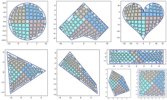
I included the circle outlines above for reference with the 'collapse' feature enabled. A theoretical limitation to v2 would likely be polygons that turn in on themselves (which would require enhanced segment logic to account for unique polygon gaps in a quadrant's tiling plane).
Next, let's take a look at building Quad-Tile Charts in python.
Python Implementation
I've made an implementation of my Quad-Tile Chart algorithms v1 and v2 available in python via my vizmath package on PyPI. Let's break down a couple more options using the initial example from the introduction and explain the inputs and outputs starting with v1:
# Quad-Tile Chart v1
# pip install vizmath==0.0.22
from vizmath.quadtile_chart import quadtile as qt
import pandas as pd

data = {
    'id' : [str(i) for i in range(1, 21)],
    'speed' : [242,200,105,100,100,95,92.5,88,80,79,
        75,67.85,61.06,60,56,55,55,55,50,50]
}
df = pd.DataFrame(data)

# create a quadtile object
#   > df: DataFrame with 1 numerical column of data and an id field
#   > id_field: required identifier field (can be dummy values)
#   > value_field: required value column
#   > xo: x-axis origin
#   > yo: y-axis origin
#   > packing: packing method ('auto','inc','num','max','min')
#   > overflow: integer threshold for 'num','max','min' packing
#   > buffer: additive value for buffering a square's size
#   > rotate: degrees to rotate the chart by
#   > constraints: polygon to encourage growth inside the perimeter
#   > size_by: 'area' or 'width'
#   > poly_sort: enable/disable sorting polygon vertices (True, False)
qt_o_area = qt(df,'id','speed', size_by='area', buffer=0)
qt_o_width = qt(df,'id','speed', size_by='width', buffer=0)

# plot the charts (sized by area and width)
qt_o_area.quadtile_plot(color='quad', cw=0.75, opacity=.9)
qt_o_width.quadtile_plot(color='quad', cw=0.75, opacity=.9)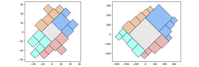
Now let's use v2:
# Quad-Tile Chart v2
# pip install vizmath==0.0.22
from vizmath.quadtile_chart import polyquadtile as pqt
import pandas as pd

data = {
    'id' : [str(i) for i in range(1, 21)],
    'speed' : [242,200,105,100,100,95,92.5,88,80,79,
        75,67.85,61.06,60,56,55,55,55,50,50]
}
df = pd.DataFrame(data)

# create a quadtile object
#   > df: DataFrame with 1 numerical column of data and an id field
#   > id_field: required identifier field (can be dummy values)
#   > value_field: required value column
#   > xo: x-axis origin
#   > yo: y-axis origin
#   > buffer: additive value for buffering a square's size
#   > rotate: degrees to rotate the chart by
#   > sides: select sides to include ('top','right','bottom','left')
#   > collapse: enable/disable collapse (True, False)
#   > constraints: polygon container to pack
#   > xc: x-axis container offset value
#   > yc: y-axis container offset value
#   > size_by: 'area' or 'width'
#   > auto: enable/disable automatic packing (True, False)
#   > auto_max_iter: iterations for automatic packing
#   > auto_min_val: minimum multiplier for automatic packing
#   > auto_max_val: maximum multiplier for automatic packing
#   > poly_sort: enable/disable sorting polygon vertices (True, False)
pqt_o_area = pqt(df,'id','speed', size_by='area', buffer=0)
pqt_o_width = pqt(df,'id','speed', size_by='width', buffer=0)

# plot the charts (sized by area and width)
pqt_o_area.polyquadtile_plot(color='quad', cw=0.75, opacity=.9)
pqt_o_width.polyquadtile_plot(color='quad', cw=0.75, opacity=.9)
Now let's investigate some more options, starting with randomized initialization for v1 and v2:
# let's test 1000 randomly sized squares:
from vizmath.quadtile_chart import quadtile as qt
from vizmath.quadtile_chart import polyquadtile as pqt

# Quad-Tile Chart v1 that's rotated (top left below)
qt_o1 = qt.random_quadtile(1000, rotate=45)
qt_o1.quadtile_plot(color='quad', cw=0.75, opacity=.9)

# Quad-Tile Chart v1 that's not rotated (top right below)
qt_o2 = qt.random_quadtile(1000, rotate=0)
qt_o2.quadtile_plot(color='quad', cw=0.75, opacity=.9)

# Quad-Tile Chart v2 with a square container (bottom left below)
poly = [(-10,-10),(-10,10),(10,10),(10,-10)] # polygon container
pqt_o1 = pqt.random_polyquadtile(1000, constraints=poly, buffer=0)
pqt_o1.polyquadtile_plot(color='quad', cw=0.75, opacity=.9)

# Quad-Tile Chart v2 with a rotated aspect ratio of 1:1 (middle below)
pqt_o2 = pqt.random_polyquadtile(1000, constraints=[(1,1)], buffer=0)
pqt_o2.polyquadtile_plot(color='quad', cw=0.75, opacity=.9)

# Quad-Tile Chart v2 with an aspect ratio of 1:1 (bottom right below)
pqt_o3 = pqt.random_polyquadtile(1000, constraints=[(1,1)],
    buffer=0, rotate=0)
pqt_o3.polyquadtile_plot(color='quad', cw=0.75, opacity=.9, circles=False)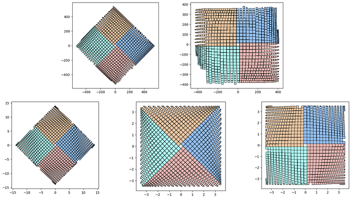
The above shows the subtle differences in placement procedures between versions (segments selected by the lowest y-value and longest length for v1 and the stair-step approach for v2). The randomized initialization for v2 will also create random convex polygons — who knows what you'll get!
from vizmath.quadtile_chart import polyquadtile as pqt

pqt_o = pqt.random_polyquadtile(100, collapse=True)
pqt_o.polyquadtile_plot(color='quad', cw=0.75, opacity=.9, circles=True,
    show_constraints=True)

# keep executing for random containers with randomly sized squares
And finally, remember that we can plot using the centroids with any shape sized to the bounding box of its parent square. Refer back to the introduction for plotting circles only for a semi-packed Bubble Chart!
Now let's review the output from the Quad-Tile Chart algorithm that's split up into square polygons and square centroids.
Square polygon output:
- item — incoming identifier specified as the 'id' input field
- a — square's relative area (not including the buffer)
- w — width of the allocated space: square's width + buffer*2
- x, y — Cartesian 2D coordinates for a point in the layout
- path — an ordered set of integers that describe the path which encloses a polygon, in conjunction with each (x, y) point in the Crystal Bar Chart, for each crystal id and face: 1 to N
from vizmath.quadtile_chart import polyquadtile as pqt
import pandas as pd

# using the initial example data with no resizing (fit's in container):
data = {
    'id' : [str(i) for i in range(1, 21)],
    'speed' : [242,200,105,100,100,95,92.5,88,80,79,
        75,67.85,61.06,60,56,55,55,55,50,50]
}
poly = [(-1000,-1000),(-1000,1000),(1000,1000),
    (1000,-1000)] # big enough container (for explaining example output)
df = pd.DataFrame(data)
o_pq1 = pqt(df,'id','speed',buffer=5.0, collapse=True,
    constraints=poly, auto=False)
o_pq2 = pqt(df,'id','speed',buffer=5.0, collapse=True,
    constraints=poly, auto=False, size_by='width')

# size by area:
o_pq1.o_polyquadtile_chart.df[['id','item','a','w','x','y','path']].head()
# size by width:
o_pq2.o_polyquadtile_chart.df[['id','item','a','w','x','y','path']].head()
The square centroids can also be extracted with the same properties, with 'item' replacing 'id':
# size by area:
o_pq1.o_polysquares.df[['id','a','w','x','y']].head()

# size by width:
o_pq2.o_polysquares.df[['id','a','w','x','y']].head()
Now let's see what else we can do with the Quad-Tile Chart.
Extensibility
Let's revisit our original goal for taking advantage of canvas layouts with some standard and unconventional containers. We've shown how we can accommodate convex and simple concave polygons, and here's a fill of our layout from the introduction with 100 squares each to a container, using some different rotations.
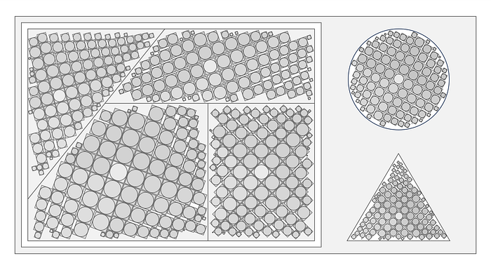
The most common canvas layouts will likely have rectangular containers, so it's handy to simply pass in the desired aspect ratio. Here are some examples by varying widths (one can adjust height the same way):
from vizmath.quadtile_chart import polyquadtile as pqt

aspect_ratio = (1,1) #(2,1) (3,1) (4,1)
pqt_o = pqt.random_polyquadtile(100, constraints=[aspect_ratio],
    rotate=45, collapse=True, buffer=.02)
pqt_o.polyquadtile_plot(color='quad', cw=0.75, opacity=.9)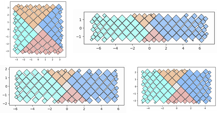
Another intriguing aspect of extensibility is incorporating hierarchical data. Some disadvantages of existing methods include:
- Nested circles can't maintain accurate relative areas at each level of the hierarchy only using circles (they need nested Radial or Voronoi Treemaps)
- Treemaps will likely have irregular dimensions at the top level (whether is be Rectangular, Radial, or Voronoi)
The Quad-Tile Chart can address the second issue gracefully (just like circles can) by capturing the top level of the hierarchy as similar shapes, offering initiative size comparisons.
Regarding the first issue, nested Quad-Tile Charts are at the same disadvantage as nested packed circles (as hinted in the tessellation section), but enable their own alternative for maintaining accurate areas throughout the tree with traditional rectangular Treemaps (or Voronoi Treemaps). Nested rectangular Treemaps may be desirable as one can use the sides of a parent square for more intuitive child rectangle comparisons.
Here are some examples of rectangular Treemaps for subsequent levels, nested in the Quad-Tile Chart that contains the top level with squares. I'll call them Squaremaps!

I've created an implementation for Squaremaps in vizmath as follows (and have added the ability to generate hierarchical data on the fly also!):
import pandas as pd
from vizmath.quadtile_chart import squaremap as sm

# generate a random square map
o_sm1 = sm.random_squaremap(num_levels=3, items_range=(2,4),
    value_range=(1,1000), sig=0.8)
o_sm1.o_squaremap.plot_levels(level=3, fill='w')

# create a square map from hierachical data
data = [
    ['a1', 'b1', 'c1', 9.3],
    ['a1', 'b1', 'c2', 6.7],
    ['a1', 'b1', 'c3', 2.4],
    ['a1', 'b2', 'c1', 4.5],
    ['a1', 'b2', 'c2', 3.1],

    ['a2', 'b1', 'c1', 5.9],
    ['a2', 'b1', 'c2', 32.3],
    ['a2', 'b1', 'c3', 12.3],
    ['a2', 'b1', 'c4', 2.3],
    ['a2', 'b2', 'c1', 9.1],
    ['a2', 'b2', 'c2', 17.3],
    ['a2', 'b2', 'c3', 6.7],
    ['a2', 'b2', 'c4', 4.4],
    ['a2', 'b2', 'c5', 11.3],

    ['a3', 'b1', 'c1', 7.5],
    ['a3', 'b1', 'c2', 9.5],
    ['a3', 'b2', 'c3', 17.1],

    ['a4', 'b2', 'c1', 5.1],
    ['a4', 'b2', 'c2', 2.1],
    ['a4', 'b2', 'c3', 11.1],
    ['a4', 'b2', 'c4', 1.5]]
df = pd.DataFrame(data, columns = ['a', 'b', 'c', 'value'])
o_sm2 = sm(df, ['a','b','c'], 'value', constraints=[(1,1)], buffer=.2)
o_sm2.o_squaremap.plot_levels(level=3, fill='w')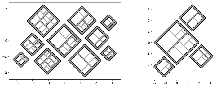
Tableau Public Implementation
I've demonstrated the Quad-Tile Chart in python above, including its hierarchical extension, the Squaremap, and below I'll show how to implement both in Tableau Public (v 2023.3.1)! Let's start with a simple Squaremap implementation and move on to a more thorough Quad-Tile Chart build that's interactive.
Squaremap Implementation in Tableau Public
For a more detailed walkthrough, my article on Radial Treemaps provides a much more extensive guide for creating an interactive hierarchy, which conveniently uses the same drawing output as the Squaremap! For now, let's generate some random input and get the drawing output data ready for a simple Tableau example.
from vizmath.quadtile_chart import squaremap as sm

# Generate some random hierarchical data and create a Squaremap
o_sm = sm.random_squaremap(num_levels=3, num_top_level_items=120,
    items_range=(2,4), value_range=(1,10), sig=0.75,
    collapse=True, buffer=0.05)
# Review an initial plot
o_sm.o_squaremap.plot_level(level=3)
# Preview of the output (drawing data)
o_sm.o_squaremap.df_rad_treemap.head(10)
# Set up the drawing object with data
o_sm.o_squaremap.o_rad_treemap.df = o_sm.o_squaremap.df_rad_treemap
# Rescale the data for leveraging map layers in Tableau
o_sm.o_squaremap.o_rad_treemap.dataframe_rescale(
    xmin=-5, xmax=5, ymin=-5, ymax=5)
# Write the data to csv
o_sm.o_squaremap.o_rad_treemap.dataframe_to_csv('squaremap')
Import the file into Tableau using the Text file option, navigate to Sheet 1, and create these calculated columns that we'll use to draw the chart and legend:
[treemap]: MAKEPOINT([Y],[X])
Start by dragging [treemap] to Detail under Marks to generate the first map layer and adjust these options by right clicking in the map area and selecting Background Layers:
- Unselect all Background Map Layers (Base, Land Cover, etc.)
- Now right click in the map area and select Map Options and unselect all of the options
Close out of Background Layers and continue with the following steps:
- Drag [Group] to Detail under Marks
- Under the Marks dropdown menu select Polygon (don't worry if it looks strange at this point)
- Drag [Path] to Path under Marks and right click on what's now SUM(Path) and select Dimension
- Drag [Value] to Color and repeat the process for converting it to Dimension
- Under Color select "Edit Colors…" and configure with the following options: {Reversed, Advanced: (Start: 0, End: 10)}
Now let's add one more layer for fun to alter the coloring:
- Drag [treemap] into the map area and a pop-up will appear: Add a Marks Layer — drop the pill into this to create a new map layer
- Repeat the steps from above except now use [Side] for the Color
- Under Color, select a black border and set the opacity to 15%
You should now have a chart that looks similar to the below (but the randomization of the input should make yours unique!). Now you can filter by [Level] or setup any kind of interaction that suites your needs.
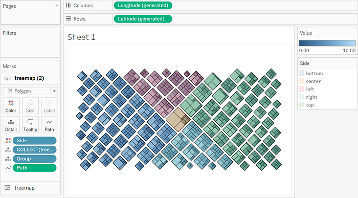
I hope you find this Squaremap implementation to be a useful starting point for exploring your hierarchical data further!
Quad-Tile Chart Implementation in Tableau Public
Now we'll focus on a more detailed Quad-Tile Chart implementation and put together an interactive visualization in Tableau Public. Let's start with some Wikipedia data on river systems and save it to a file.
import pandas as pd

# Wikipedia list of river systems (top 50 as of 1/26/2024)
# https://en.wikipedia.org/wiki/List_of_river_systems_by_length
data = {
    'river' : [str(i) for i in range(1, 51)],
    'length_km' : [
        6650,6400,6300,6275,5539,5464,5410,4880,4700,4444,4400,4350,4241,
        4200,3969,3672,3650,3645,3610,3596,3380,3211,3185,3180,3078,3060,
        3058,3057,2989,2888,2809,2740,2720,2704,2620,2615,2570,2549,2513,
        2500,2490,2450,2428,2410,2348,2333,2292,2287,2273,2270],
    'length_m' : [
        4130,3976,3917,3902,3445,3395,3364,3030,2922,2763,2736,2705,2637,
        2611,2466,2282,2270,2266,2250,2236,2100,1995,1980,1976,1913,1901,
        1900,1900,1857,1795,1745.8,1703,1700,1690,1628,1625,1597,1584,
        1562,1553,1547,1522,1509,1498,1459,1450,1424,1421,1412,1410],
    'drainage_area_km2' : [
        3254555,7000000,1800000,2980000,2580000,745000,2990000,2582672,
        3680000,1855000,2490000,810000,1790000,2090000,712035,1061000,
        950000,1380000,960000,884000,1485200,63166,850000,610000,219000,
        324000,1030000,570000,473000,817000,404200,1330000,454000,1024000,
        534739,242259,1093000,900000,644000,270000,1547,1522,1509,1498,
        1459,1450,1424,1421,1412,1410],
    'Average_discharge_m3_s' : [
        2800,209000,30166,16792,18050,2571,12475,22000,41800,11400,15500,
        16000,10300,5589,19800,767,13598,8080,7160,856,31200,8400,6210,
        3300,703,3153,10100,82,3600,7130,13000,4880,1480,12037,1400,6000,
        2575,4300,3800,270000,1547,1522,1509,1498,1459,1450,1424,1421,
        1412,1410],
    'outflow' : [
        'Mediterranean','Atlantic Ocean','East China Sea','Gulf of Mexico',
        'Kara Sea','Bohai Sea','Gulf of Ob','Río de la Plata',
        'Atlantic Ocean','Sea of Okhotsk','Laptev Sea','South China Sea',
        'Beaufort Sea','Gulf of Guinea','Ganges','Southern Ocean',
        'Atlantic Ocean (Marajó Bay), Amazon Delta','Caspian Sea',
        'Arabian Sea','Persian Gulf','Amazon','Amazon','Bering Sea',
        'Atlantic Ocean','Aral Sea','Andaman Sea','Gulf of Saint Lawrence',
        'Gulf of Mexico','Yenisei','Black Sea','Andaman Sea',
        'Mozambique Channel','Lena','Bay of Bengal','Aral Sea','Amazon',
        'Hudson Bay','Paraná','East Siberian Sea','Paraguay','Ob','Irtysh',
        'Caspian Sea','Amazon','Mississippi','Gulf of California',
        'Laptev Sea','Black Sea','Lena','Congo'],
    'name': [
        'Nile–White Nile–Kagera–Nyabarongo–Mwogo–Rukarara',
        'Amazon–Ucayali–Tambo–Ene–Mantaro',
        'Yangtze–Jinsha–Tongtian–Dangqu (Chang Jiang)',
        'Mississippi–Missouri–Jefferson–Beaverhead–Red Rock–Hell Roaring',
        'Yenisey–Angara–Selenga–Ider','Yellow River (Huang He)','Ob–Irtysh',
        'Río de la Plata–Paraná–Rio Grande','Congo–Chambeshi (Zaïre)',
        'Amur–Argun–Kherlen (Heilong Jiang)','Lena','Mekong (Lancang Jiang)',
        'Mackenzie–Slave–Peace–Finlay','Niger','Brahmaputra–Yarlung Tsangpo',
        'Murray–Darling–Culgoa–Balonne–Condamine','Tocantins–Araguaia',
        'Volga','Indus–Sênggê Zangbo','Shatt al-Arab–Euphrates–Murat',
        'Madeira–Mamoré–Grande–Caine–Rocha','Purús','Yukon','São Francisco',
        'Syr Darya–Naryn','Salween (Nu Jiang)',
        'Saint Lawrence–Niagara–Detroit–Saint Clair–Saint \
        Marys–Saint Louis–North (Great Lakes)','Rio Grande','Lower Tunguska',
        f"Danube–Breg (Donau', Dunăre', Duna', Dunav', Dunaj)",
        f"Irrawaddy River–N'Mai River–Dulong River–Kelaoluo–Gada Qu",
        'Zambezi (Zambesi)','Vilyuy','Ganges–Hooghly–Padma (Ganga)',
        'Amu Darya–Panj','Japurá (Caquetá)','Nelson–Saskatchewan',
        'Paraguay (Rio Paraguay)','Kolyma','Pilcomayo','Upper Ob–Katun',
        'Ishim','Ural','Juruá','Arkansas','Colorado (western U.S.)',
        'Olenyok','Dnieper','Aldan','Ubangi–Uele']
}

df = pd.DataFrame(data)
df.to_csv('river_systems.csv')
We'll use the length (km) field as our target to squarify and bring in the other fields later for interaction. For the container, let's use a triangle to be river themed (signifying a river "delta") and plot a preview.
from vizmath.quadtile_chart import polyquadtile as pqt
from vizmath import functions as vf

# triangle container
poly = [(-2.75,-1.33),(0,3.33),(2.75,-1.33)]
# let's adjust it to get the squares as diamonds
poly = vf.rotate_polygon(poly,45)

# create a Quad-Tile Chart with collapse, sized by width
# while adjusting the continer position with xc and yc
# to position the central square lower
o_pqt = pqt(df,'river','length_km', constraints=poly, collapse=True,
    rotate=45, buffer=.04, xc=-.18, yc=.18, size_by='width')

# preview plot
o_pqt.polyquadtile_plot(show_constraints=True)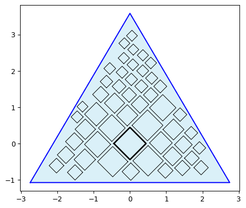
This looks good, so let's save the output data for the chart polygons and centroids for rendering layers in Tableau. We also need the coordinates for the triangle for drawing the container so let's print those out to use later.
# Output files (rescale the data for leveraging map layers in Tableau)

# Quad-Tile Chart polygon output
o_pqt.o_polyquadtile_chart.dataframe_rescale(-3,3,-2,4)
o_pqt.o_polyquadtile_chart.df = pd.merge(
    o_pqt.o_polyquadtile_chart.df, df, left_on='item', right_on='river')
o_pqt.o_polyquadtile_chart.df = o_pqt.o_polyquadtile_chart.df[
    ['river','side','x','y','path','length_km','length_m',
    'drainage_area_km2','average_discharge_m3_s','outflow','name']]
o_pqt.o_polyquadtile_chart.dataframe_to_csv('quadtile')

# Quad-Tile Chart centroid output
o_pqt.o_polysquares.dataframe_rescale(-3,3,-2,4)
o_pqt.o_polysquares.df = pd.merge(
    o_pqt.o_polysquares.df, df, left_on='id', right_on='river')
o_pqt.o_polysquares.df = o_pqt.o_polysquares.df[
    ['river','side','x','y','length_km','length_m',
    'drainage_area_km2','average_discharge_m3_s','outflow','name']]
o_pqt.o_polysquares.dataframe_to_csv('quadtile_centroids')

# Triangle container coordinates
poly = o_pqt.constraints
rs_poly_yx = [(vf.rescale(y, -2, 4, -1, 1),
    vf.rescale(x, -3, 3, -1, 1)) for x,y in poly]
print(rs_poly_yx)
# results in:
# [(-0.691813852924281, -0.9166666666666669),
# (0.8615194804090525, 0.0),
# (-0.691813852924281, 0.9166666666666667)]
Finally, let's create a legend to enable more interaction.
#%% legend plot
df_legend = df.groupby('outflow')['name'].count().reset_index()
o_pqt_legend = pqt(df_legend,'outflow','name',
    constraints=[(4,1)], collapse=True,
    rotate=45, buffer=.1, size_by='width', sides=['top','right'])
o_pqt_legend.polyquadtile_plot(show_constraints=True)

#%% legend data
o_pqt_legend.o_polyquadtile_chart.dataframe_rescale(-2,6,-4,4)
o_pqt_legend.o_polyquadtile_chart.df = pd.merge(
    o_pqt_legend.o_polyquadtile_chart.df, df_legend,
    left_on='item', right_on='outflow')
o_pqt_legend.o_polyquadtile_chart.df = o_pqt_legend.o_polyquadtile_chart.df[
    ['outflow','side','x','y','path','name']]
o_pqt_legend.o_polyquadtile_chart.dataframe_to_csv('quadtile_legend')
Now we're ready for Tableau, so let's start by importing all 3 files using the Text file option, navigate to Sheet 1, select the quadtile data source from the upper left Data tab, and create these calculated columns:
[Squares]: MAKEPOINT([Y], [X])
[Container]: if [Side] = 'top' then MAKEPOINT(-0.691813852924281,-0.9166666666666669) elseif [Side] = 'right' then MAKEPOINT(0.8615194804090525,0) elseif [Side] = 'bottom' then MAKEPOINT(-0.691813852924281,0.9166666666666669) elseif [Side] = 'left' then MAKEPOINT(-0.691813852924281,-0.9166666666666669) end
Start by dragging [Container] to Detail under Marks to generate the first map layer and adjust these options by right clicking in the map area and selecting Background Layers:
- Unselect all Background Map Layers (Base, Land Cover, etc.)
- Now right click in the map area and select Map Options, and in the panel unselect all of the options
Close out of Background Layers and continue with the following steps:
- Drag [Side] to Detail under Marks
- Under the Marks dropdown menu select Polygon
- Under Color select a black border color, adjust the opacity to 40%, and set the color to a light blue
Next, let's add an outline layer for the squares:
- Drag [Squares] into the map area and a pop-up will appear: Add a Marks Layer - drop the pill into this to create a new map layer
- Rename the pill to 'Outlines' from the pill dropdown menu
- Drag [River] to Detail under Marks in this new map layer
- Under the Marks dropdown menu select Line (don't worry if it looks strange at this point)
- Drag [Path] to Path under Marks and repeat the process for converting it to Dimension
For the main square layer, repeat the process above for a new layer using Polygon from the Marks dropdown menu, coloring by [Drainage Area Km2] with these options: {Start: 0, End: 3,000,000}.
Finally, let's add a layer using the centroids by selecting quadtile_centroids from the Data tab in the upper left and adding these calculated columns:
[Centroids]: MAKEPOINT([Y],[X])
[Size]: [Length Km] ^2
You'll notice that we squared the length to account for the correct sizing in Tableau, which we'll use in the following steps:
- Drag [Centroids] into the map area and a pop-up will appear: Add a Marks Layer — drop the pill into this to create a new map layer
- Drag [River] to Detail under Marks in this new map layer
- Under the Marks dropdown menu select Circle
- Drag [Size] to Size under Marks and repeat the process for converting it to Dimension and set the size tick to the second hash
- Drag [Average Discharge M3 S] to Color with and add a white border and these options: {Start: 0, End: 50,000}
You'll see a null warning in the lower right corner that you can right click on and select Hide Indicator. At this point you should have something that looks like this (I've added some other details and attributes as shown below for implementing interactions and labels later on):
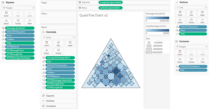
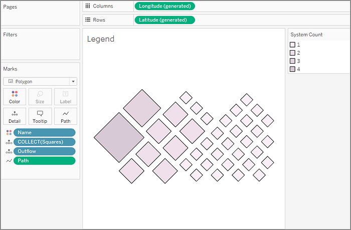
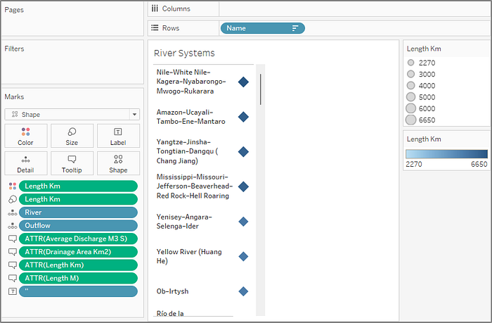
Now let's add three more sheets to complete the source material for the dashboard. Refer to each of the images below for the setup.
- "Bars" - using the quadtile_centroids data source
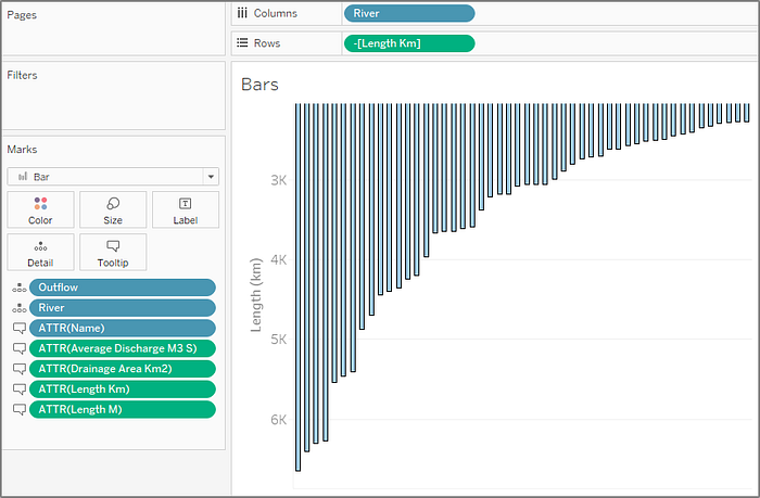
- "Legend" - using the quadtile_legend data source
- "Rivers" - using the quadtile_centroids data source with [Name] sorted by {Sort By: Field, Sort Order: Descending, Field Name: [Length Km], Aggregation: Maximum} (by right clicking the [Name] pill on Rows and selecting Sort…)
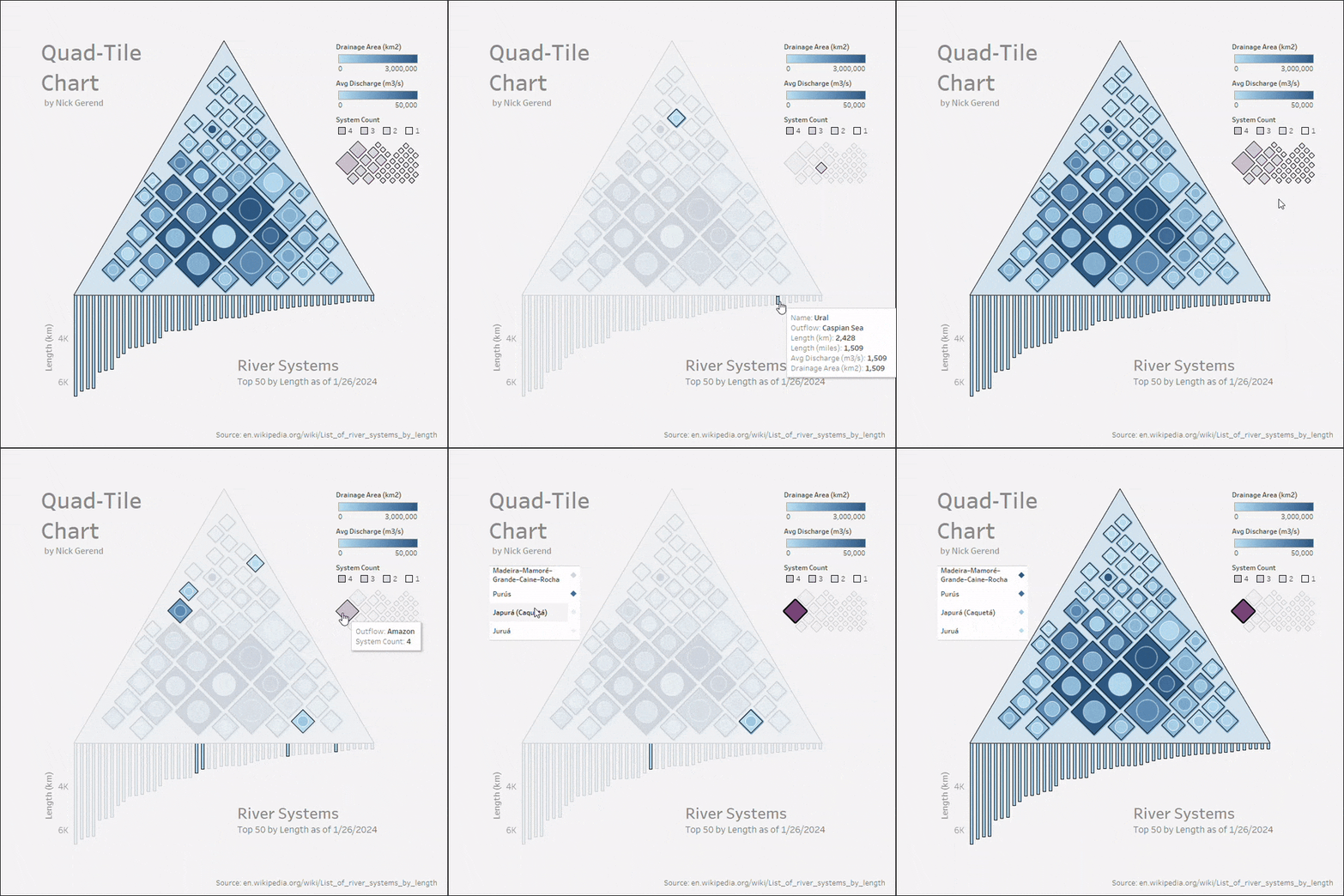
Finally, let's arrange all 4 sheets on a Dashboard, and set up some actions from the top menu under Dashboard > Actions. Click the Add Action dropdown and select Highlight. Under Targeted Highlighting select Selected Fields and select the [Outflow] and [River] fields (make sure [Outflow] was added as shown above in the sheets as a Detail). Finally select the Hover option under the Run action on menu on the right.
For the last action, click the Add Action dropdown and select Filter with these options: {Source Sheets: Legend, Target Sheets: Rivers, Selected Fields: Outflow > quadtile_centroids > Outflow, Run action on: Select, Clearing the selection will: Exclude all values}. Now the dashboard will highlight on demand across all sheets and filter off of selection from the Legend sheet!
Conclusion
In this article, we embarked on a journey to see if squares could stand up to circles in the domain of packed-shape visualization. To test the application of squares we implemented an optimization framework for high-level comparisons of squares and circles and ultimately landed on leveraging a custom algorithm to take advantage of the square's full potential.
I provided a detailed guide to what I call the "Quad-Tile Chart", for visualizing a set of values and its extension the "Squaremap" for visualizing a hierarchy of values, both with the ability to pack squares in a desired polygon container to accommodate available space on a visualization canvas.
The polygon container is a key advantage over the leading packed circle implementations that are present in today's data visualization space (which conform to a circular boundary), and hierarchical data finds a new home with the Squaremap.
Maybe most importantly, the arrangement of the squares in the Quad-Tile Chart is aesthetically pleasing to look at (a must for competing with circles!) and the squares are interchangeable with circles placed at their centroids (for a semi-packed Bubble Chart) which I'll conclude as a victory for our endeavor to justify the inclination to squarify data.
With data series and hierarchies looming around every corner, I hope you'll find these visualization techniques to be useful tools on your data exploration journey!
References
All images in this article were created by the author unless otherwise stated.
[1] Wikipedia (CC BY-SA), "Fastest animals" (as of 1/26/2024)
[2] Wikipedia (CC BY-SA), "List of river systems by length" (as of 1/26/2024)
Related Articles


