Spotify was released over 10 years ago, and its core product hasn't changed much since. They've added some features like podcasts, exclusive content and wider platform support, but music-streaming is undoubtedly what Spotify lives and dies by.
You'd think that by now, Spotify would have a carefully fine-tuned user experience, with every single possible user flow thoughtfully designed and planned out. Every little nook and cranny of their app precisely and meticulously crafted for a seamless experience… right? Wrong.
I use Spotify every day, and it always frustrates me. Basic user flows are unintuitive, there are inconsistencies across different pages, and things aren't located where I'd expect. To me, some of their design choices are just incomprehensibly awful. Like, mind-bogglingly bad.
But maybe I'm too critical — so I'll let you be the judge. Here are some things that I think suck about the Spotify app.
Note: I use an Android phone, but these apply to the iOS app as well. I've recorded GIFs to demonstrate the issues, please be patient as they load!
Adding a Song to Multiple Playlists
So I find a new song that I like, and I want to save it to a couple of my playlists. Probably one of the most basic user flows in a music-streaming app. Should be easy, right?
Find the song, tap the 3 dots, hit Add to Playlist, and select the playlists that I'd like to save the song to.
Except, nope. It doesn't let me select multiple playlists. Only one at a time. I mean, really?

For each playlist, I have to go through a series of taps to open up the overflow menu and select a single playlist. Oh, and if I want to save the song to my library? That'll be another series of taps.
I'll admit there are some design challenges here. Spotify warns me when I try to add a song to a playlist that already contains that song, to avoid duplicate songs in one playlist.
But the solution seems pretty simple. For example, visually separate the playlists into two groups, the ones that contain the song and the ones that don't. It's really not rocket science…
Inconsistent Tap and Hold
Note: Tap and hold is an Android-specific pattern. This one doesn't apply to iOS.
On any song tile, I can tap the 3-dot icon to pull up an overflow menu containing more options for the song. I would expect that tapping and holding the song tile would do the same thing — and it does!
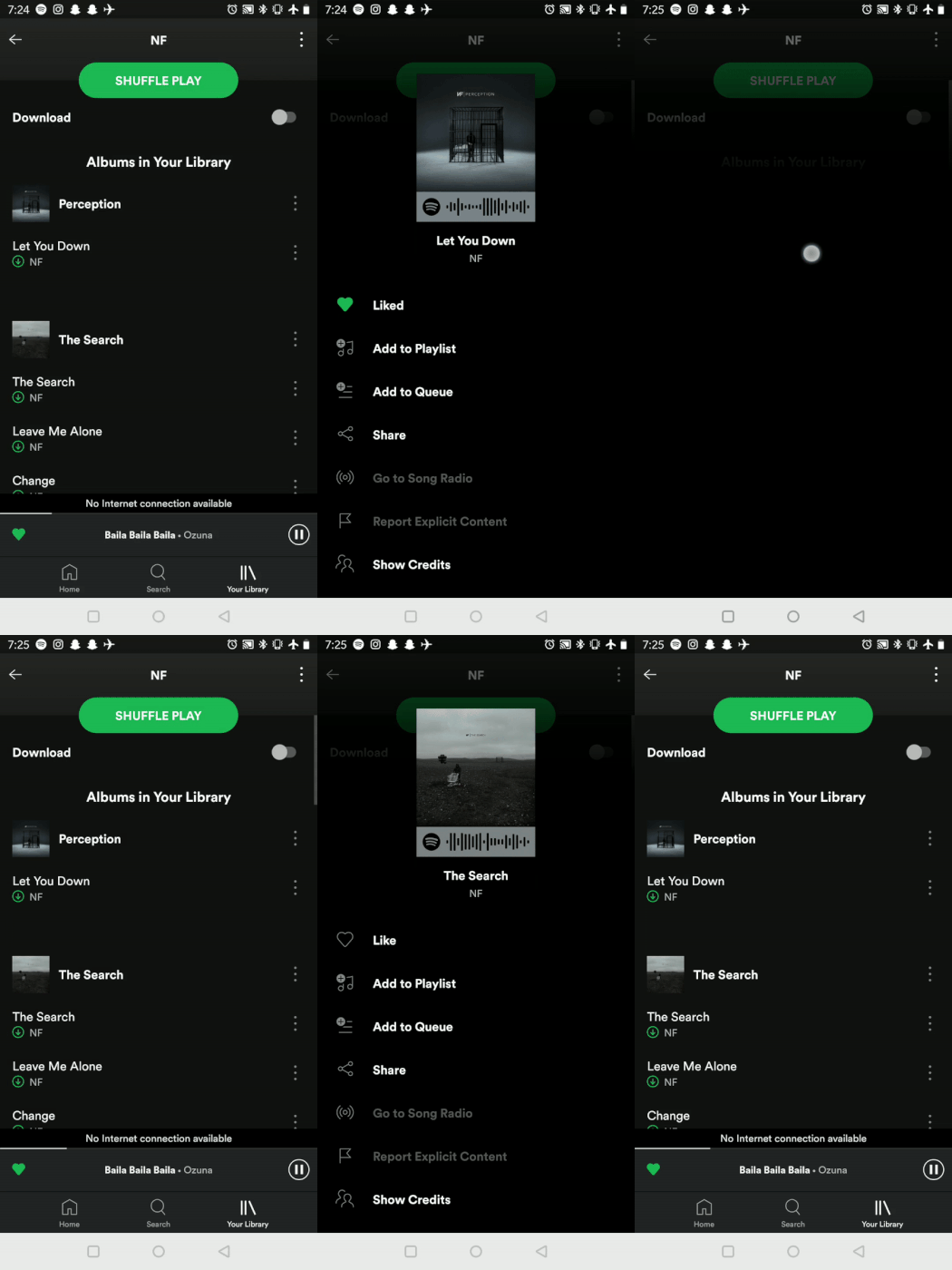
Well, it does, sometimes. Other times, it just doesn't work.
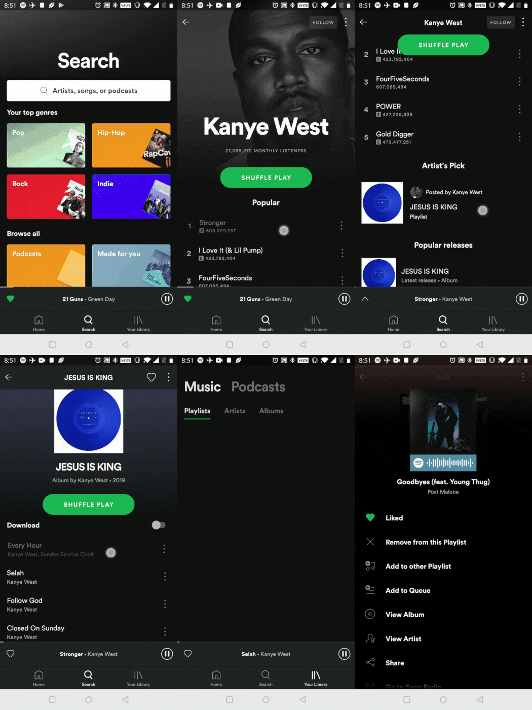
It seems like on some specific pages, the tap and hold works, and others it doesn't. On the pages where it doesn't work, I'll accidentally play the song if I tap, hold and release (I can't tell you how many times I've accidentally destroyed my queue by doing this).
Either have the tap and hold work everywhere, or nowhere at all. Not sometimes. That's the worst.
I've tried and tried, but I can't make up any good explanations for this one.
Searching and Sorting Lists
I'd like to find a song in one of my playlists, or sort the playlist by date added instead of alphabetically. Here's how:

Not too bad. I don't like that the menu is so tall that I have to swipe up to see more actions, it's easy to miss some of the actions, like the sort. I'd prefer if the search and sort actions were always visible, pinned on top and hiding away when I scroll downwards. Still, not the end of the world.
Let's take a look at how to do the same thing, but for artists this time.
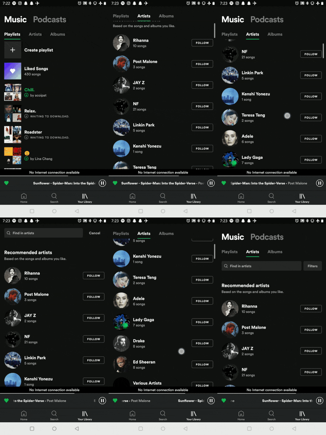
For whatever reason, there's now a search bar and a 'filters' button instead of a menu. This action bar isn't always visible like the 3-dot menu button is for playlists, nor does it appear if you scroll upwards. Instead, it's only accessible if you scroll all the way to the top of the page.
In fact, when I switch to the artists tab, the search bar and filter button are originally hidden. To see them, I have to scroll up. If I start scrolling down at all though, the actions are hidden away until scrolling all the way back up.
I literally thought that there was no way to filter artists for the longest time, until one day I accidentally scrolled up all the way and the search bar popped up.
I'd expect the bar to show up whenever I scroll up, or at least have it visible when I first switch the artists tab.
Ok, if that was a bit tough to follow, to quickly summarize: The way I search/sort lists is inconsistent. That leads to me not knowing whether I should be tapping on 3-dot menus, or scrolling all the way up. And why should I ever be scrolling all the way up in the first place? Just make the search bar visible when I scroll up, like any other app would… arghhh!
*proceeds to rip hair out*
Oh yeah, and did I mention that there's no way to search through podcasts? I don't use Spotify for podcasts, just tried out of curiosity…
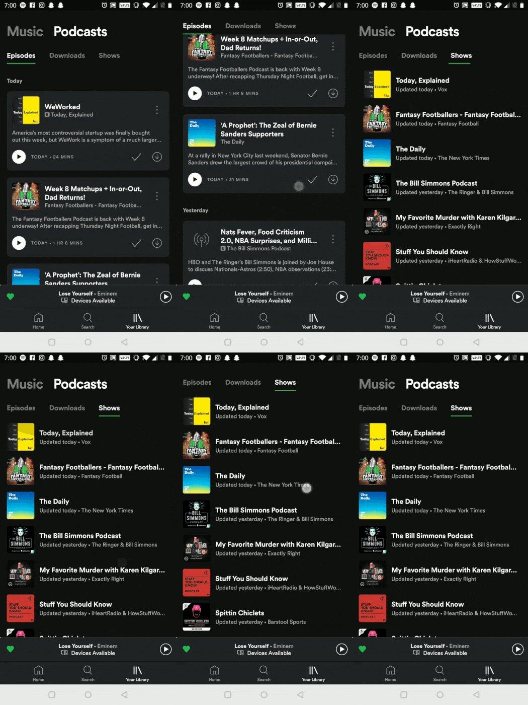
Well, there might be a way, hidden somewhere I haven't found yet. Let me know if there is…
Top Charts and Recommended Music
Spotify has awesome ways to help me discover new music, like top charts, new releases, and personally curated playlists based on my music preferences (Discover Weekly). Where would you think these are located?
There used to be a dedicated Browse tab, but they've since removed it. My first guess was to look on my home page, as the home page promotes various artists, playlists and albums Spotify thinks I might like.
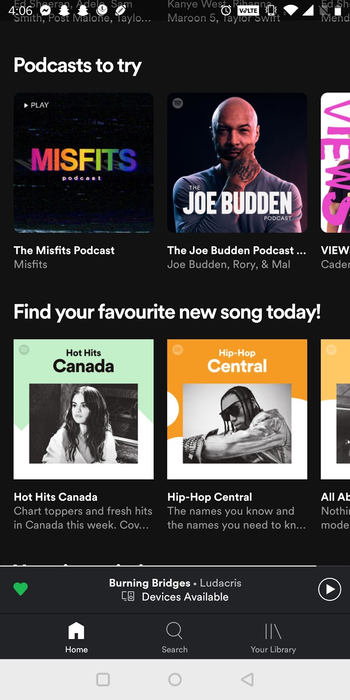
Naturally, I thought I would find Charts, New Releases, Discover, and other similar lists here as well. Instead, these particular lists have been tucked away in the Search tab.
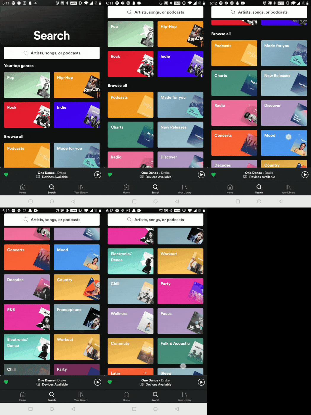
Why separate these lists from the recommendations on the home page? The location doesn't make any sense — the cards are right underneath top genres, and around these cards are even more genres. If I'm scrolling through the app quickly, they blend right in and I think that they are just other genres. The cards don't fit in at all on this page.
Is it Time to Jump Ship?
To me, the issues I pointed out aren't just small, nit-picky things. They are problems and inconsistencies in some of the most basic, fundamental user flows.
You'd think that by now, Spotify would have a carefully fine-tuned user experience, with every single possible user flow thoughtfully designed and planned out…right? Wrong.
I've been subscribed to Spotify Premium for countless years now, and I loved Spotify the moment I tried it. It's one of those rare products that demonstrate how technology can completely revolutionize an industry. It's fundamentally changed the way that we purchase, access and listen to music.
Spotify is still the world's #1 music-streaming service, with 36% of the global market and over 215 million active users monthly [1]. It's facing fierce competition though, with Apple Music overtaking Spotify in the U.S. and giants like Amazon and Google in the market.
But one thing is clear — it's definitely not the UX that's keeping me with Spotify. I'm on a super cheap family plan, and porting my music to another app is way too much work. Spotify has a great selection of music and does a good job for me at recommending new music. And there's definitely a bit of a familiarity and nostalgia factor. So despite my complaints, I haven't been convinced to jump ship — yet.
I'd love to hear your thoughts. Is it time to try out an alternative, or do other services face the same UX problems, or worse? Did you notice any of the issues I pointed out before, and have you run into any other major annoyances? Am I warranted in my complaints, or am I being a bit of a whiny brat?
Thanks for reading!
References
[1]: Spotify market stats
This article was written based on Spotify v8.5.29.828, Android 9.
You might also enjoy this story, where I discuss a technique I used to find some of the flaws discussed here:

