Altair is a statistical visualization library for Python. Its syntax is clean and easy to understand as we will see in the examples. It is also very simple to create interactive visualizations with Altair.
Altair is highly flexible in terms of data transformations. We can apply many different kinds of transformations while creating a visualization. It makes the library even more efficient for exploratory data analysis.
The first three parts of the Altair series covered the following topics.
- Part 1: Introduction
- Part 2: Filtering and transforming data
- Part 3: Interactive plots and dynamic filtering
In this article, we will see different ways of customizing visualizations with Altair. Creating informative visualizations that demonstrate the underlying structure within data or unveil the relationships among variables is critical part of data science.
It is also important to make them look nice and appealing. Thus, we should spend some time to customize the visualizations for better appearance.
We will be using an insurance dataset that is available on Kaggle. Let's start by importing the libraries and reading the dataset into a Pandas dataframe.
import numpy as np
import pandas as pd
import altair as alt
insurance = pd.read_csv("/content/insurance.csv")
insurance.head()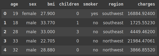
The dataset contains some measures (i.e. features) about the customers of an insurance company and the amount that is charged for the insurance.
We can create a scatter plot to inspect the relationship between body mass index (bmi) and insurance cost (charges). The smoker column can be used to separate smoker and non-smoker people.
(alt.
  Chart(insurance).
  mark_circle().
  encode(x='charges', y='bmi', color='smoker').
  properties(height=400, width=500))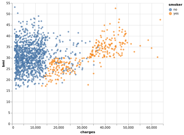
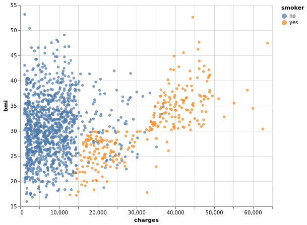
All of the bmi values are higher than 15. Thus, it would look better if the ticks on y-axis start at 15. We can use the scale property to adjust to customize the y-axis.
(alt.
  Chart(insurance).
  mark_circle().
  encode(
    alt.X('charges'),
    alt.Y('bmi', scale=alt.Scale(zero=False)),
    alt.Color('smoker')).
properties(height=400, width=500))
In order to use the scale property, we specify the column with Y encoding ( alt.Y('bmi') ) instead of passing a string ( y='bmi' ). The zero parameter is set as "False" to prevent the axis from starting at zero.
Here is the updated visualizations:
We can also use the domain parameter to specify a custom range. Let's also change the size of the visualization using the properties function.
(alt.
  Chart(insurance).
  mark_circle().
  encode(
    alt.X('charges'),
    alt.Y('bmi', scale=alt.Scale(domain=(10,60)),
    alt.Color('smoker')
  ).
  properties(height=300, width=400))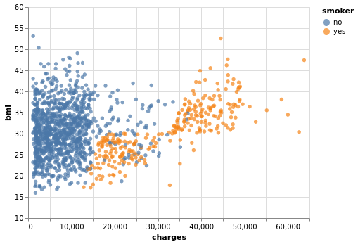
We may also want to customize the appearance of the points in the scatter plot. For instance, the size, color, and opacity can be adjusted as follows:
(alt.
  Chart(insurance).
  mark_circle(size=50, color='darkblue', opacity=0.6).
  encode(
    alt.X('charges'),
    alt.Y('bmi', scale=alt.Scale(domain=(15,55)))
  ).
  properties(height=400, width=500))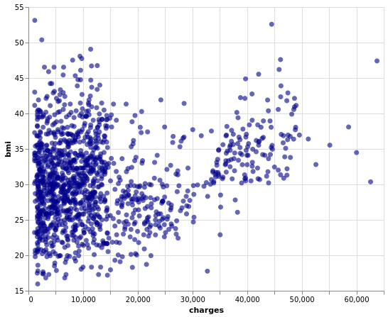
We can also specify these changed in the encoding function. The following code generates the same visualization as the one above.
(alt.
  Chart(insurance).
  mark_circle().
  encode(
    alt.X('charges'),
    alt.Y('bmi', scale=alt.Scale(domain=(15,55))),
    size = alt.value(50),
    color = alt.value('darkblue'),
    opacity = alt.value(0.6)
  ).
  properties(height=400, width=500))
Altair allows for customizing the legend as well.
(alt.
  Chart(insurance).
  mark_circle(size=40).
  encode(
    alt.X('charges'),
    alt.Y('bmi', scale=alt.Scale(zero=False)),
    alt.Color('smoker',
              legend=alt.Legend(
                 title='Do they smoke?',
                 orient='left',
                 titleFontSize=13,
                 labelFontSize=13
                 )
              )
    ).
  properties(title="Bmi vs Insurance Cost")
)
We have changed the title of the legend and put it on the left. The font size of the title and labels have also been adjusted.
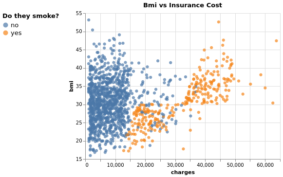
We have also added a title by using the properties function.
In some cases, we need to change the axis title because column names may not be appropriate or very clear. The title of X and Y encodings are used to change the axis title.
(alt.
  Chart(insurance).
  mark_circle(size=40).
  encode(
    alt.X('charges', title="Insurance Cost"),
    alt.Y('bmi', scale=alt.Scale(zero=False),
          title="Body Mass Index"),
    alt.Color('smoker',
              legend=alt.Legend(
                 title='Do they smoke?',
                 orient='left',
                 titleFontSize=13,
                 labelFontSize=13
                 )
              )
    ).
  properties(title="Bmi vs Insurance Cost",
             height=350, width=500)
)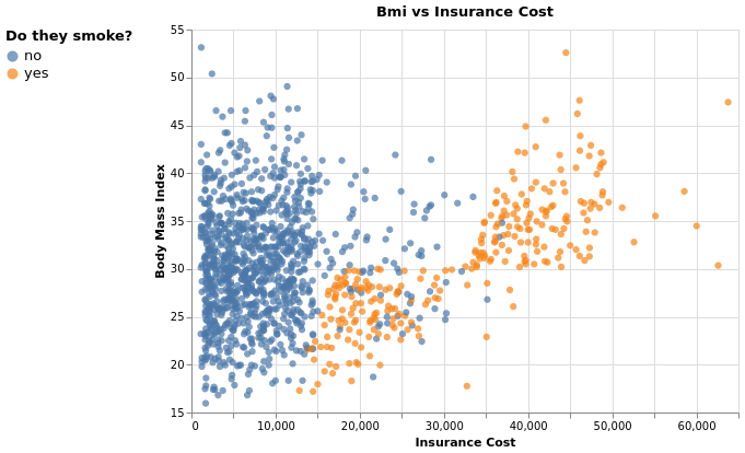
What we have achieved at the end seems much better than the first plot we created.
Conclusion
We have covered some of the options that Altair offers to customize the visualizations. There are, of course, many more ways to create highly customized visualizations.
In many cases, the default settings work fine with a few small adjustments. However, we can always make the visualization more appealing and distinctive. It will help you convey the message more clearly.
Thank you for reading. Please let me know if you have any feedback.


