

The Seaborn Relational Plot (relplot) allows us to visualise how variables within a dataset relate to each other. Data visualisation is an essential part of any data analysis or machine learning workflow. It allows to gain insights about our data. As the famous saying suggests, 'a picture is worth a thousand words'.
Within this short tutorial we will see how to use the relplot function from Seaborn to visualise well log data on scatter plots and line plots.
Data Source
The data for this tutorial is sourced from the following GitHub repository and formed part of a Machine Learning competition aimed at predicting lithology from well log measurements.
Bormann P., Aursand P., Dilib F., Dischington P., Manral S. 2020. FORCE Machine Learning Competition. https://github.com/bolgebrygg/Force-2020-Machine-Learning-competition
Follow Along by Video
There is also a video version of this article on my YouTube channel, which you can also view here:
Import Libraries and Data
The first step in the project is to import the libraries we are going to be using. These are Seaborn and Pandas. Seaborn allows us to create very powerful graphics with a few lines of code, and pandas allows us to load data from CSV files and store them within dataframes.
import seaborn as sns
import pandas as pd
After importing the libraries, we can begin importing the data from our CSV file using pd.read_csv()
df = pd.read_csv('Data/Xeek_Well_15-9-15.csv', na_values=-999)Creating a Scatter Plot with Relplot
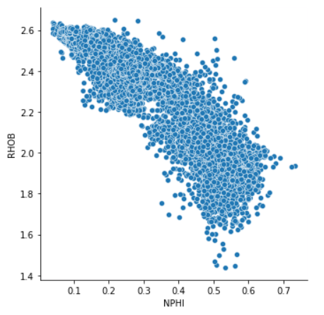
Now that the data has been loaded we can begin creating our first scatter plot using Seaborn's Relplot function. A common scatter plot within petrophysics is a neutron porosity (NPHI) vs density (RHOB) plot.
g = sns.relplot(data=df, x='NPHI', y='RHOB');When we execute this code we get back a very simple scatter plot, with the axis labels already assigned for us.
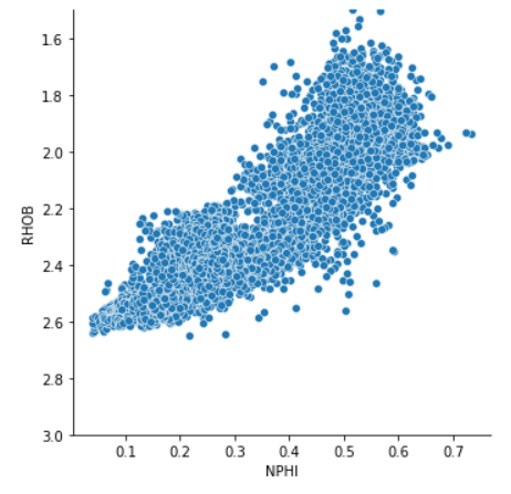
When working with neutron-density scatter plots we often view the density axis in reverse order so that porosity increases positively with both axes.
We can do this by calling upon g.set, and then setting the ylim argument.
g = sns.relplot(data=df, x='NPHI', y='RHOB')
g.set(ylim=(3, 1.5));
This returns the following plot, which looks more appealing when carrying out petrophysical analysis.
Customising the Scatter Plot
Colouring By a Continuous Variable
The Seaborn Relplot allows us to specify multiple arguments for customising our plot. One of these is the hue argument which allows us to specify another variable to colour our plot by.
In this example, we can select the Gamma Ray (GR) data, which can be used to give us an indication of shaliness of our formations.
g = sns.relplot(data=df, x='NPHI', y='RHOB', hue='GR')
g.set(ylim=(3, 1.5));
When the code is run, we get back the following plot.
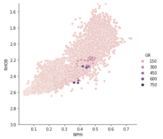
When we look at this plot, we can see that we have one issue. The plot appears to be washed out due to anomalously high values.
We could potentially remove these values from our data if they are considered as real outliers, or we can rescale the plot.
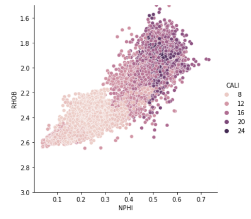
Another variable that we often plot is borehole caliper (CALI). This gives us an indication of how washed out our borehole is. This is important as many measurements can be severely impacted if they read more of the borehole fluid compared to the formation.
g = sns.relplot(data=df, x='NPHI', y='RHOB', hue='CALI')
g.set(ylim=(3, 1.5));
When we execute this code, we can see we generate the following plot. From it we can see that some of the lower RHOB and higher NPHI readings are either from a washed out section of the borehole, or have been obtained in a larger hole section. Further investigation into the caliper curve and bitsize curve would reveal which is the most likely scenario.
Colouring By a Discrete Variable
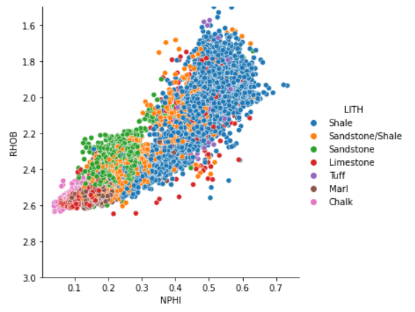
Instead of colouring by continuous features, we can also colour by categorical features. In this example we will see how bulk density (RHOB) and neutron porosity (NPHI) vary with different geological lithologies (LITH).
In this example, we just simply place the LITH column in the hue argument.
g = sns.relplot(data=df, x='NPHI', y='RHOB', hue='LITH')
g.set(ylim=(3, 1.5));
From the returned plot, we can see that shales (in blue) have high neutron porosities and a wide range of bulk density values. We can also see the other lithologies and where the fall in relation to the measurements.
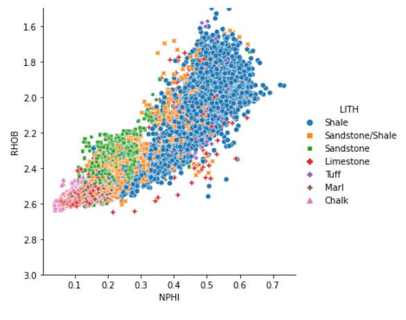
Styling the Marker
In addition to being able to control the hue for each of the lithologies, we can also change the style by passing LITH to the style argument.
g = sns.relplot(data=df, x='NPHI', y='RHOB', hue='LITH', style='LITH')
g.set(ylim=(3, 1.5));
On the returned plot, we now have the benefit of colour and shape to identify our different lithologies. This is especially useful if the graph is printed in black and white.
Line Plots
The relplot is not just limited to scatter plots, we can also generate line plots. All we have to do is add the argument kind='line' to the relplot call.
g = sns.relplot(data=df, x='DEPTH_MD', y='GR', kind='line')
g.set(ylim=(0, 150));
Using depth measurement and the gamma ray feature (GR) we can generate a very simple log plot of our data versus depth.
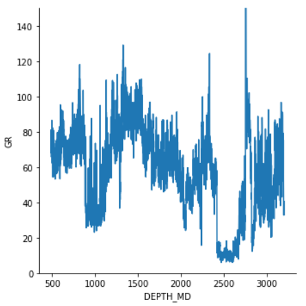
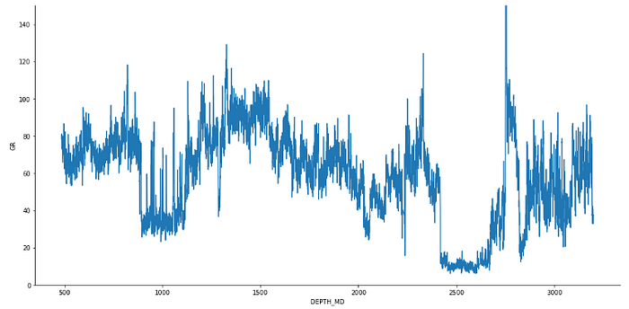
Setting the Figure Size with Height and Aspect Ratio
The figure above looks a little squished and hard to see what is happening. There are multiple ways to change the size of figures within seaborn, and the most convenient way within the relplot is to specify a height and an aspect like so.
In this example, the height is set to 7, and the width will be 2 times that.
g = sns.relplot(data=df, x='DEPTH_MD', y='GR', kind='line', height=7, aspect=2)
g.set(ylim=(0, 150));
This allows us to stretch out our plot like so.
Splitting the Figure into Subplots / Facets
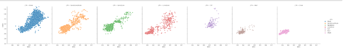
As seen in the figures above, it can become confusing to distinguish the different categories (lithologies) when they are all lying on top of each other. One way around this is to create multiple subplots, one for each category (lithology).
This is made very easy with the relplot. We simply pass a new argument called col='LITH' .
g = sns.relplot(data=df, x='NPHI', y='RHOB',
           hue='LITH',
           style='LITH',
           col='LITH')
g.set(ylim=(3, 1.5));
When we run that, we get back the following series of scatter plot, all on the same scale and split out by our category (lithology). However, as we have several categories it can be very difficult to see without zooming in.
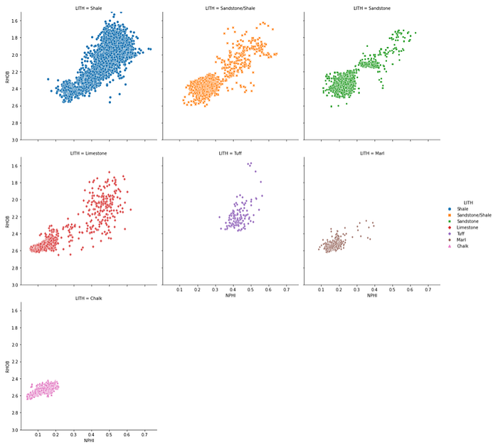
Wrapping the Columns
To make the plots more readable, we can apply a column wrap value. Once we reach that value, the plot will then create a new row and continue with the next category.
This is achieved by passing in col_wrap=3. The number can be whatever number you want, but 3 works with this example nicely.
#Wrapping the columns
g = sns.relplot(data=df, x='NPHI', y='RHOB',
           hue='LITH',
           style='LITH',
           col='LITH',
           col_wrap=3)
g.set(ylim=(3, 1.5));
Now our relplot is much more readable and easier to interpret.
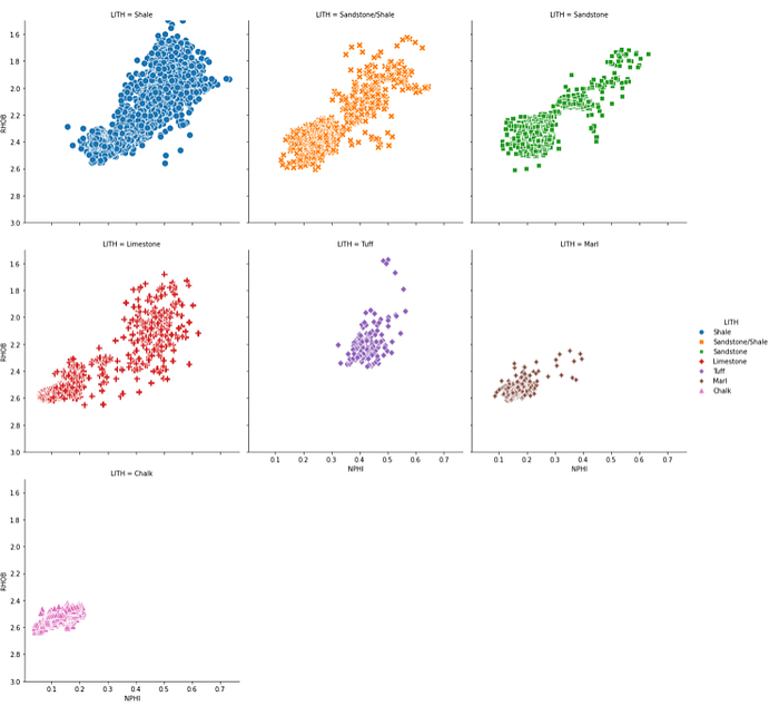
Changing the Point Size
If we want to increase the size of our points, we can do so by passing in a value for the marker size argument: s=100 within the relplot call.
#Changing size of points
g = sns.relplot(data=df, x='NPHI', y='RHOB',
           hue='LITH',
           style='LITH',
           col='LITH', col_wrap=3,
           s=100)
g.set(ylim=(3, 1.5));
When we run this, we can see that we now have much bigger points, thereby making the plot more readable.
Summary
Within this short tutorial we have seen how to use the powerful Seaborn relplot for visualising well log data on both a scatter plot and line plot, without calling them separately. This can make our code much tidier and easier to read. The relplot also allows us to split our data out by categories or colour the points by continuous or discrete data.
Thanks for reading. Before you go, you should definitely subscribe to my content and get my articles in your inbox. You can do that here!
Secondly, you can get the full Medium experience and support myself and thousands of other writers by signing up for a membership. It only costs you $5 a month, and you have full access to all of the amazing Medium articles, as well as have the chance to make money with your writing. If you sign up using my link, you will support me directly with a portion of your fee, and it won't cost you more. If you do so, thank you so much for your support!