
In a world increasingly driven by data, the ability to understand and visualize data is a highly valuable skill. One of the most effective tools for starting this journey is Tableau, a powerful data visualization platform that allows anyone — from beginners to seasoned professionals — to transform raw data into meaningful insights. This article will guide you through the essentials of Tableau, helping you build a strong foundation to effectively analyze data.
Why Tableau?
Tableau provides a user-friendly, drag-and-drop interface that makes it quick and easy to create visualizations. Its ability to connect with various data sources — from Excel files to SQL databases and online services — makes it a flexible choice for analytics projects. Tableau can also handle large-scale data, offering efficiency and adaptability for both small projects and enterprise-level solutions.
Getting Started with Tableau
To dive in, you'll need to set up Tableau, which is available in multiple editions, including Tableau Public (free) and Tableau Desktop (paid). Once installed, you'll find an intuitive interface with key components like the Data pane, Sheets, and Dashboard area. These features provide a central space to create and manage visualizations. Begin by connecting to a data source — Tableau supports numerous formats, and even sample datasets are available to help you practice.
The Basics: Data and Visualization Concepts
Understanding a few key concepts will make Tableau feel more approachable. Data is categorized into Dimensions and Measures. Dimensions often represent qualitative data (like names or categories), while Measures represent quantitative data (like counts or amounts). Visual elements are divided into Continuous and Discrete types, affecting how Tableau displays data.
With a drag-and-drop interface, you can create basic visualizations like bar charts, line graphs, scatter plots, and pie charts. You'll learn to apply filters to focus on specific data points, use sorting to bring clarity to trends, and enhance visuals with colors and labels to make insights stand out.
Building Dashboards and Telling Stories
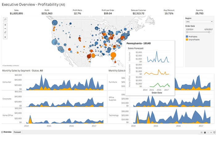
One of Tableau's standout features is the ability to combine individual visualizations into comprehensive dashboards. By arranging multiple charts and visual elements, you can create a dashboard that delivers a clear, cohesive overview of your data. Tableau's Story feature further allows you to build a narrative around your data by sequencing visualizations that highlight trends, patterns, or key takeaways.
Intermediate Techniques: Calculations, Parameters, and Mapping
Once you're comfortable with the basics, you can take a deeper dive into calculated fields and parameters, which enable custom calculations and interactive elements. For instance, you can calculate percentages or growth rates directly within Tableau without modifying your original dataset.
Tableau also shines in mapping capabilities — making it easy to plot data on geographic maps. For example, if you have sales data by region, you can use Tableau's mapping tools to visualize your sales distribution across different locations.
Advanced Visualizations and Data Management
With experience, you'll want to explore Tableau's advanced visualization options, like heat maps, waterfall charts, and bullet graphs. These specialized charts allow for more nuanced analysis, ideal for presenting complex datasets.
Data blending and joining are essential for working with multiple datasets. Tableau allows you to merge data from various sources, making it easier to analyze complex relationships and provide a holistic view of your data landscape.
Sharing Your Work: Publishing and Collaboration
Once your visualizations are complete, Tableau offers options for sharing your insights with others. You can publish your work to Tableau Public or Tableau Server, enabling easy access and collaboration. Embedding your visualizations on websites or sharing links can also be an effective way to share findings.
Real-World Applications of Tableau
Tableau's versatility has made it popular across industries like retail, finance, and healthcare. For instance, a retail company might use Tableau to monitor sales performance by location, while a healthcare provider could track patient data and improve care delivery. By learning Tableau, you gain a valuable tool to uncover insights and make data-driven decisions, regardless of the industry.
Conclusion
Mastering Tableau is a journey, but each step opens new possibilities to transform raw data into powerful insights. With regular practice and exploration, Tableau can become an invaluable asset in making informed, data-driven decisions.
References
- Tableau Official Documentation
- Data Visualization with Tableau by Ben Jones
- Tableau Your Data! by Daniel G. Murray
About Me
An aspiring data scientist enthusiast with a strong desire for learning and development. Proficient in utilizing Python for Data Cleaning, Data Manipulation, Exploratory Data Analysis, and Machine Learning. Demonstrated skills through hands-on projects, such as developing predictive models, performing comprehensive data analyses, and creating interactive data visualizations. Equipped with strong analytical thinking, problem-solving skills, attention to detail, communication, collaboration, and a proactive approach to learning new technologies and methodologies.
Connect with me on LinkedIn, Medium, and GitHub.
In Plain English 🚀
Thank you for being a part of the In Plain English community! Before you go:
- Be sure to clap and follow the writer ️👏️️
- Follow us: X | LinkedIn | YouTube | Discord | Newsletter | Podcast
- Create a free AI-powered blog on Differ.
- More content at PlainEnglish.io