
WWDC came and went and I'm a bit mixed on it. I do think there are some very interesting features coming. I was especially impressed by translations which appear to be coming to most platforms: iOS, tvOS, and watchOS. Also iPadOS if you count that as its own OS.
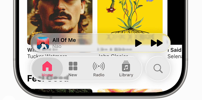
The iPhone now has translations between callers. This is the one big feature that Samsung's AI suite had that Apple didn't so I guess it was only a matter of time before they copied it. Also Apple Music is getting translations. Finally I can see what the Eurovision songs mean without Googling them.
Also I'm impressed by Auto Mix which intelligently switches songs instead of waiting for them to end. I actually just asked either ChatGPT or Gemini how hard would it be to implement this exact feature. I also asked it if it was possible to use embeddings to shuffle to similar songs instead of using whatever terrible algorithm Apple Music uses now. Baby steps.
I also have to mention the screen unknown calls and messages feature. In 2023 I wrote a piece titled Screw Standby, Live Voicemail Is The iOS 17 Feature I'm Most Excited About where I said:
Maybe people will love it even more on the iPhone because Apple's implementation is more traditional whereas Google's is sort of creepy. Like if you're going to pick things to say you might as well pick up.
Well looks like Apple is going all the way and copying Google's implementation. I don't know how I feel about this. I guess it's not that different.
Also I should mention Apple is providing developers the ability to interact with Apple Intelligence. It sounds nice, especially as I wrote a piece titled Can AI Email Be Affordable discussing the high costs of AI. But many users won't have Apple Intelligence leading to a fragmented experience. Plus the on device Apple Intelligence is only 3 billion parameters. I have problems getting an 8 billion parameter model to do what I want. So am I going to give the people with the newest most expensive iPhones a worse experience? I don't think so.
Also I thought the Image Playground API was cute because they said it was powered by ChatGPT. So is this an Apple API or an OpenAI API? Although I'm not a huge fan of OpenAI's new image generator. Sure, it gets fingers and text correct, but it also takes forever to run. In the time it would take to generate 1 ChatGPT image I could probably generate like 20 Imagen 4 images.
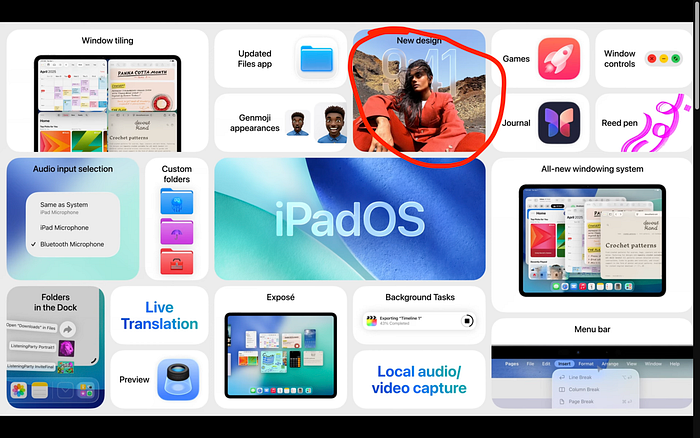
But this WWDC was undoubtedly overshadowed by the new redesign. Every year when announcing new operating systems Apple puts out these bento box diagrams of what's new. And this year all of them (except VisionOS) mentioned the new redesign, sometimes more than once.
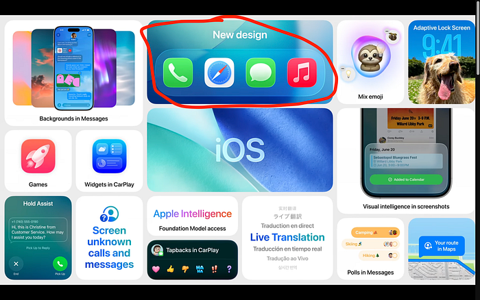
And, honestly, I think the new 'liquid glass' design is an accessibility disaster.
Originally I thought it looked pretty good as it was just like iOS 7 but more polished. But then I saw more of it. And now I think Apple way overdid the glass effect. They reduced the frosted part of the frosted glass and now there's just not enough contrast.
If you look at every time the new liquid glass effect was shown off there are many examples of the text or icons being almost invisible. It definitely does not meet web accessibility guidelines.
And this is not the first time Apple has tried to make a UI that was difficult to read. Who could forget the iOS 7 redesign where Apple switched to Helvetica Neue Ultra Ultra Ultra Light.
Well, it looks like history has repeated itself with the liquid glass redesign. I can only hope Apple walks this design back and makes the glass more frosted.
Also I'm not a huge fan of Liquid Glass in general. It's fine when applied sparingly. But Apple is just applying this thing everywhere. It looks a bit… cluttered. Like there are physical glass sections on your UI.
And it also feels unnecessary. Like the objects are transparent but they also refract light so you can't really see through them. It feels like if a game designer added bloom to literally everything because it looked good. It just feels amateurish.
I'm a much bigger fan of Google's Material Design. I'm not sure what I think of the newest version. It feels a bit too colourful, like it's designed to cater to millennials (because that's literally why they said they made it) but it at least feels like a design I would like to use. Even if it's a bit cartoonish.
You know a while ago I wrote a piece titled I Can't Wait For The iOS 19 Redesign where I said how I wasn't really impressed by iOS 7's design.
But I guess the reason it happened so fast was because iOS 7 doesn't exactly have that cohesive of a design. What do you think when you think iOS 7 design? ¯\_(ツ)_/¯ Frosted glass I guess.
I had high hopes for the new redesign. I called it neumorphism-lite. I thought Apple would overcome all the challenges of creating neumorphic UIs.
But neumorphism has always had one major challenge, as you can probably tell from the above image. It just doesn't have enough contrast. It is a usability and accessibility nightmare. If you try to add colour it just clashes with the style.
Looks like I was wrong. Apple did not overcome the problems of neumorphic UIs. The low contrast that has traditionally plagued neumorphism is very present in Apple's new redesign.
Maybe it's even worse because liquid glass is like a hyper-ultra-mega neumorphism where everything is designed to resemble literal glass. Apple went the exact opposite way from what I was thinking.
I hope that Apple improves their design before launch. Make it easier to read and less try hard. Although I don't have high hopes. When Apple released iOS 7 it took them two whole years to finally make the text more legible. So it could be that we're stuck with this legibility nightmare for a long time.