
Background
Predecessors
In the landscape of data visualization, the evolution of representing complex set relationships has been marked by significant milestones, notably with creation of the simple but effective Venn Diagram, the modern Chord Diagram, and the UpSet Plot.
Venn Diagram
Venn Diagrams, conceived by John Venn in the 1880s¹, are a fundamental tool in set theory and logic, renowned for their simplicity and effectiveness in visually representing relationships between different sets. Consisting of overlapping circles, each circle in a Venn Diagram typically represents a set, with the overlap between circles indicating common elements shared by those sets.

They are particularly useful in educational settings, business analysis, and logical reasoning, as they provide a clear and intuitive way to display intersections, differences, and unions of sets. Their ability to simplify complex relationships into easily understandable visuals makes them an invaluable tool for problem-solving, data analysis, and decision-making processes.
Chord Diagram
The modern Chord Diagram became particularly notable in recent history following an article published in the New York Times in 2007 citing work by Martin Krzywinski² (a prime contributor to the visualization tool "Circos"³) and, today, is characterized by its circular layout with curved polygon chords connecting sets on the perimeter of a circle, with each chord illustrating the relationship between two sets or a standalone population within one set.

These diagrams are particularly effective in revealing the hidden patterns and connections within a dataset. The strength of the relationships are often represented by the thickness of the chords, and other elements (like color and shapes) can be included to show directionality, making Chord Diagrams not only visually striking but also highly informative.
UpSet Plot
The UpSet Plot, introduced in 2014 by Lex, Gehlenborg, et al.⁴, emerged as a solution to visualize complex set intersections, overcoming some inherent shortcomings of Chord and Venn Diagrams, with the ability to visualize set relationships with more than two intersecting sets.

It combines the simplicity of a matrix with the quantitative representation of bar charts, offering a direct view of complex set information that may fall outside the scope of Chord Diagrams which are limited to pairwise set relationships.
Room for Improvement
While all 3 methods are excellent at providing information in their own way, there are some obvious disadvantages with each approach:
- Venn Diagrams lack the ingredients to effectively represent complex relationships due to multiple overlapping areas becoming cluttered
- Chord Diagrams are confined to pairwise set relationships which substantially limit their application
- UpSet Plot's matrix layout doesn't scale well with increasing set combinations, so it may be difficult to get immediate insight into some aspects of set complexity or even "the big picture"
Multi-Chord Diagram
Inspiration
To address the challenges mentioned above with Venn and Chord Diagrams, I came up with an algorithm in June 2021 to generalize the Chord Diagram to accommodate 3 or more set interactions and called it the "Multi-Chord Diagram" (or multichord for short). As a byproduct of development, I also came up with the UpSet Plot independently as a way of testing this new approach before I knew it was already an established plot!

This new visualization offers the following functionality relative to its 3 predecessors:
- Provides an accurate and pleasing visual layout for complex set relationships relative to the Venn Diagram that lacks fidelity
- Eliminates the pairwise limitation of the Chord Diagram while maintaining potential for creativity with directionality, spacing, etc.
- Compliments the discrete information of the UpSet Plot by offering immediate visual insight into network complexity while not getting lost in matrix and bar chart encoding (and as I noted previously, they also pair well together!)
The Multi-Chord Diagram not only broadens the application spectrum for Chord Diagrams but also provides a more nuanced understanding of complex networks which is a critical need in today's data-driven world.
Math, Algorithm & Layout
Starting with the mathematical ingredients, here are the fundamental items at work in the Multi-Chord Diagram construction:
- Cartesian Polar Coordinate Conversion (CPC): for calculating positioning in Cartesian space first, for simplicity
# Input coordinates are in Cartesian, but represent Polar ingredients
#   > 'r' is the Cartesian height offset in this case
#   > the angle is calculated as a percentage along
#     the straight line in Cartesian space relative to 2*pi
x = r * cos(angle)
y = r * sin(angle)

# For converting points, I created this helper function:

from math import cos, sin, pi

def polarize(x, max_x, y, y_offset = 0.):
    angle = (2.*pi)*(((x)%(max_x))/(max_x))
    angle_deg = angle * 180./pi
    angle_rotated = (abs(angle_deg-360.)+90.) % 360.
    angle_new = angle_rotated * pi/180.
    y += y_offset
    x_out = (y)*cos(angle_new)
    y_out = (y)*sin(angle_new)
return x_out, y_out- Chord Function (CF): produces a set of points along a path between two points on a circle, some common implementations include: - straight line (the original!) - arc from the circle whose midpoint is the chord of contact to it - Bezier curve (with 3 or more points) - custom function (I created one for my initial python implementation )
# Here's a custom chord function I created for use in the Multi-Chord Diagram
# chord(x0, y0, x1, y1, x2, y2, points, h_override=0.)
#   > x0, y0: the circle's center
#   > x1, y1, x2, y2: two points on a circle
#   > points: number of desired points along the chord path
#   > h_override: height constraint on the chord's apex

from math import cos, sin, pi, sqrt, atan2

def LnToPntDst(x0, y0, x1, y1, x2, y2):
    n = abs((y1-y2)*x0+(x2-x1)*y0+x1*y2-x2*y1)
    d = sqrt((x2-x1)**2+(y2-y1)**2)
    return n/d

def DistBtwTwoPnts(x1, y1, x2, y2):
    return sqrt((x2-x1)**2+(y2-y1)**2)

def Rotate(x, y, angledeg, x_offset, y_offset):
    xa = x*cos(angledeg*pi/180) + y*sin(angledeg*pi/180)
    ya = -x*sin(angledeg*pi/180) + y*cos(angledeg*pi/180)
    xa -= x_offset
    ya -= y_offset
    return xa, ya

def AngleByTwoPnts(x1, y1, x2, y2):
    return atan2(x2-x1, y2-y1)*180/pi - 90

def chord(x0, y0, x1, y1, x2, y2, points, h_override=0.):
    h = LnToPntDst(x0, y0, x1, y1, x2, y2)
    w = DistBtwTwoPnts(x1, y1, x2, y2)

    if h_override == 0.:
        new_h = (1.-(h/w)/10.)*h
        if new_h < h*0.01:
            h = h*0.01
        else:
            h = new_h
    else:
        h = h*h_override

    a = AngleByTwoPnts(x1, y1, x2, y2)
    xr = []
    yr = []
    for i in range(points+1):
        arc_percent = i/(points/2.)
        if i > points/2.:
            arc_percent = (points-i)/(points/2.)
        if i == 0 or i == points:
            arc = 0.
        else:
            arc = sqrt((h/2.)**2-((h/2.)-(h/2.)/((points)/2.)*i)**2.)
        percent = arc/(h/2.)

        y_1 = -percent*arc+(1-percent)*arc_percent
        y_2 = percent*arc+(1-percent)*arc_percent
        xr_1, yr_1 = Rotate(i/points*w, y_1, a, -x1, -y1)
        xr_2, yr_2 = Rotate(i/points*w, y_2, a, -x1, -y1)

        d1 =  DistBtwTwoPnts(x0, y0, xr_1, yr_1)
        d2 =  DistBtwTwoPnts(x0, y0, xr_2, yr_2)

        if d1 < d2:
            xr.append(xr_1)
            yr.append(yr_1)
        else:
            xr.append(xr_2)
            yr.append(yr_2)
return list(zip(xr, yr))- Rescale Function (RF): for rescaling the diagram to a unit square for convenience
# 'x_o' is the original value
# 'x_min' is the current minimum of the values range
# 'x_max' is the current maximum of the values range
# 'x_r' is the rescaled value based on a new range, 'new_min' and 'new_max'
x_r = (new_max - new_min) * ((x_o - x_min)/(x_max - x_min)) + new_min
Here's the Multi-Chord Diagram Algorithm:
- Begin with set combinations and their magnitudes (or calculate them from raw data), for example: ({a}, 25.5), ({a, b}, 15), ({a, c}, 14.4), etc.
- Define a layout order and buffer offsets for spacing out sets and nested set-combinations, and provide an optional overall radial percentage fill
- Layout a number line corresponding to the range of the data with points representing each set combination in the order specified, separated by the given offsets
- Propagate the extent of the number line backwards and forwards
- Collect chord endpoints by grouping those closest together from the 3 available number lines
- Define a number of points to use for drawing and proceed with calculating the point locations in each section, utilizing (CPC) to map out straight line sections and chord endpoints onto a circular layout, and leverage (CF) for the chord points inside the circle
- Add outer set combination and set polygons using (CPC), and rescale using (RF) to a unit circle
Here's a Cartesian layout using another visualization I call the Multi-Arc Diagram:

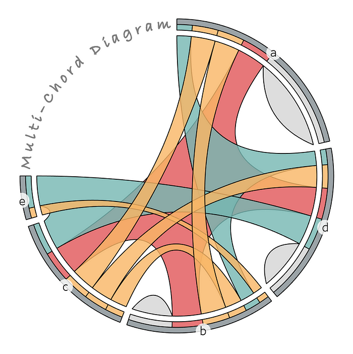
And, finally, the most simplistic version of the Multi-Chord Diagram layout is constructed with the following components:
- Chords representing a standalone set population or connecting 2 or more sets, for however many set to set relationship combinations exist
- A middle ring, split up into sections by unique set combinations within sets, representing "exclusive-to" set combination magnitudes
- An outer ring, split up into sections by set, containing "inclusive-of" set-combinations within each as set (illustrating set magnitudes, minus buffer spacing from the middle ring)

Python Implementation
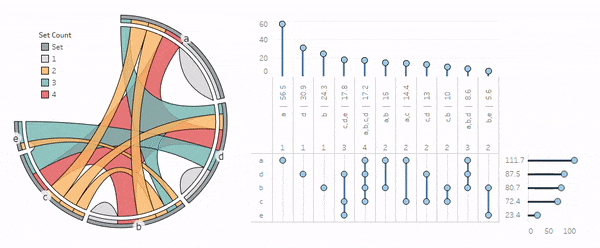
I've made an initial implementation of the algorithm available in python via my dataoutsider package, available on PyPI. Here's an example of usage:
from dataoutsider import multi_chord as mc
import pandas as pd

data = [['a', 56.5], ['a,b', 15], ['a,c', 14.4],
        ['a,b,d', 8.6], ['c,d', 13], ['d', 30.9],
        ['c,b', 10], ['b', 24.3], ['a,b,c,d', 17.2],
        ['b,e',5.6], ['c,d,e',17.8]]
df = pd.DataFrame(data, columns = ['group', 'value'])
df_mc = mc.multi_chord_on_groups_alias(df, percent=75)
mc.multi_chord_plot(df_mc, level = 3, transparency = 0.5)
Here's the underlying output (df_mc):

In the next section, I'll demonstrate how to take this output and create an interactive visualization in Tableau Public to accommodate professionals in the business intelligence space.
Tableau Public Implementation (including the UpSet Plot)
In this section, I'll present a tutorial for implementing my Multi-Chord Diagram in Tableau Public (v 2023.3.0) and interacting with different components.
Start by exporting the Multi-Chord Diagram data (created in the previous section), including data to build the UpSet Plot. I called the method for the UpSet Plot data multi_chord_venn as a nod to the Venn Diagram, and because I wasn't aware that the UpSet Plot already existed at the time.
import os
df_mc.to_csv(os.path.dirname(__file__) +
    '/multichord_diagram.csv', encoding='utf-8', index=False)
df_upset = mc.multi_chord_venn(df_mc).drop_duplicates()
df_upset.to_csv(os.path.dirname(__file__) +
    '/upset_plot.csv', encoding='utf-8', index=False)
Let's start with the multichord_diagram.csv. Import the file into Tableau using the Text file option, navigate to Sheet 1, and create these calculated columns:
[mc_map]: MAKEPOINT([Y], [X])
[mid_path]: int({fixed [Group]: avg(if [Type] = 'element' then [Path] else null end)} * 3/2)
[mc_label]: if [Type] = 'element' and [Path] = [mid_path] then MAKEPOINT([Y], [X]) else null end
Start by dragging [mc_map] to Detail under Marks to generate the first map layer and adjust these options by right clicking in the map area and selection Background Layers:
- Unselect all Background Map Layers (Base, Land Cover, etc.)
- Now right click in the map area and select Map Options, and in the panel unselect all of the options
Close out of Background Layers and continue with the following steps:
- Drag [Group], [Type], and [Value] to Detail under Marks
- Drag [Count] to Detail under Marks
- Right click on what's now SUM(Value) and select Dimension, right click again and select Discrete
- Repeat the process for SUM(Count)
- Right click again on Value and select Sort, then select Descending and drag Value to the top of the pills in Marks
- Under the Marks dropdown menu select Polygon (don't worry if it looks strange at this point)
- Drag [Path] to Path under Marks and repeat the process for converting it to Dimension
- Under Color select a black border color, adjust the transparency to 80%, and select Edit Colors to edit the color options as you like
Now the structure of the Multi-Chord Diagram should be in view. Let's add some labeling:
- Drag [mc_label] into the map area and a pop-up will appear: Add a Marks Layer - drop the pill into this to create a new map layer
- Drag [Group] to Label under Marks in this new map layer
- Under the Marks dropdown menu select Circle, click on Label, and select these options: {Alignment: Horizontal-Center, Vertical-Middle}
- With the menu still open, click on Text - highlight the text in the text box, change the font to size 12, and hit OK
- Click on Color, select white and change the transparency to 80%
- Finally, click Size and adjust the size to the second hash
You'll see a null warning in the lower right corner that you can right click on and select Hide Indicator. At this point you should have something that looks like this (with your selected colors):

You'll notice that the sets are ordered by their magnitudes in clockwise descending, while the chords are ordered by clockwise ascending (the algorithm's default setting). The drawing order can be adjusted as needed like we did with Value above.
Now let's create the UpSet Plot. Start by importing the upset_plot.csv file, by selecting the Data tab and clicking New Data Source. Select text file and import the data. Create a new worksheet with the first plus sign on the bottom panel and ensure the new data source is selected at the upper right under Data.
Now add these calculated columns:
[count]: {fixed [Group]: sum(if [Group2] = 'count' then [Value2] else null end)}
[chord_magnitude]: if not isnull([count]) then [Value] else null end
[set_magnitude]: {fixed [Group2]: max(if [Group] = [Group2] then [Value] else null end)}
Next drag [Group2] to the Filter and select only the sets (a,b,c,d,e). Add [Value2] to the filter and filter in only the value of 1. Finally, add [count] to the filter and uncheck Include Nulls Values in the bottom right.
Proceed with these steps for setting up the matrix view:
- Drag [chord_magnitude] to Columns, select Minimum for its Measure in its dropdown menu, and select Discrete
- Double click next to this pill to add a new pill and type: '|'
- Hit Enter to commit the text as a new pill and drag [Group] beside it followed by [count]
- Drag [Group2] to Rows, select Sort from its dropdown menu, and sort by: {Nested, Descending, set_magnitude, Maximum}
- Add a sort to [chord_magnitude]: {Nested, Descending, chord_magnitude, Minimum}
- Drag [Value2] to the last position in Rows and set the Measure to Maximum
- Under the Marks dropdown, select Circle
Note that I've noticed some bugs in this version when in the dual axis mode, so sorting may need to be adjusted as needed. Now we'll do some formatting:
- Right click on the bottom axis, select Edit Axis, and change the settings to: {Custom, Fixed start: 1, Fixed end: 1}
- Close out, right click again and uncheck Show Header
- At the top of the view, right click on all of the discrete Columns headers (anywhere in the view-header for each), except for [count], and select Rotate Label (you can also adjust the size of each header container to accommodate the labels better)
- Hide the outside headers by right clicking on them and selecting Hide Field Labels for Columns/Rows
Now we'll create a dual axis to draw some lines between the points:
- Drag [Value2] (again) over to the last position in Columns and set it to Maximum as before
- From its dropdown menu, select Dual Axis and right click on the new axis, select Synchronize Axis, and then hide both axis by unchecking Show Header on each
- On the new view select Line from the Marks dropdown, double click inside of Marks to create a new pill and type: 1
- Hit Enter and drag this pill to Path
Here's a completed view with the view dropdown option at the top set to Entire View:

Now let's create similar views for the chords (exclusive-to populations) and sets (inclusive-of populations).
Here's the chord view:

Here's the set view:

Now add them to a dashboard and setup an action under Actions in the Dashboard top-menu. Click the Add Action dropdown and select Highlight. Under Targeted Highlighting select Selected Fields and select the [Group] and [Group2] fields. Finally select the Hover option under the Run action on menu on the right and now the entire dashboard with highlight off of hovering over sets and chords!
Conclusion
In this article, I've covered a brief history of visualizations applied to relationships between sets and what I call the "Multi-Chord Diagram", a visual tool I developed as an enhancement to some existing methods for gaining quick insights into data with complex set relationships. I've had many occasions over recent years to take advantage of this tool for pet projects and a variety of business applications, and I hope it offers some new capabilities for others to enjoy!
I believe data visualizations can help address challenges in exploratory data analysis, modeling, and story telling, and that it's a true intersection of art and science that can be enjoyed by all.
Let me know if you come across any fun or professional use cases, and thanks for reading!
References
[1] John Venn, On the Diagrammatic and Mechanical Representation of Propositions and Reasonings (1880), Philosophical Magazine and Journal of Science
[2] David Constantine, Close-ups of the Genome, Spieces by Spieces by Spieces (2007), New York Times
[3] Martin Krzywinski, et al., Circos: An information aesthetic for comparative genomics (2009), Genome Research
[4] Lex A, Gehlenborg N, Strobelt H, Vuillemot R, Pfister H. UpSet: Visualization of Intersecting Sets (2014), IEEE Transactions on Visualization and Computer Graphics