

Maybe this sounds familiar?
- Get a new dataset.
- Spin up a notebook.
- Import Pandas, Matplotlib, Seaborn… whatever.
- Write analysis code that looks pretty similar to the last time you did this.
- Produce the same old visualisations you've written a hundred times before.
Oops! That's not quite right. Delve into the Python code, find what needs changing and rerun the notebook.
It's not that it's hard — it's just a bit tedious.
And you end up with a Jupyter Notebook with tables and charts interspersed with Python code, which does just what you want, but is not the ideal thing to show to your customers.
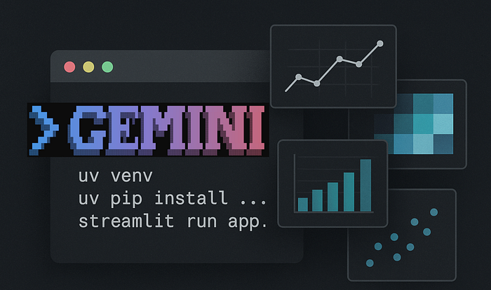
Now, imagine instead you drop a CSV into a folder and type "start" into a prompt.
Thirty seconds later, a Streamlit app is running in your browser. It's showing a clean, interactive dashboard with dataset previews, summary statistics, histograms, all without touching a single line of code.
Something like this:
And if that's not exactly what you want, just tell it and it will make the appropriate changes.
That's the idea I've been experimenting with using Gemini CLI and its secret weapon: GEMINI.md.
The Core Idea
The Gemini CLI is a command-line tool that lets you interact with Google's Gemini models directly from your terminal. But the real power comes from GEMINI.md, a Markdown file that acts as a persistent instruction set. It's like giving the AI a permanent sticky note that says:
"Whenever I ask you to do something in this project, follow these rules and preferences."
Using this, we can create a pipeline that:
- Accepts a CSV file as input.
- Sets up a virtual environment using
uv. - Generates a custom Streamlit app for data analysis.
- Runs the app automatically — ready for interactive exploration.
- Is ready to accept instructions to modify the analysis for immediate execution
The best part? You can make the instructions in GEMINI.md as rigid or as adaptive as you like. You can hardcode every analysis step… or you can tell Gemini to first propose a plan, wait for your feedback, and then code the app.
In other words, it's not just automation — it's automation with a human-in-the-loop when you want it.
Let's look at an example.
Automatically analysing CSV data
For this experiment, I asked Gemini to propose a plan for the analysis.
The GEMINI.md file looks like this:
# Project overview

You are helping to automate a data analysis workflow using the Gemini CLI.
You should:

1. Accept a CSV file. Unless otherwise stated, this will be in the folder
'data'.
2. Propose a plan to analyse the given data.
3. The proposed plan should be presented to the user and can either be accepted as is or with modifications.
4. Generate a Streamlit app that implements the plan.
5. Use the 'uv' package manager to create and manage a virtual environment.
6. Automatically run the generated Streamlit app after setup.
7. Accept additional instructions to modify the running app.

# Workflow details

- Virtual environment name: '.venv' created using 'uv init'.
- Install dependencies: 'pandas', 'streamlit', 'Plotly' and any other libraries that are necessary using 'uv pip install <library>'
- Use Python 3.11 unless specified otherwise.
- Write all code into 'app.py' in the current directory.
- All charts are to be implemented using Plotly.
- The app should be run with the command: 'start uv run streamlit run app.py' (this will start a subprocess in Windows that will allow modification to run immediately)
- All tables should be displayed using Streamlit 'st.dataframe'.
- Use Streamlit user interface components to seperate the data views and navigation.

# Style preferences

- Code must be clean and modular. Use PEP8 formatting.
- Keep imports grouped at the top.
- Add clear inline comments explaining each major step.
This describes a generic process for data analysis and could be used for just about any data file. It's written in plain English and so should be perfectly understandable.
I've split the file into three sections: the first is an overview of the workflow, which includes the idea that Gemini will propose a plan which the user can modify if required. The second section gives specific guidance in setting up the environment and constructing the app, and the third ensures that the code is well-constructed and follows the PEP8 style guide.
So, how do we use it?
- Install Gemini. This is straightforward, but you will need Node installed on your system first. Full instructions can be found in the Gemini GitHub repo, so I won't reproduce them here. And although there are instructions on how to get and use an API key, you don't need one. There is a free tier that requires no registration and gives you plenty to work with, so you can ignore the API key stuff.
- Create a new empty folder for your project and create the GEMINI.md file in it (cut and paste mine, if you like). Next, create a data folder inside your project folder and put your CSV file in it.
- From a command line in PowerShell, type Gemini.
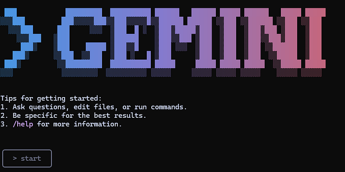
The result can be seen in the screenshot above. The rectangle at the bottom is where Gemini wants you to type your instructions. As you can see, I've simply typed 'start'. This is enough to prompt Gemini to follow the GEMINI.md instructions, and it responds with the following:
✦ Okay, let's start. First, I'll examine the dataset to propose an
analysis plan.
 ╭──────────────────────────────────────────────────────────────────────────╮
 │ ✔  ReadFile data\life-expectancy.csv                                     │
 │                                                                          │
 │    (truncated)                                                           │
 ╰──────────────────────────────────────────────────────────────────────────╯
✦ Based on the data, I propose the following analysis plan:


   1. Load Data: Read the life-expectancy.csv file.
   2. Data Cleaning: Sanitize column names for easier use.
   3. Data Exploration & Visualization:
       * Display a summary of the dataset.
       * Create an interactive world map showing the most recent life expectancy for each
         country.
       * Plot the global average life expectancy trend over time.
       * Allow users to select a country to see its specific life expectancy trend.
       * Enable comparison of life expectancy trends between multiple countries.


  Does this plan work for you? I can also modify it based on your suggestions.
I'm going to go with that, but I'm only interested in the data from 1900, so I typed this.
Yes, this is fine but we are only interested in dates from the year 1900 Gemini responds,
✦ Great, I'll incorporate that change. I will now set up the environment
and generate the Streamlit application. First, I'll create a virtual
environment.
I'll not print all the prompts, but Gemini will need the user's permission to execute commands or change code at each step of the process, so it asks if it's ok to create the virtual environment.
 ?  Shell uv venv ←                                                                       │
 │                                                                                          │
 │   uv venv                                                                                │
 │                                                                                          │
 │ Allow execution?                                                                         │
 │                                                                                          │
 │ ● Yes, allow once                                                                        │
 │ ○ Yes, allow always "uv ..."                                                             │
 │ ○ No (esc)
And I respond by hitting <return> , which selects the default option.
It goes on to prompt me to allow it to install the libraries, and when it has finished this, it generates the application and runs it.
The resulting application is automatically run in the browser, as you can see below.
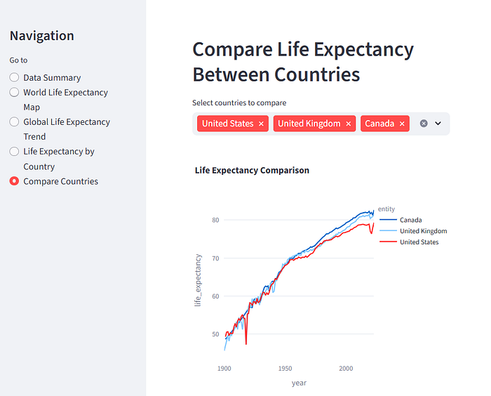
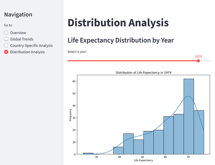
It has done a pretty good job of producing an interactive application that lets us explore the data. You can see miniature versions of the other views, below.
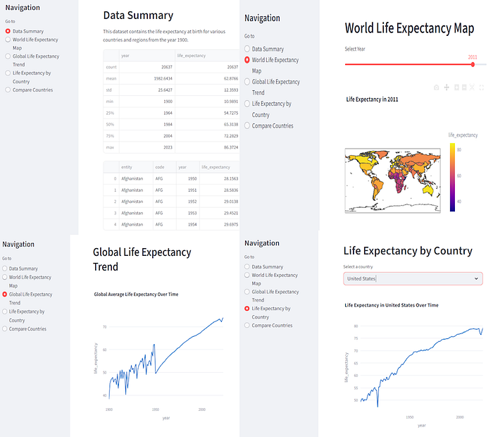
Now, if you squint, you can see an error in the 'Data Summary' panel. The main table only shows the head of the dataframe. Since Streamlit allows scrollable tables, it would be better to display the whole data set.
Because I asked it to run the app in a separate process, my Gemini window is still active, so I can make modifications on the fly. I ask it:
> The data table in the data summary panel only shows the head of the data
frame.
Please change it so that the whole data set is included and ensure that that
the table is scrollable so that it fits nicely in that panel.
It makes the required (simple) change, and the app is updated.
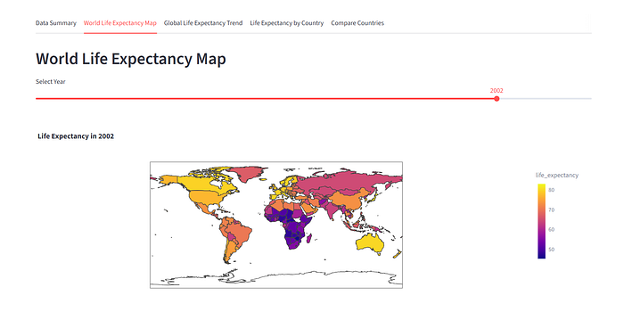
How about a slightly more challenging change? I asked Gemini to replace the side panel navigation so that the different views are in different tabs. And within seconds I had a new version of the app running:
Conclusion
GEMINI.md makes the Gemini CLI a very powerful tool. We have seen here how we can get Gemini to propose a way forward, allow modifications to that plan, execute the plan, run the resulting app and allow further modifications if we need them. All with simple commands and all done in seconds.
Your requirements may vary. Perhaps you have a fixed method that you want to apply to any data analysis task. Well, you can do this by simply specifying it in the GEMINI.md file.
If you prefer, matplotlib, or not to use uv, then specify what you want, and it will be done.
Furthermore, you can have a hierarchy of GEMINI.md files. This would allow you to specify a generic set of instructions that define a house style while writing lower-level instructions that would apply only to a specific task, or group of tasks.
I have a feeling I'll be coming back the this topic again, soon.
Thanks for reading, I hope it has been useful. If you would like to see more of my work, please follow me here on Medium and/or subscribe to my occasional newsletter on Substack.
Notes
- The data was download from Our World in Data, (OurWorldinData.org/life-expectancy | CC BY). Riley (2005); Zijdeman et al. (2015); HMD (2024); UN WPP (2024) — with major processing by Our World in Data
- Code — I haven't produced a repo for this, the code that was generated is listed below (the sidebar navigation version).
import streamlit as st
import pandas as pd
import plotly.express as px

# Set page configuration
st.set_page_config(layout="wide", page_title="Life Expectancy Analysis")

# Load data
@st.cache_data
def load_data():
    df = pd.read_csv('data/life-expectancy.csv')
    df = df[df['Year'] >= 1900]
    df.columns = ['entity', 'code', 'year', 'life_expectancy']
    return df

df = load_data()

# Sidebar for navigation
st.sidebar.title("Navigation")
page = st.sidebar.radio("Go to", ["Data Summary", "World Life Expectancy Map", "Global Life Expectancy Trend", "Life Expectancy by Country", "Compare Countries"])

# Page 1: Data Summary
if page == "Data Summary":
    st.header("Data Summary")
    st.write("This dataset contains the life expectancy at birth for various countries and regions from the year 1900.")
    st.dataframe(df.describe())
    st.dataframe(df)

# Page 2: World Life Expectancy Map
elif page == "World Life Expectancy Map":
    st.header("World Life Expectancy Map")
    year = st.slider("Select Year", min_value=int(df['year'].min()), max_value=int(df['year'].max()), value=int(df['year'].max()))

    map_data = df[df['year'] == year]

    fig = px.choropleth(map_data,
                        locations="code",
                        color="life_expectancy",
                        hover_name="entity",
                        color_continuous_scale=px.colors.sequential.Plasma,
                        title=f"Life Expectancy in {year}")
    st.plotly_chart(fig, use_container_width=True)

# Page 3: Global Life Expectancy Trend
elif page == "Global Life Expectancy Trend":
    st.header("Global Life Expectancy Trend")
    global_trend = df.groupby('year')['life_expectancy'].mean().reset_index()
    fig = px.line(global_trend, x='year', y='life_expectancy', title='Global Average Life Expectancy Over Time')
    st.plotly_chart(fig, use_container_width=True)

# Page 4: Life Expectancy by Country
elif page == "Life Expectancy by Country":
    st.header("Life Expectancy by Country")
    country_options = df['entity'].unique()
    selected_country = st.selectbox("Select a country", country_options)

    country_data = df[df['entity'] == selected_country]

    fig = px.line(country_data, x='year', y='life_expectancy', title=f'Life Expectancy in {selected_country} Over Time')
    st.plotly_chart(fig, use_container_width=True)

# Page 5: Compare Countries
elif page == "Compare Countries":
    st.header("Compare Life Expectancy Between Countries")
    country_options = df['entity'].unique()
    selected_countries = st.multiselect("Select countries to compare", country_options, default=["United States", "United Kingdom", "Canada"])

    comparison_data = df[df['entity'].isin(selected_countries)]

    fig = px.line(comparison_data, x='year', y='life_expectancy', color='entity', title='Life Expectancy Comparison')
    st.plotly_chart(fig, use_container_width=True)