

Introduction
There are many ways to better understand a series of data. Whether it be a set of temperatures, test scores, grocery prices, step counts or UFO sightings, there's always something to learn about the nature of something through the lens of data analysis and visualization.
In the following, I'll describe a new technique for visualizing a series of data that uses simple threshold-based clustering. I hope you'll find it to be a fresh approach to pair with conventional methods of visualization like histograms and box plots for gathering a new perspective on a feature of interest.
Sequential Differential Clustering
Numerically
How does one set itself apart? In terms of a single numerical attribute, let's assume a simple threshold is the standard by which ordered values are compared to one another and separated into groups. Take for example the following sequence:
[ 0 , 1 , 1 , 2 , 3 , 5 , 8 , 13 , 21 , 34 , 55 , 89 , 144 ]
This is of course the first 13 digits of the Fibonacci sequence. If we take the difference of each value and the prior value in the sequence, starting with 3rd position, we get the same sequence shifted forward by 2 steps:
[ _ , _ , 0 , 1 , 1 , 2 , 3 , 5 , 8 , 13 , 21 , 34 , 55 ]
Now let's set a threshold of 5 and assume anything greater than 5 delineates a new cluster as we traverse the sequence from left to right. This would result in the first 8 items being grouped together (values of 0–13) with each subsequent item being the only item in its group since all remaining differences exceed 5.
For the Fibonacci sequence this method yields a predictable result, but in exploratory data analysis all types of patterns may emerge. I'll describe how to explore these patterns with a new type of data visualization, starting with a couple of familiar chart types below for comparison.
With a Histogram
Let's try to apply the clustering strategy to a histogram by determining the number of bins based on the same threshold and reviewing the separation:
# pandas histogram
import pandas as pd
import numpy as np
data = {'value' : [0,1,1,2,3,5,8,13,21,34,55,89,144]}
df = pd.DataFrame(data=data)
data_range = df['value'].max() - df['value'].min()
num_bins = np.ceil(data_range/5).astype(int)
print(num_bins) # 29
df['value'].hist(bins=num_bins, color='w', edgecolor='black',
  linewidth=1.2, grid=False, figsize=(7,1.5))
With a Beeswarm Chart
Now let's visualize each individual value with a beeswarm plot with each circle having a diameter equal to the threshold value to look for gaps:
# vizmath (modified) beeswarm chart
from vizmath.beeswarm import swarm
import pandas as pd
from math import pi
data = {
    'id' : [str(i) for i in range(1, 14)],
    'value' : [0,1,1,2,3,5,8,13,21,34,55,89,144]
}
df = pd.DataFrame(data=data)
bs = swarm(df, 'id', 'value', None, size_override=pi*(5/2)**2)
bs.beeswarm_plot(color=False)
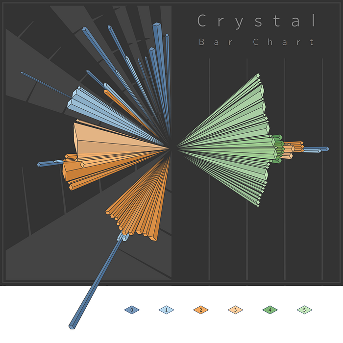
Crystal Bar Chart
Layout
To introduce the Crystal Bar Chart, let's start by continuing with our previous example using alternating shades of gray to illustrate the different clusters (we'll go into detail later):
# vizmath crystal bar chart
import pandas as pd
from vizmath.crystal_bar_chart import crystals
data = {
    'id' : [str(i) for i in range(1, 14)],
    'value' : [0,1,1,2,3,5,8,13,21,34,55,89,144]
}
df = pd.DataFrame(data=data)
cbc = crystals(df, 'id', 'value', 5, width_override=5, rotation=90)
cbc.cbc_plot(legend=False, alternate_color=True, color=False)
For fun, let's add a arbitrary size property:
# vizmath crystal bar chart with added width property
import pandas as pd
from vizmath.crystal_bar_chart import crystals
data = {
    'id' : [str(i) for i in range(1, 14)],
    'value' : [0,1,1,2,3,5,8,13,21,34,55,89,144],
    'size' : [5,13,8,7,6,8,13,5,11,4,9,12,6] # new size property
}
df = pd.DataFrame(data=data)
cbc = crystals(df, 'id', 'value', 5, width_field='size', rotation=90)
cbc.cbc_plot(legend=False, alternate_color=True, color=False)
Now let's shift the values to see how the chart adapts to the new origin:
# vizmath crystal bar chart with adjusted origin
import pandas as pd
from vizmath.crystal_bar_chart import crystals
data = {
    'id' : [str(i) for i in range(1, 14)],
    'value' : [0,1,1,2,3,5,8,13,21,34,55,89,144]
}
df = pd.DataFrame(data=data)
cbc = crystals(df, 'id', 'value', 5, width_override=5,
    rotation=90, offset=21) # new offset
cbc.cbc_plot(legend=False, alternate_color=True, color=False)
Inspiration
In October 2020, my wife and I were checking out a data visualization challenge, and the data offered was a single feature that contained some duplicates.
My initial thought was to make something that appeared 3-dimentional that resembled crystals, and what I ended up with was a simple version of the Crystal Bar Chart.

In 2022, I picked up the idea again and generalized it with threshold-based clustering (a sequential differential clustering strategy) to stratify a set of values, given a threshold, and alternate a cluster's crystal formation (representing the values in a cluster) around a central axis with each subsequent crystal stacked next to its offset (once removed) neighbor.
Skyscrapers¹ seemed to be a good dataset to start with and became my first test of the new algorithm:

Next, I'll describe the key features of the Crystal Bar Chart.
Crystal Bar Chart Algorithm
Drawing the Crystal Bar Chart is a matter of coordinating the points of contact of a crystal's top face to an origin such that the side faces are drawn correctly to outline a full crystal for each value in the given set:

- Begin with a set of values and sort them according to preference (ascending or descending), for example: 0.2, 1.5, 7.4, 9.4
- Adjust the values with a desired offset (-1.7 for example) to adjust the origin's position
- Set a threshold value (3.5 for example), and group the data according to sequential differential clustering as described previously
- Iterate through each group (outer loop) and each value within a group (inner loop), orienting the initial value's crystal along a central axis and update the staring position for the next crystal based on the item's range, perpendicular to the central axis
- For each subsequent value, alternate between right and left placement of crystals in a similar way by accounting for the range taken up by the crystal's top face to adjust for the placement of the next alternating crystal (different methods for sorting and placement on the perpendicular axis are under review for future updates)
- Calculate the points for each face of the crystal (left, right, top): top face dimensions: outlined by the sequential differential clustering threshold (height parallel to the central axis) and range according to a size attribute (width perpendicular to the central axis) left and right face dimensions: drawn according to the side-face polygons in view, determined by the slopes encountered between points of contact from the crystal's top face and the origin (defaulted to 0,0)
- When a new cluster is encountered, reset the starting position and repeat face position calculations for each crystal in the cluster
- Reverse the offset to remap the values to the original range if desired
Python Implementation
I've made an implementation of my Crystal Bar Chart algorithm available in python via my vizmath package on PyPI. Let's break down a couple more options using the initial example above and explain the inputs and outputs:
import pandas as pd
from vizmath.crystal_bar_chart import crystals # pip install vizmath==0.0.14

# using the example data from above:
data = {
    'id' : [str(i) for i in range(1, 14)],
    'value' : [0,1,1,2,3,5,8,13,21,34,55,89,144],
    'size' : [5,13,8,7,6,8,13,5,11,4,9,12,6]
}
df = pd.DataFrame(data=data)

# create a crystals object
#   > df: DataFrame with 1 numerical column of data and an
#     optional size column 'width_field'
#   > id_field: required identifier (can be dummy values)
#   > height_field: required value column
#   > height_range: sequential differential clustering threshold
#   > width_field = optional size column
#   > bottom_up: False = descending, True = ascending
#   > width_override: value constant to set the size value
#     (overrides the width_field values)
#   > offset: value to adjust the origin by
#   > reset_origin: False = keeps offset, True: resets origin with offset
#   > rotation: overall rotation around the center in degrees
cbc = crystals(df, 'id', 'value', 5, width_field='size', bottom_up = True,
    width_override = None, offset=21, reset_origin=True, rotation=90)

#plot the Crystal Bar Chart
cbc.cbc_plot(legend=False, alternate_color=True, color=False)
Here's the output from the Crystal Bar Chart algorithm:
- id - item identifier
- group - cluster containing items resulting from sequential differential clustering: 1 to N
- side - identifier for crystal faces: {0,1,2}
- value - the item's value (position of the centroid of the crystal's top along the central axis)
- height - sequential differential clustering threshold (height of the crystal's top face, parallel to the central axis)
- width - secondary value ≥ 0 (width of the crystal's top face, perpendicular to the central axis)
- x, y - Cartesian 2D coordinates for a point in the layout
- path - an ordered set of integers that describe the path which encloses a polygon, in conjunction with each (x, y) point in the Crystal Bar Chart, for each crystal id and face: 1 to N
# Cyrtsal Bar Chart DataFrame
cbc.o_crystal_bar_chart.df[['id', 'group', 'side',
    'value', 'height', 'width', 'x', 'y', 'path']].head()
In a future version, I'll look to incorporate different options for placing crystals along the axis perpendicular to the central axis according to different sortings, starting positions, etc. to aid in cluster and value comparisons.
Tableau Public Implementation
In this section, I'll present a tutorial for implementing my Crystal Bar Chart visualization in Tableau Public (v 2023.3.0) along with some fun interaction capabilities.
In keeping with the crystal theme, let's start with a dataset from Wikipedia on diamonds². The data contains information on the diamond's name, uncut and cut weight, origin and more. For example purposes, I'll limit this data to diamonds greater than 200 carets with both uncut and cut values that have only one cut record.
import pandas as pd

# https://en.wikipedia.org/wiki/List_of_diamonds (as of 12/25/2023)
# filtered to enries with uncut and cut values with only 1 cut, >200 carats
diamonds = {
    'Name' : [
        '4 February Stone', 'Centenary Diamond', 'Cross of Asia',
        'DeBeers Diamond', 'Earth Star Diamond', 'Golden Jubilee Diamond',
        'Graff Lesedi La Rona', 'Great Mogul Diamond', 'Gruosi Diamond',
        'Incomparable Diamond', 'Jubilee Diamond', 'Koh-i-Noor',
        'Lesotho Brown', 'Lesotho Promise', 'Millennium Star',
        'Premier Rose Diamond', 'Regent Diamond', 'Taylor-Burton Diamond',
        'Tiffany Yellow Diamond'],
    'Uncut' : [
        404.2, 599, 280, 440, 248.9, 755.5, 1111, 780, 300.12,
        890, 650.8, 793, 601, 603, 777, 353.9, 410, 241, 280],
    'Cut' : [
        163.41, 273.85, 79.12, 234.5, 111.59, 545.67, 302.37, 280, 115.34,
        407.48, 245.3, 105.6, 71.73, 75, 203.04, 137, 140.64, 68, 128.54],
    'Color' : [
        'white', 'colorless', 'yellow', '-', 'brown', 'yellow-brown',
        'colourless', '-', 'black', 'brownish-yellow', 'colorless',
        'colorless', 'pale brown', 'colorless', 'colorless',
        'colorless', 'white with pale blue', 'colorless', 'yellow'],
    'Origin' : [
        'Angola', 'South Africa', 'South Africa', 'South Africa',
        'South Africa', 'South Africa', 'Botswana', 'India', 'India',
        'Democratic Republic of Congo', 'South Africa', 'India', 'Lesotho',
        'Lesotho', 'Democratic Republic of Congo', 'South Africa', 'India',
        'South Africa', 'South Africa']
    }

df = pd.DataFrame(data=diamonds)
Next we'll use vizmath to create a Crystal Bar Chart and output the drawing information and original data to csv files:
from vizmath.crystal_bar_chart import crystals
cbc = crystals(df, 'Name', 'Uncut', 100, width_field='Cut') # calculate
cbc.o_crystal_bar_chart.dataframe_rescale(0, 5000, -2500, 2500) #rescale
cbc.to_csv('crystal_bar_chart') # crystal bar chart output
cbc.df.to_csv('data.csv') # original data
Import the crystal_bar_char.csv file into Tableau using the Text file option. Then use the Add link next to Connections to add the data.csv to the Files list. In the stage to the right, double click on the crystal_bar_char.csv pill and drag the data.csv file from Files to the stage. With Inner Join selected, select the [Id] field under the Add new join clause dropdown under Data Source and the [Name] field under data.csv.
Now that the dataset is prepared, navigate to Sheet 1, and create these calculated columns that we'll use to draw the chart:
[chart]: MAKEPOINT([Y],[X])
[chart_top]: if [Side] = 0 then MAKEPOINT([Y],[X]) else null end
Start by dragging [chart] to Detail under Marks to generate the first map layer and adjust these options by right clicking in the map area and selecting Background Layers:
- Unselect all Background Map Layers (Base, Land Cover, etc.)
- Now right click in the map area and select Map Options and unselect all of the options
Close out of Background Layers and continue with the following steps:
- Drag [Group], [Id], and [Side] to Detail under Marks
- Convert what is now SUM(Group) and SUM(Side) to Dimension and Discrete by right clicking on each and making the selections
- Right click on [Group], select Sort, and select Descending
- Under the Marks dropdown menu select Polygon (don't worry if it looks strange at this point)
- Drag [Path] to Path under Marks and right click on what's now SUM(Path) and select Dimension
- Drag [Group] to Color and repeat the process for converting it to Dimension and Discrete
- Under Color select "Edit Colors…" and configure with an alternating grayscale scheme with a light shade on groups 0 and 2 and darker shade on groups 1 and 3
- Hit OK and adjust the Opacity to 95% with a black border under Color
- Drag [chart_top] into the map area and a pop-up will appear: Add a Marks Layer - drop the pill into this to create a new map layer
- Repeat the steps from above except now use [Origin] for the Color, and adjust the colors as needed
- Under Color, select a black border and set the opacity to 70%, and right-click on the nulls pill at the bottom right of the chart and select Hide Indicator to hide the nulls label
Now the chart section is in place and should look similar to the following:

Let's add another chart to use for comparison and interaction:
- Create a new worksheet using the first plus sign on the bottom panel to create Sheet 2
- Drag [Group] to Columns and convert to Dimension and Discrete
- Drag [Name] to Columns and [Uncut] to Rows
- Right click on [Uncut] and select Maximum under Measure
- Drag [Origin] to Color and [Cut] to Size
- Right click on [Cut] and select Maximum under Measure
- Under the Format menu at the top, select Shading…, and select a dark gray color under Column Banding > Header with the Level tick set to the first notch and the other options set to None
- Right click on Group / Name at the top and select Hide Field Labels for Columns, and adjust the legend name and colors as needed
Sheet 2 is ready and should look similar to the following after selecting Entire View from the top menu:

Finally, let's pull the two Sheets together in a dashboard. After creating the dashboard and adding the sheets, set up an action under Actions in the Dashboard top-menu. Click the Add Action dropdown and select Highlight. Under Source Sheets select Sheet 2 and select Sheet 1 under Target Sheets. Under Targeted Highlighting select Selected Fields and select the [Group] and [Name] fields. Finally select the Hover option under the Run action on menu on the right and now the entire dashboard will highlight off of hovering over each bar and group on Sheet 2!
After adjusting colors and orienting everything in an organized way, here's our new dashboard in Tableau Public:

Conclusion
In this article, I've given an overview of a new type of data visualization that I call the Crystal Bar Chart. This tool is useful for compressing information into a small space with overlapping shapes along a central axis that represent one dimensional data, grouped by sequential differential clustering, with an option to represent a second numerical attribute along a perpendicular axis.
The space saving feature of the Crystal Bar Chart serves as an effective alternative to bar charts and similar visualizations that may require a large footprint, and it pairs well with various other tools for examining data series in academic and professional work.
With various options to adjust characteristics of the crystal-like representation of data, I hope you'll find this visualization technique adaptable to different data exploration exercises and a fun new way to discover insights!
References
[1] Wikipedia (CC BY-SA), "List of tallest buildings" (as of 4/10/2022)
[2] Wikipedia (CC BY-SA), "List of diamonds" (as of 12/25/2023)
Related Articles