

As a marathon runner, I use Strava. A lot. In addition to all the usual social features (sharing activities, keeping up with what my friends are doing, checking my club's activities etc.) I rely on Strava to track all of my activities and I use it regularly to analyse my training progress. Or at least I try to. I like to use Strava's training log to review how my current training is going, compared with previous years, but unfortunately, this is not where Strava shines, even though the training log is a premium feature.
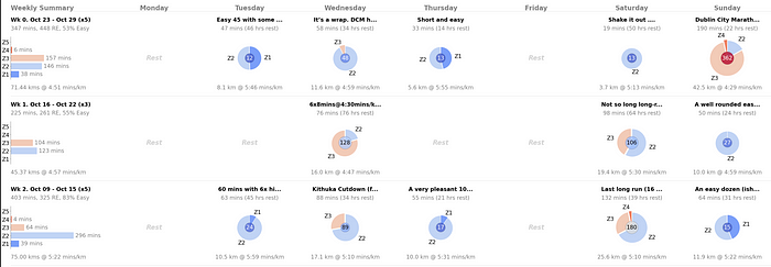
Part of the problem is the very limited information provided by the training log. For instance, in the example training log below we see several weeks' worth of activities (the coloured circles) which provide a summary of the frequency and distance of training activities but without any information on training intensity or effort. So, I thought it would be an interesting side-project to look at how we might improve upon this…
I will begin this article by discussing my view of what is missing from Strava's current training log and suggest how this missing information might be added to a re-imagined training log visualisation. I will describe how this can be implemented, using examples from Python and Matplotlib, and I will finish by presenting a concrete example of the result using my own Dublin Marathon 2023 training data.
Motivations
The above example of Strava's training log shows the final 4-weeks of my training for the Dublin marathon this year (2023). Each row corresponds to a week of training and each column to a different day of the week. The days I trained are associated with colour-coded circles indicating the distance completed that day. Red circles are races. Darker green circles are long runs. The shaded green circles are workouts — usually more complex multi-part interval sessions — and the light green circles are regular runs that are neither long runs nor workouts. All of these categories are manually assigned by the runner. Finally, the left-hand column indicates the relevant date information and the total distance for each week.
This is a perfectly reasonable and visually appealing approach to summarising several weeks of training. However, it provides a very limited snapshot of training. It focuses only on activity frequency and training volume (distance) — relevant to be sure — but without any information on training intensity or effort. For example, there is no pacing or heart rate (HR) information, unless it happens to be contained in the session title provided by the runner, and even then this might not be a reliable indicator of what happened during the session. Without this information, it is very difficult to assess how training is progressing and even more difficult to compare one week of training to another, let alone how this year's training compares to an earlier year's training because running distance only tells part of the story.
Objective
Let's improve Strava's training log by enhancing this basic visualisation to include all of the following training features:
- The average pace (mins/km) of the session (or week) and its distance and duration.
- Strava's relative effort (suffer) score, to provide an assessment of overall session intensity or weekly intensity.
- The time spent in each heart rate zone shows how training time is distributed among easy, moderate, and hard efforts. Strava uses 5 HR zones (Z1, …, Z5). which correspond to increasingly intense efforts, and are based on a runner's heart rate as a fraction of their maximum heart rate.
The HR zone data is useful for runners since it provides a granular measure of effort/intensity and helps runners distinguish between their easy and harder efforts. As mentioned above this is useful to track how training is progressing. Additionally, intensity and effort are also needed to help runners track their recovery runs so that they can complete them with the required easy effort and be ready for harder workouts later in the week. Indeed, runners are often encouraged to employ an 80/20 approach to training — 80% of training should be at an easy effort (HR zones 1 and 2) — to guard against over-training and potential injury.
Accessing Strava Data
The focus of this article is on the visualisation of Strava training data and, as such, it will not discuss how to collect this data from Strava in detail. Suffice it to say that Strava provides an API which can be used to gain authorised access to your data or another user's data, with their permission. I used the API to access my data for this work and there are several articles online — here or here, for example — where the interested reader can find out how to do this for themselves.

The above is a subset of the activity data I collected from the Strava API. Each row corresponds to an individual activity and includes information about the date of the activity, its distance (meters), duration (seconds), relative effort (suffer score), and the distance run in various HR zones, among other information (time spent in HR zones etc.)
The Training Session Pie Chart
Our first task is to upgrade the simple visualisation of a single training activity in the current Strava training log; see below. It shows the name of the session (either user-provided or a default Strava name) and the distance completed but without any pacing or other intensity-related information.
The chart below shows our proposed alternative for the same activity. This new chart is made up of several distinct components (headline, header, chart, footer) to make it easier to position its different information elements without relying on absolute location coordinates; incidentally the borders around these elements are there only to highlight the elements and will not be used in the final visualisation. The use of separate elements in this way will facilitate a grid layout later by making it easier to adjust the size of these charts while avoiding collisions between the different information elements. These elements include the session distance and average pace (footer) and this time the size of the pie chart is proportional to the total duration of the session, which is also indicated in the header (190 minutes), along with the elapsed (rest) time since the previous session (22 hours).
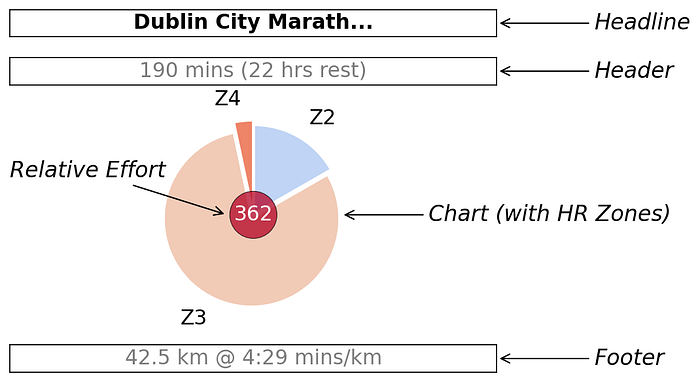
Importantly, instead of a simple circle to indicate the distance covered by the session, a pie chart is used to encode important intensity information using HR zones. These wedges are arranged clockwise, from the 'noon' position, in order of HR zone (Z1, Z2, …, Z5), and the size of the wedge corresponds to the fraction of time spent in that zone. The colour of the wedge also indicates the HR zone and matches the colours used in the weekly bar charts discussed later. In this activity, the running took place in mainly in zones Z2 and Z3 with some time also spent in Z4.
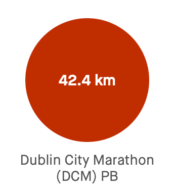
Finally, the overall relative effort (RE) score for the activity is shown in the centre of the pie chart, with a background colour that is proportional to its value relative to the training block. In this case, the dark red background indicates that a relative effort of 362 is among the highest of the training block; in fact, it was the highest.
Clearly, this new visualisation provides significantly more information than the Strava equivalent but without occupying significantly more screen real estate and flexibility when it comes to which information is emphasised. For instance, the overall size of the pie chart above is based on the overall session time (190 minutes in this example) but this can be configured according to the athlete's needs. For example, overall distance could be used, as is the case in the Strava training log, or relative effort or power (for cyclists) or the athlete's perceived effort, if available.It would also be straightforward to use pacing or power zones instead of HR zones too if required. For the interested reader, sample Python code to recreate a version of this chart is provided at the end of this article.
The Training Week Summary Bar Chart
The second type of chart we need summarises an entire week or training. This is all but absent from the default Strava training log, except for the weekly distance total that is provided alongside each row.
We wish to add relevant information about the fraction of time spent in each HR zone during the week as a whole, alongside pacing and relative effort information. We need to do this in a way that is visually compatible with the new pie charts so that both types of charts can be used together in our new training log visualisation.
The new weekly summary chart is shown below for a week of Dublin Marathon training, 10 weeks before race day. During that week 238 minutes of running (46.88 km) were tracked (across 4 sessions), with an average pace of 5:40 mins/km. Weekly relative effort was high (RE = 365) and approximately 53% of training was run at an easy effort (Z1 and Z2; 125/238). The bar chart shows the number of weekly minutes in each HR zone,colour-coded to match the scheme used in the session pie charts.

The style and structure (headline, heading, chart, footer) of this chart are compatible with the session pie chart — sizing, positioning, colours etc. — so that they can be used together in a large grid of charts. Once again it is straightforward to swap in different types of training data, such as pacing or power zones, as required and sample Python code to recreate this chart is provided at the end of the article for the interested reader.
Designing the Training Log Grid
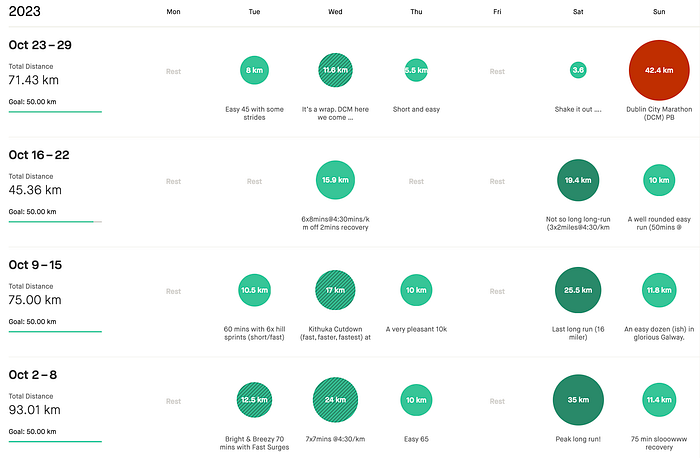
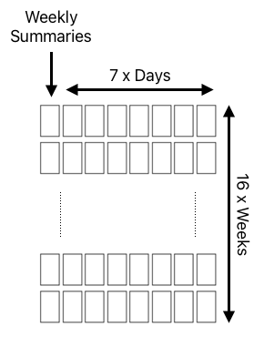
Now that we can construct the pie charts for the individual sessions and the weekly bar graphs, it is time to assemble these into a multi-week visualisation. Just like the Strava training log, we will use a grid layout for this, with each row corresponding to a week of training and each column to a single day; see below. The leftmost column will be used to provide the weekly summaries. Thus, for a 16-week marathon training programme, we will need a grid with 16 rows (one per week) and 8 columns (the weekly summary plus 7 days).
It is straightforward to produce such a grid using Matplotlib. For example, the following snippet will do the job, so that individual charts can then be produced and located based on week and day, as appropriate.
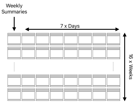
However, this approach will not work for the type of visualisation we need, because each visualisation component (session pie or weekly summary) is made up of several separate components (headline, header, chart, footer). Instead, we need a grid that looks more like the example below, with each component as a separate axis/subplot.
To produce this type of grid, we can use Matplotlib's powerful gridspec with add_subplot used to assign individual elements (headers, charts, footers etc.) to the appropriate locations in this grid. It is beyond the scope of this article to take a deeper dive into the world of Matplotlib and gridspec but the outline grid setup code shown below illustrates the general approach. Very briefly, each of the 16 rows is assigned 10 units of height (row_h) in the main grid (line 5). Then, the headline, header, and footer sections for each graph are allocated 1 unit of height and the chart itself is allocated 6 units of height. Finally, we add a gutter (1 unit of height) to each row to control the space between rows. The interested reader can find out more here.
There is nothing to prevent showing more or fewer weeks of training than the 16 discussed here. Most marathon training plans cover between 12 and up to 20 weeks of training, for example, and in our final visualisation below we will present 12 weeks of training.
Completing the Training Log Visualisation
Putting all of this together produces the large visualisation shown below. In this case, we present 12 weeks of Dublin Marathon training with each row corresponding to a single week of training. The first column shows the weekly summaries and the remaining 7 columns show the daily activities. Days without an activity are marked as rest days.
This is a complex visualisation — one that probably needs a large screen to view comfortably — but it captures much more useful training information than Strava's default training log. And it lends itself to a deeper level of inquiry and analysis.
We can see, for example, that most of my hard efforts took place on Wednesdays; the Wednesday pie charts show much more time spent in Z3, compared to the easy/recovery sessions on Tuesdays and Thursdays. Similarly, my long runs on Saturdays also stand out as harder sessions, not just because of the distance but also because they usually contained prescribed periods of harder effort at marathon pace, usually towards the end of the run; they were usually followed by shorter recovery runs on Sundays. Saturdays also included several races, in weeks 5, 7 and 10, which explains the considerable time spent in Z4 on these days compared to other long runs. We can also see how the running volume drops during the final two taper weeks, while intensity is maintained, as easy running is traded for rest days before race day.
Finally, is worth noting, that sometimes runners will track more than one activity per day. For example, some runners will perform morning and evening activities while others will split a single session into individual parts to account for separate warm-up, main activity, and cool-down activities. For now, we concatenate all of the activities on a given day into a single aggregate activity. For example, on Saturday in Week 5, the visualisation above shows that I took part in the Dublin Half Marathon (an annual race as part of the Dublin Marathon race series) but the data for that day indicates a 30.2 km run rather than the 21.1 km half marathon distance. The reason is that this 30.2 km included separate warm-up and cool-down activities. Of course, rather than aggregating activities in this way, we could decide to implement a different policy, such as focusing on the longest (or fastest) activity in a multi-activity day, especially on a race day.
Conclusions
This article aimed to explore the development of a more informative training log for (marathon) runners, using Strava's default training log as a starting point. The resulting visualisation captures a lot of extra useful information for the interested runner, especially when it comes to training intensity and effort. This makes it easier to evaluate how training is progressing.
We have described how to construct the individual activity and summary charts using Python and Matplotlib (with sample code provided below) and also discussed how to assemble these charts into a complex but flexible grid structure.
Finally, it is worth highlighting that this approach can be readily adapted for other types of sports, based on the information that is more relevant to those disciplines. For example, as mentioned above, cyclists may wish to include power zones instead of HR zones in their training logs. Indeed, as recreational athletes become better instrumented, with new types of wearable sensors, it will be increasingly important for developers to find novel ways to present these new forms of data to support athletes as they train and compete.
Note: The author produced all images and code.
Example Code
Plotting the Session Chart
The code sample below shows the approach taken to create the session pie charts. This article assumes that the required session data (distance, time, intensity effort etc.) is available in a Pandas series called session without further explanation.
Plotting the Weekly Summary Chart
The code sample below shows the approach taken to create the weekly summary bar charts. It expects the relevant weekly session data to be provided as a dataframe, week.