For years, Polaris's design language has been relatively unchanged. It was heavily influenced by the once-pervasive flat design trend, and although there was a minor update in 2020 with new colors and illustrations, the core design philosophy barely evolved.
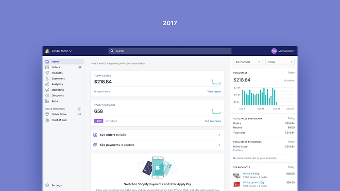
Before flat design took hold in the early 2010s, software had more dimensionality and tried to mimic the real world. Then, new minimalism fostered cleaner interfaces, made things easier to understand, and made experiences feel more efficient. This was fantastic. Whenever Shopify removes complexity from its product, merchant success goes up. Flat design definitely had a role in that.
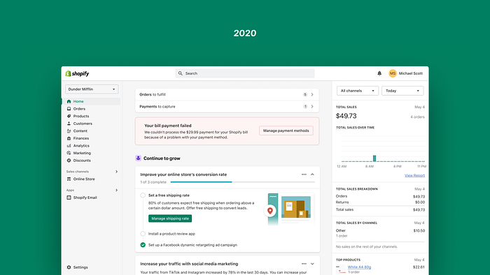
Minimalism had run its course when merchants started classifying the Admin experience as "dull", "depressing" and "bland". Polaris helped standardize this sterile feeling, with a UI that was not optimized for the kind of work merchants have to do everyday.
Shopify's Admin is not just a website, it's a professional tool. So it should feel like that — but one with soul. So we set about making it feel that way.
The starting point
With that realization, at the end of last year, Thomas Jonkajtys — a fellow designer — and I teamed up with the mission of uplifting Polaris's design language.
The initial brief was pretty simple, we wanted to make the Admin feel more like a "pro tool". What does that actually mean? A few different things:
- A pro tool is effective in the way it organizes and displays information.
- A pro tool is highly functional, with straightforward visuals, while not being intrusive or decorative.
- A pro tool is responsive, and provides interactions that feel almost real.
Ultimately, our design language had to make the product feel more effective and coherent in the context of commerce, while being aesthetically pleasing, and able to create moments of joy.
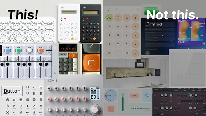
With that said, at this point in the process, these are just words. Design needs visuals, so we started collecting inspiration from products we thought spoke a similar design language to what we were aiming for. Most of them were actual physical products, and not software. We didn't want to follow any particular digital trend, as the world of merchants is more than just a screen.
To define the visual design direction, we created two clusters: one for "this", and another for "not this". At this stage it's important to capture what we want our design language to convey as well as what we want it to avoid.This helps narrow down our options and defines the range in which we'll be directing, pivoting, and adjusting the language.
We also started digging for photos and recordings from previous research studies to get a better understanding of the environment in which merchants operate: Where do they work? What's on their desk? What objects do they often use? This helped us understand merchants at a different level, and find inspiration in objects that could bring a sense of familiarity.
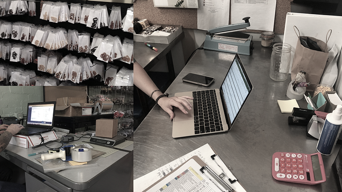
Good design can be dictated, but great design comes from understanding the way your users function in their space and offering solutions that make their lives easier.
Diverging

With a more concrete understanding of the range we wanted to explore, we worked with fellow Polaris designers Sara Hill and Joe Thomas, to broaden and accelerate our exploration.
Design needs constraints and instructions, so we defined a few rules:
- Keep existing behavior and patterns. Our focus was to evolve the design language, not the entire merchant experience.
- Design extremes. We're not looking for subtlety at this state, and we can always pull back and calibrate afterwards.
- Keep it high-fidelity, but high-level. Details can be refined later.
- Mimic real merchants. Our design language needed to flex and adapt to merchants, working with idealized data doesn't help achieve this.
- Diversify. We wanted to have more visual diversity, more options, and wanted to prevent folks from falling in love with one idea, because most of them would be left on the drawing board.
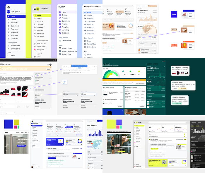
This divergent exploration brought up many fun ideas. A broader use of color, ambitious skeuomorphism, more 3D, usage of blend modes, you name it. We had covered enough ground to reduce the team back to two, and started the next step in defining the design language.
Converging

Two very opinionated designers executing on a vision is challenging. We had to build trust throughout the entire process. The divergent exploration gave us an outlet to experiment, but also gave us exposure to the perspective of other designers. It also served as a way to figure out how we could lean on each other's strengths.
Some decisions were easy, like finding a font that felt appropriate to Shopify. We both picked Inter independently, so it became obvious that was the way to go.
Other decisions took a bit more fine-tuning:
Clean but tactile
It's easy to lean too far in a direction, go overboard, and end up with something that feels monotone. As we analyzed our divergent explorations, we found valuable elements in both ends of the spectrum.
The real challenge was striking the right balance, and finding the combination of elements that complemented each other.
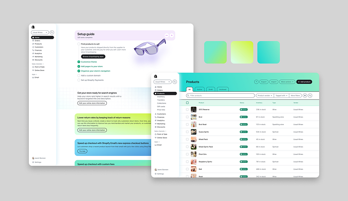
When we leaned too much into the dimensionality and vibrancy, everything became busy, and demanded too much attention.
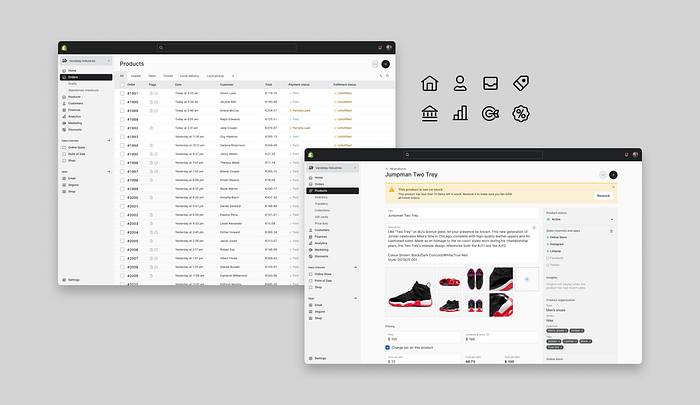
When we tried to lean in the opposite direction, it started to feel flat.
Through experimentation and some trial and error we started to narrow down the list of elements that deserved a spotlight, and the ones that should play a supporting role.

Since we wanted to move away from a sterile feeling, we started with an extreme that was more tactile, and from there we started designing by subtraction, removing unnecessary complexity until we reached the point where we felt we couldn't remove anything else.
Interactions became our main vehicle to deliver joy in the experience. We concluded that we wanted joy to come with the accomplishment of a task, and avoid it to be obtrusive and void of meaning.
A button that feels just right
Buttons are one of the most important pieces of a UI, because they are the main visual indicators for the actions a user can take. It didn't come as a surprise the level of scrutiny our buttons went through, and to get it right, we went through a good amount of iterations.
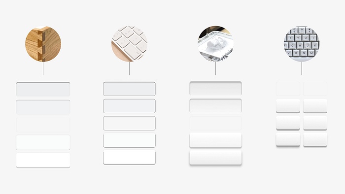
We wanted to make buttons feel real, so we started from mimicking the real world. From there it was an iterative process of making sure the buttons hit the right notes.

They had to feel tactile, but not too imposing. They had to feel like plastic, not glass. Last, and probably more importantly, the interaction had to feel juicy.
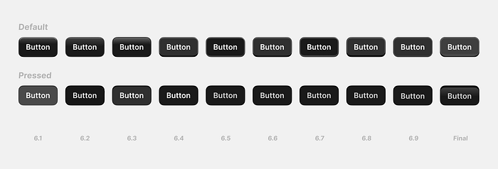
The primary button became a challenge, since we initially lacked darker values to make it feel three dimensional. We partially solved it with a "shine", but then realized the pressed state needed some attention too.
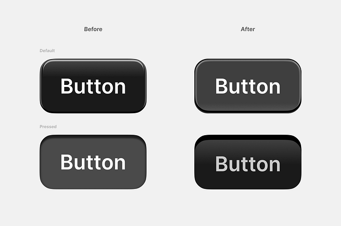
After making the default button a touch lighter, we landed on a solution that had the level of juiciness we were looking for.
Icons with just enough weight
Icons are instrumental in reducing text overload and augmenting efficiency. We saw in the iconography an opportunity to inject a dash of joy and make the experience more approachable.
The challenge with icons was finding the appropriate scale and weight. We strived for icons that were in harmony with typography, noticeable without being overpowering, and with a unique personality that doesn't dominate the interface.
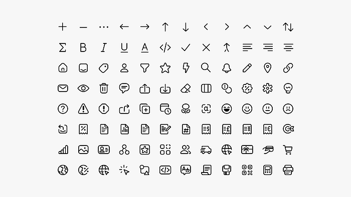
For each style iteration, we designed dozens of icons, because we had to see them in context to find which performed the best.
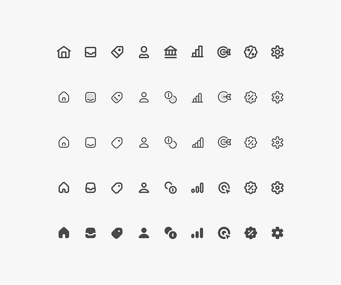
After numerous iterations, we settled on a set with 1.5px outline, with filled variants used for navigation. These icons performed well in a dense interface, drawing just the right amount of attention, while the filled navigation icons anchor the user's experience.
From green to black
The initial choice to retain green as the primary color was driven by its association with Shopify's brand. However, as the design evolved, we found that green didn't align well with the professional tone we were aiming for.
Green is often associated with a friendly, approachable interface and positive outcomes, but it didn't lend itself to the neutrality we sought. We wanted our interface to be neutral, allowing colors to be used semantically and with purpose.
We turned to black, because it's commonly associated with "Pro" products. Black brings impact and contrast, which is exactly what we needed for our interactive states.
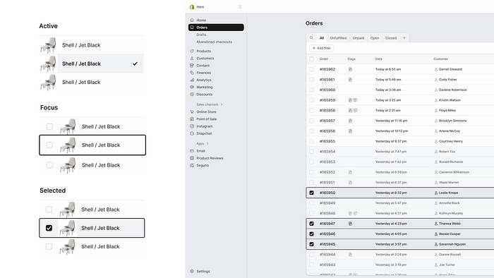
While being neutral, using black as a primary color ensured other colors used in the interface wouldn't be overshadowed, but instead, carry their intended meanings.
We made all our decisions through debates, experimentation, prototyping and more debates. After a while we found something we were ready to push forward. But how did we know it was the right direction?
- It was something we were excited to push forward.
- The design language aligned with the brief and the "this" and "not this".
- And as we were applying our design language to more surfaces, the before and after became progressively more dramatic and appealing.
At this point, our positioning was strong, and the design language we carefully crafted was ready for its next trial: reviews with key stakeholders.
Getting buy-in

Reviews can be hard, but they are key to turn stakeholders into advocates for our work. We knew it was crucial to listen and address concerns, without forgetting we had to be assertive, and showing the value in our design direction.
Coming in with a strong point of view for the design language was vital. And reacting to relevant feedback from stakeholders by showing — not telling — the value in our solution gave us more credibility and increased trust. We gave each piece of feedback its fair shot, and we had to be willing to accept when some things actually strengthened the new design language.
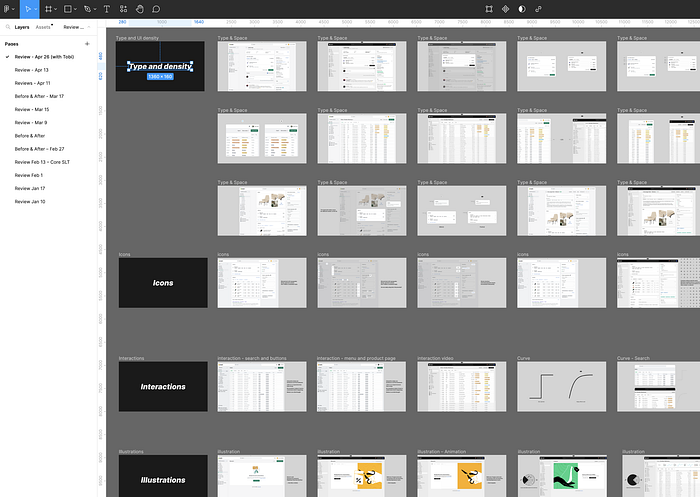
Each presentation deck was tailored for individual stakeholders, enabling discussion to happen at appropriate levels without alienating anyone. We found that leading with visuals rather than design principles shifted the conversations from theory to practicality, and this helped us move forwards.
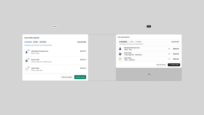
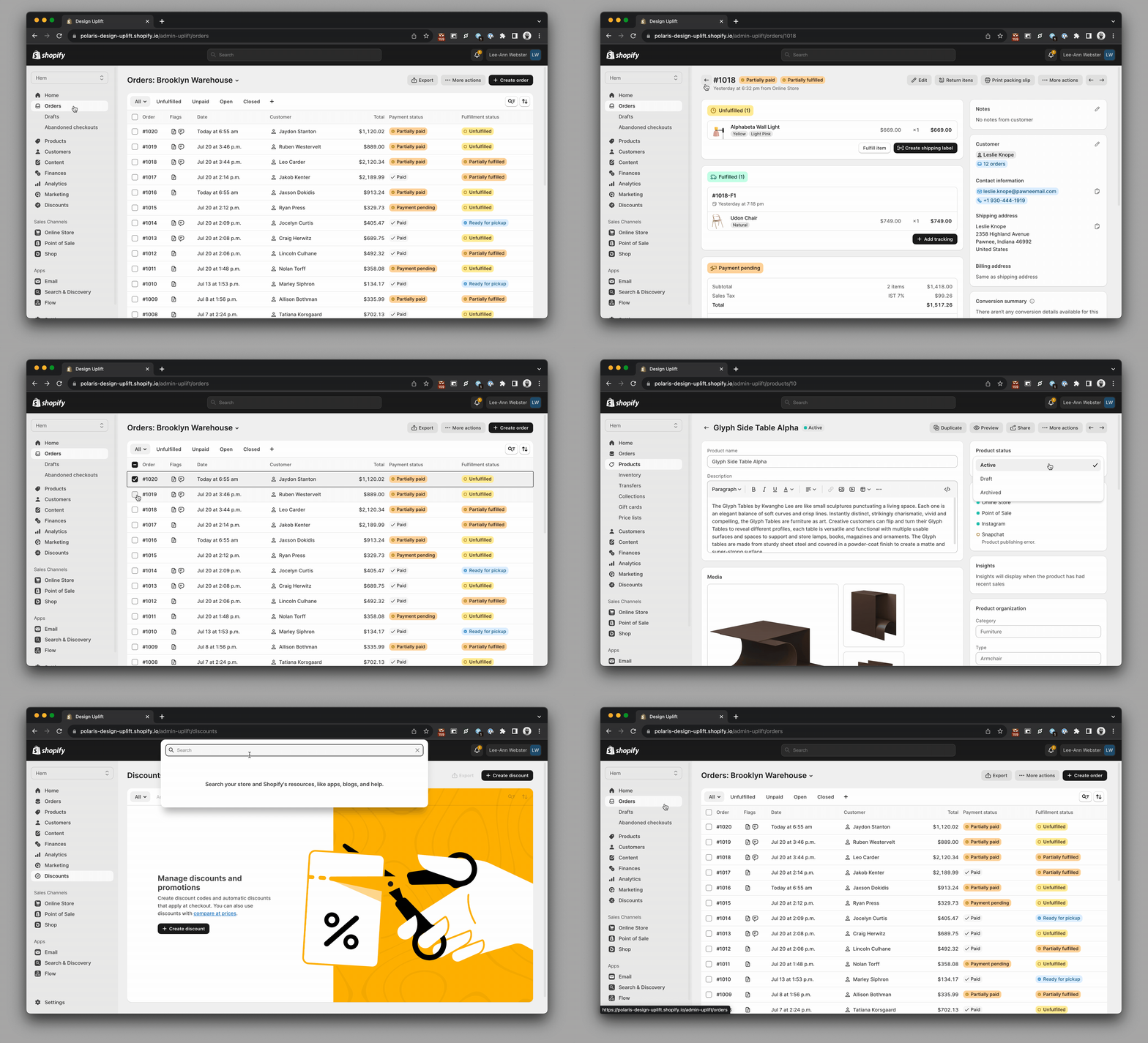
We used a lot of "before and after'' comparisons, to show folks the value in the change, but that wasn't enough to capture the feeling of the new design language, so worked with Guilherme Santos — a developer in the Polaris team — and created a working prototype that gave people something more tangible than mockups to interact with, and react to.
Make it happen. Fast!
Our last review was with Tobi, the CEO. And in all honesty, we couldn't have asked for a better outcome. He saw the value in the direction and we were all excited to ship this to Merchants as fast as possible.
The best time to do that was the upcoming Summer Edition 2023 — in 10 weeks. Previously, it would have been impossible to ship a holistic design change across a complex application like the admin in 10 weeks time. Luckily, the Polaris team had spent the past year gearing up for this moment, with a mission to get the admin to 90% Polaris mainline coverage. The team overhauled Polaris tokens, simplified the release process from 3 steps to 1, created migration and linting tools, and created a coverage dashboard to help product teams get on Polaris mainline. We advocated, incentivized and partnered with feature teams to use Polaris components and tokens. We updated hundreds of lines of code to make sure the product leveraged Polaris.
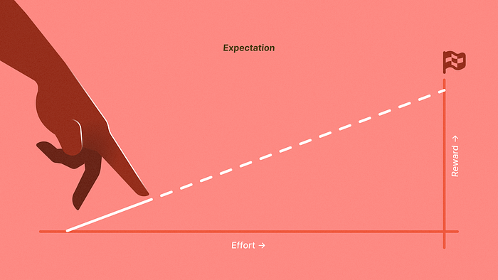
After a year, the admin was at 86.6% coverage. This effort required an initial investment, with improvements "below the surface" that didn't yield a noticeable return for a year. But these small improvements stacked up, and had a compounding effect that enabled us to make such a drastic change to the Admin in a matter of weeks.
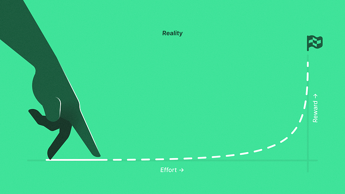
The rapid and effective execution of this transformation wouldn't be possible without the hands-on leadership and exceptional dedication from Chloe Rice, Kyle Durand, and Sam Rose. They didn't just direct the Polaris engineering team, but were deeply involved in the implementation details. Our team's technical prowess and commitment to quality turned designs into a tangible, functioning reality.
It took about 3 weeks to update Polaris with the uplift styles and we were happy to see that when we updated Polaris, about 86% of the admin changed automatically. The hard work was updating the remaining 14% that had gone off Polaris mainline. Anytime we made a holistic spacing change in Polaris, it would inadvertently break components that had custom spacing.
Releasing this change was also a big operational feat, we had to:
- Make sure the implementation of the new design language stood up to our high quality bar.
- Coordinate with dozens of other teams that were not only releasing new functionality, but now had to be guided through adapting those features to the new design language.
- Become de-facto owners of multiple areas in the admin that had no clear owners.
- Provide support to designers and developers.
This was all great on-the-ground research to show us how Polaris needs to continue to evolve to be a better system for the consumers and for the admin.
So… what shipped?
This design language is the most significant design change to Shopify's Admin in 7 years. More than just a visual update, it elevates the admin by incorporating tactility, depth. Mirroring the tools merchants rely on in their daily operations.
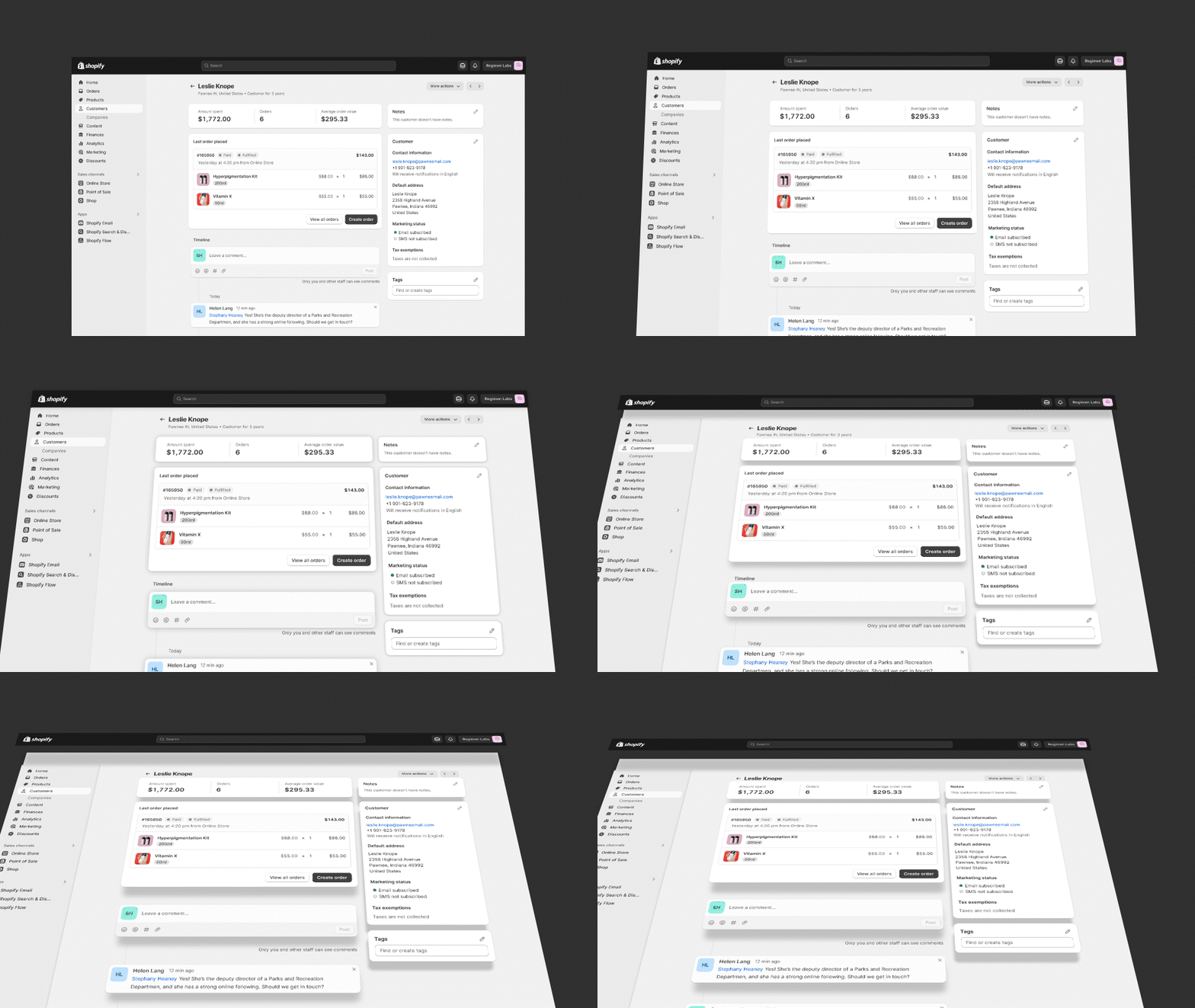
The desire to bring satisfaction and joy to our merchant's journey it's part of Shopify's DNA.
We wanted to transpose some of that feeling to their mission control — the Shopify Admin — and make even the simplest actions, like the buttons they interact with every day, feel satisfying and fun — just like the "cha-ching" sound every time a sale is made. These are the moments when the experience feels alive and delivers small moments of joy in a merchant's day.
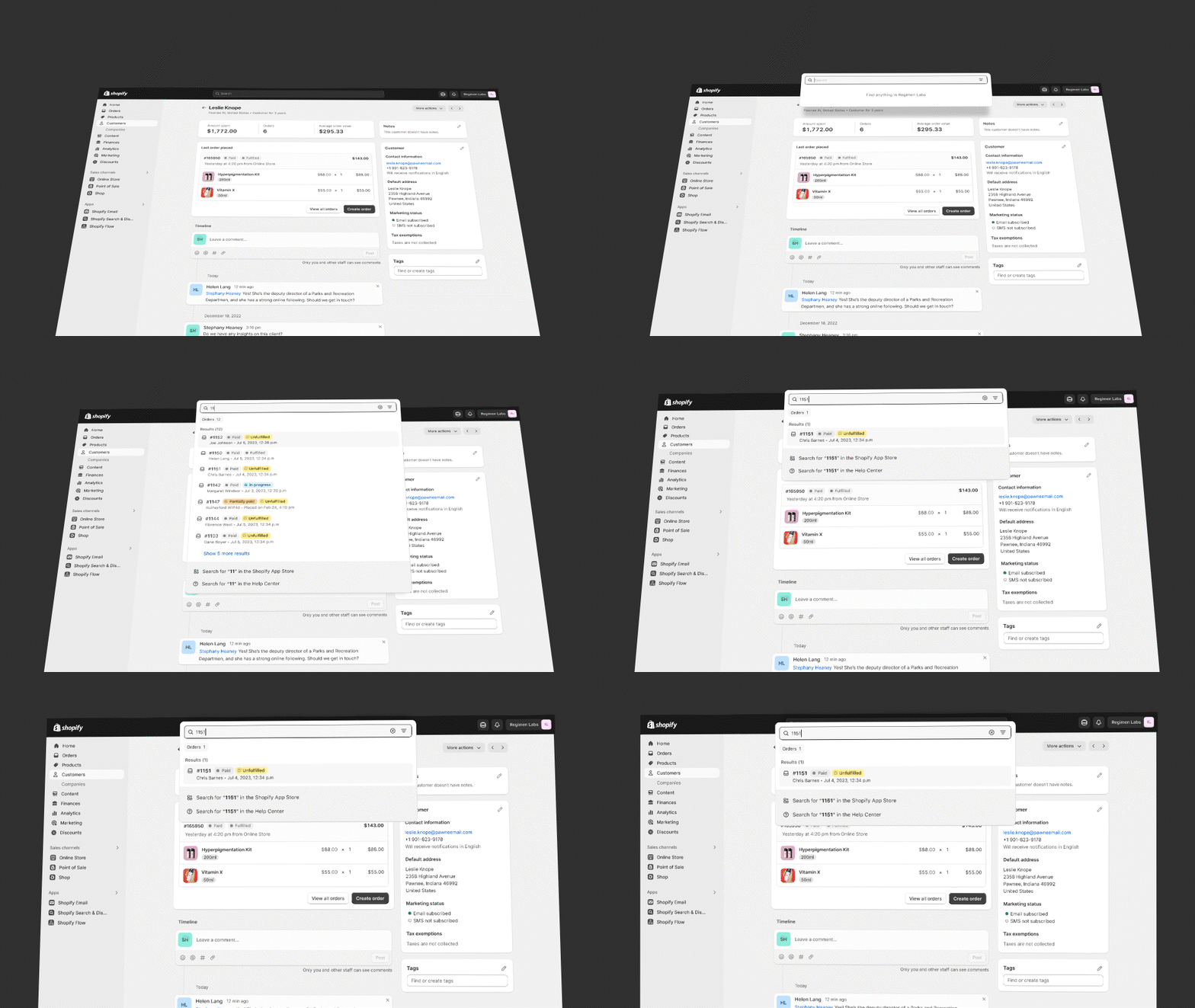
This is still a tool for work, so we balance these moments of joy with our increased focus on efficiency, by optimizing the UI to the type of work merchants do.
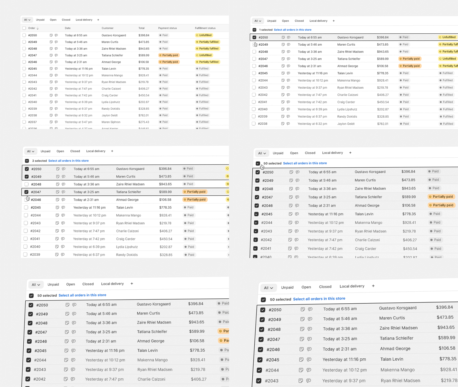
While dealing with a lot of data, merchants desire to see more of it at once, so we reduced text sizes across the board, to use space more efficiently. We're streamlining typography and chose Inter as the Admin's typeface. Inter was crafted specifically for computer screens, and its enhanced legibility of small text is now available to all merchants, no matter the platform or browser they use.

We decided to lean more on icons as intuitive shortcuts that allow merchants to navigate and interact swiftly across the interface, while avoiding an excessive amount of text that gets in your way to get things done. Common actions like editing are replaced with space-saving icons. Icons that have been redesigned to perfectly match our typography. Lightweight and efficient, they feel approachable and have a soul that intertwines well with the new design language.
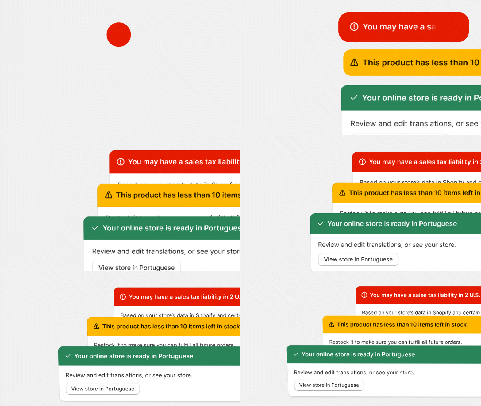
Our new color palette is daring and vibrant. When we use color, we use full vibrancy to communicate meaning consistently. Green means go. Red means danger. Not half measures.
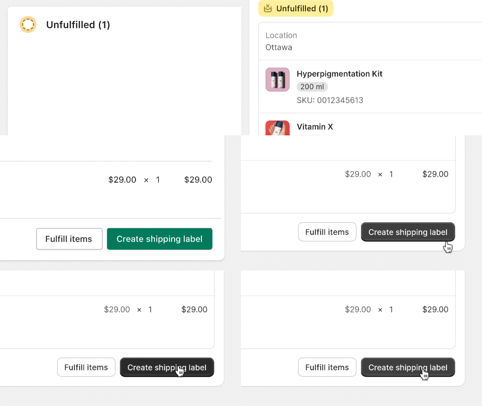
Interactions are being given the attention they deserve. We defined a signature motion curve called Snappy. Snappy is quick, but still gives merchants a cue as to where something comes from, instead of things just appearing instantly. Snappy is progressively going to appear in many areas of the Admin over time.
We're combining motion, color, and depth to make the UI feel responsive and alive, and we're creating affordances that enable merchants to interact with the interface intuitively, without having to pause to understand if something is interactive or not.
Merchants' "fresh eyes"
Before shipping the new design language, we wanted to know what merchants thought about it. So as soon as the implementation reached a good quality level, we conducted a study, where we gave temporary access to the new experience to several merchants.
We weren't looking for validation. We wanted to get an understanding whether merchants' perceptions were lining up with the intentions behind the new design language. We were also getting ready for a preview of the kind of feedback merchants would have in regards to such a dramatic change in visual design versus the level of disruption this would have on their habits in the Admin, which is to be expected.
Good news, the new design language was well received. "Familiar", "refined", "denser", "useful" were terms that were used to describe the impact of the new design language. Merchants who also noticed the change called out the value in the "cleaner" design, and appreciated a higher density of information. Button styling and tactility was also called out as easier to see, and fun to interact with.
Even for merchants that thought such an update "doesn't really matter", we heard some acknowledgement of the UI feeling "fresher" and making their job "a little less boring". Every small adjustment and improvement stacks up to exactly this. Although undisruptive, making menial tasks more enjoyable was exactly what we were aiming for.
Sweating the details down to the pixel, discussing the tiniest things you can imagine… details aren't just details. They make the product. And that product gives entrepreneurs the superpowers to achieve their goals.
More to come
Like a curtain drawing back on a performance, what goes on behind the scenes can be chaotic and messy until the moment of the reveal. We hope that this peek at the process of building this new design language shows how the many actors, set designers and directors involved can come together when putting together such a substantial production. And I want to take a moment to acknowledge everyone from the Polaris team who contributed to this effort: Aaron Casanova, Alex Page, Aveline Thelen, Bernardo Garcia, Charles Lee, Chloe Rice, Dominik Wilkowski, Guilherme Santos, Jared Fanning, Jess Telford, JJ Galipeau, Joe Thomas, Johan Stromqvist, Kyle Durand, Laura Griffen, Lo Kim, Marten Bjork, Mateus Ferreira, Melanie Tayler, Natasha Lloyd, Nayeob Kim, Raquel Breternitz, Sam Rose, Sara Hill, Selene Hinkley, Sophie Schneider, Susie Simon, Thomas Jonkajtys, Yesenia Perez-Cruz, Yuraima Estevez.
We're far from finished.
Our goal is to make Shopify's admin the best place for our merchants to run their businesses, and we'll keep evolving our design language to be the best, most professional tool they can rely on. That means always looking to the future and never letting ourselves grow stale.
When you open Shopify's admin today, some areas might still feel untouched — new illustrations, for example, are still being evolved and will roll out alongside ambitious updates and evolutions of our design patterns. But before we do that, we want to lean in and listen to what our merchants think about this powerful tool that we have the privilege to design. So stay tuned for more.
