

The word is out that Solarpunk is in, at least according to Figma CEO, Dylan Field, at SXSW 2024. And there are clues as to why the fastest-growing design tool is heading towards the next design trend after Neubrutalism.
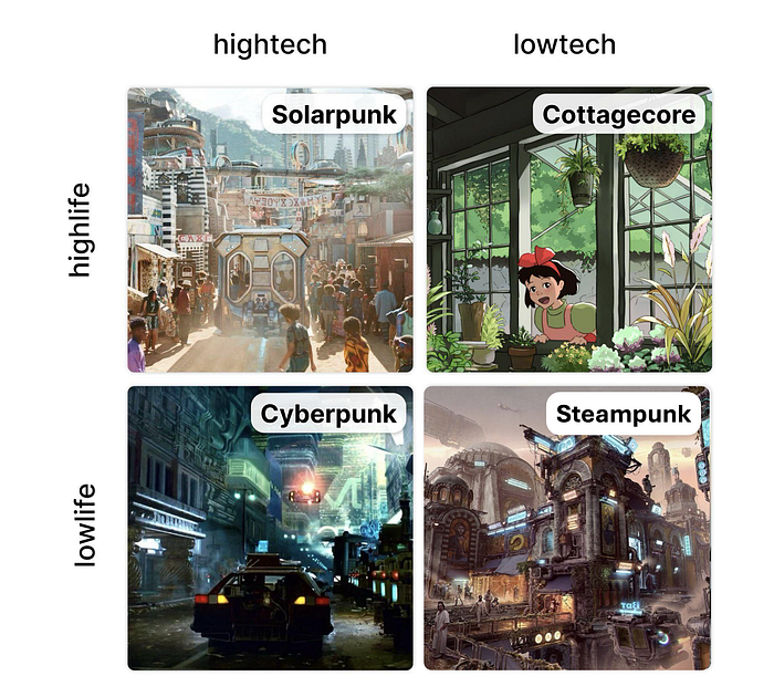
To make the contrast even stronger, he used two upcoming electric vehicles, Tesla's Cybertruck and Rivian's R3, as a comparison of the two design trends, Cyberpunk and Solarpunk.
In his words, while both vehicles show futuristic elements, Tesla Cybertruck's design aesthetic went for a raw, edgy, triangular/low poly treatment, creating a depressing or dystopian feel, emulating Cyberpunk.
Rivian R3, on the other hand, was more associated with Solarpunk in the sense that it had more curves and blended more into the environment, making it look human, natural, and optimistic about the future.
Given that these words were spoken in a public setting, left alone in a pivotal SXSW event, could this be the foreshadowing of where Figma is heading next? If so, what could this mean for the company and for us as designers as we imagine a possible future?
We dive into the design decisions that led Figma to become one of the most recognisable brands.
Before Figma, there was brutalism
There was once a vision of creating an ideal city of straight lines and right angles. If this sounds familiar, it is because I had previously shared about how modernist architects like Le Corbusier shared such ideologies with many architects.
However, a branch out of modern architecture came from a 1955 essay by architectural critic Reyner Banham, who also associated the movement with the French phrases béton brut ("raw concrete") and art brut ("raw art"). The use of bare building materials, minimal geometric shapes, and a monochromic colour palette, along with the aspect of creating an egalitarian approach for all people, made brutalism popular in the mid-1950s.
Sadly, the art form lost its appeal as the Cold War dragged on and more people started associating Brutalist architecture with communism. By 1980s, buildings no longer adopted monolithically raw appearances. Rather, there have even been cases of the government deciding to tear down brutalist buildings. Whether it is due to neglect due to the deterioration of cheap materials, a political swipe at socialist thinking, or just redevelopment so as to make profits, many of such buildings have disappeared in the last decade.
Neubrutalism or Neo Brutalism
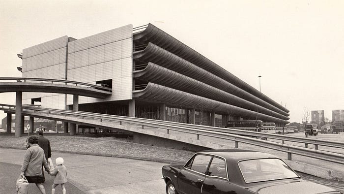
This has caused campaigners and critics to fight for the preservation of brutalist buildings. Some battles were lost as buildings like Robin Hood Gardens were demolished. Others, such as the Preston Bus Station, were threatened, but through surveys and petitions, they managed to get protected and refurbished.
One might say their actions are signs of a punk movement—an opposition against authority—by expressing themselves outward through behaviour and culture. Such are the actions of the common people who took action to protect their beloved buildings. It has become a central narrative theme cutting across various time periods—an anti-establishment that keeps their values of protecting a greater good against a bourgeois and capitalistic society.
Just as a movement inspires designers and creatives across mediums, so too did Brutalism. Not only were there new atypical musics, but there was also a new wave of expression in graphics, particularly in web design.
For years since the rise of Apple's pristine and minimal UI with the IOS 7 in 2013, many companies followed the design standards by replicating the same guidelines on their own screens. Nicely rounded edges with elegant gradients and smooth drop shadows. After a while, every app and website started looking the same.
Except for the new kids of the block, like Figma
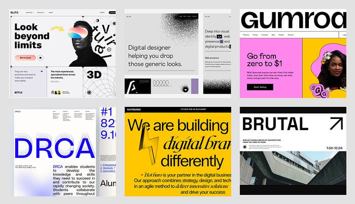
Neubrutalism built upon the raw aesthetic of its predecessor, retaining characteristics like bold typography, contrasting colour palettes, and over-exposed structural elements. On top of that brutalist base, neubrutalism infused brutalism's rawness with a modern sensibility, incorporating more movement and present-day design elements like animation, illustration, asymmetrical layouts, and new-age typography.
Slated to be the next Adobe killer, Figma was meant to provide a highly collaborative and accessible digital environment for anyone to design. Its virtues mirror both the raw use of materials, in this case the design of components, as well as the "punk" essence of going against the grain of conventional design icons.
Hence, when former creative director Tori Hinn was tasked with giving a brand refresh to Figma in 2019, she and her small team of designers created one of the pioneering looks of Neubrutalism for the web.
Here are some of the key elements of the Neubrutalist style:
- Strong colour contrast
- Flat-colour background
- No shadows, just thick, solid outlines
- Conservative typography with a little quirkiness
- Nostalgic computer windows pattern
- Eye-catching geometric shapes
- Asymmetric or inconsistent page layout
Along with some personality traits like curiosity, vibrancy, honesty, and boldness, Figma's Neubrutalism approach was the perfect answer to what it should look like in the 2020s. It also inspired other designers and brands to rediscover and develop their own voice with the design tool.
But with every ideology comes a flaw
With punk, the paradox of reinforcing anti-establishment is the eventual change in the establishment itself. In other words, establishing an anti-establishment may become the establishment itself, potentially looking like what they swore not to be. Such was the case with Figma when Adobe initially attempted to acquire them.
Or what about other standards, such as accessibility, inclusivity, and community? Should they be shunned or celebrated because they have included a wider spectrum of people? As some punk references are nihilistic, they take on a darker, more individualistic tone to human life.
Additionally, brutalism is often misunderstood to be felt as harsh, cold and plainly brutal. On the other hand, brutalism tends to be wrongly associated with insurrection or violent rebellion. NNG writer Kate Moran described the common link between brutalism and anti-design. What may be intended as playful experiments might also be perceived as creating deliberate yet dysfunctional uglyness.
A little optimism in our life
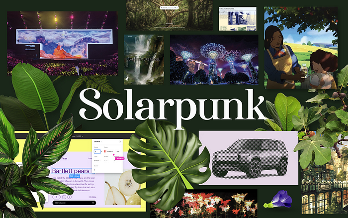
Which brings us back to why Figma CEO Dylan Field chose to speak more about a new emerging design trend at SXSW called Solarpunk: an iteration of multiple versions.
From Steampunk to Solarpunk is a nice juxtaposition to sum up the evolution of thinking. It was also the first instance when Solarpunk was first mentioned in 2008. When placed as a comparison, Solarpunk shines because of its unique qualities: the focus on renewable energy over fossil fuels; to innovate in the now and extrapolate into the future; and to fight for a Solarpunk reality so as to live in it one day.
Over the years, more writings from various authors poured in, including some of the designers at UX Collective, but it was a Solarpunk manifesto in 2019 detailing 22 calls to action that caught my attention.
Among my favourites are the following:
1. We are solarpunks because optimism has been taken away from us and we are trying to take it back.
3. At its core, Solarpunk is a vision of a future that embodies the best of what humanity can achieve: a post-scarcity, post-hierarchy, post-capitalistic world where humanity sees itself as part of nature and clean energy replaces fossil fuels.
4. The "punk" in Solarpunk is about rebellion, counterculture, post-capitalism, decolonialism and enthusiasm. It is about going in a different direction than the mainstream, which is increasingly going in a scary direction.
5. Solarpunk embraces a diversity of tactics: there is no single right way to do solarpunk. Instead, diverse communities from around the world adopt the name and the ideas, and build little nests of self-sustaining revolution.
11. Our future must involve repurposing and creating new things from what we already have. Imagine "smart cities" being junked in favour of smart citizenry.
14. Solarpunk wants to counter the scenarios of a dying earth, an insuperable gap between rich and poor, and a society controlled by corporations. Not in hundreds of years, but within reach.
18. The visual aesthetics of Solarpunk are open and evolving. As it stands, it is a mash-up of the following: a. 1800s age-of-sail/frontier living (but with more bicycles) b. Creative reuse of existing infrastructure (sometimes post-apocalyptic, sometimes present-weird) c. Appropriate technology d. Art Nouveau e. Hayao Miyazaki f. Jugaad-style innovation from the non-Western world g. High-tech backends with simple, elegant outputs
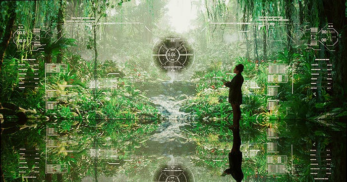
Number 18 particularly hit a chord with me, especially as a designer who needs to imagine a visual world. And that is the reason why science fiction often comes with supporting visuals to aid their readers in connecting highly abstract concepts with hints of tangible artefacts from the future.
Unfortunately, quick media consumption often leads us to quick conclusions about Solarpunk being futuristic and green. And because the world is so focused on sustainability and climate action, Solarpunk becomes polluted if we focus only on the visual aesthetics.
We have to stop the bandwagon effect of doing something primarily because other people are doing it, regardless of their own beliefs, which they may ignore or override. We have to stop the herd mentality in design too by embracing complexity, diversity, and DIY-ness in our practices. And that might mean going beyond simple visual aesthetics to propose a refined design language.
Hello, Brave New World!
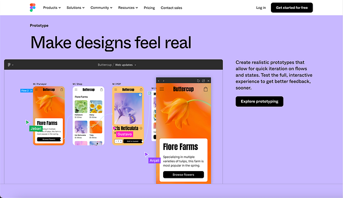
Figma is again leading the way with new visual aesthetics, but it is also adding to the ethos of Solarpunk. Since the announcement of a failed acquisition of Adobe in 2023, with reasons unknown to the general public, Figma has chosen not to hit the brakes. Instead, it has undergone another brand refresh after 5 years since its Neubrutalism style.
The telltale signs are the subtle changes we are seeing on Figma's homepage. This isn't a complete revamp of Figma's identity, similar to an Armageddon or an apolyptotic dystopian future. Yet at the same time, we see more natural, organic elements emerging in Figma's design palette.
These design elements did not come out of a void. In fact, a growing number of innovators are embodying a similar interpretation of Solarpunk.
Below are some notable examples that we can see in 2024:
1. Refik Anadol's nature-focused open-source AI model debuts at World Economic Forum
Tapping vibrant nature scenes based on rainforest data, with waterfalls, forests, birds, flowers, and ecosystems, the installation includes custom generative sound and scents, allowing interaction with the raw dataset. These data are available from institutions like the Smithsonian Institution and London's Natural History Museum, which will continue to grow with the use of advanced technologies to collect data, such as LiDAR, photogrammetry, and capturing high-quality audio and visuals of diverse ecosystems.
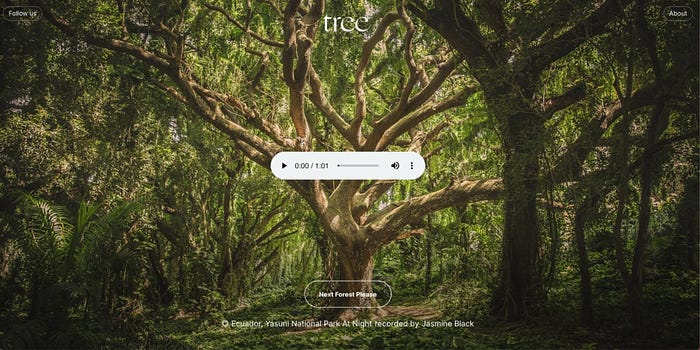
2. New Now's tree.fm multi-sensorial digital experience
Showcasing the various sights and sounds of rainforests around the world, tree.fm is a ground-up initiative that invites its users to escape and unwind in their urban context while educating us on the need for us to protect the biodiversity supporting future generations. The web application draws on Neubrutalist principles of inconsistent layouts, yet gives a sense of plants growing out of the screen with a subtle zooming interaction.
3. teamLab's new borderless museum in Tokyo
"Technology is not in conflict with nature but has the potential to complement it," says interactive art collective teamLab, which opens its doors to the new Borderless digital art museum on February 9, 2024. Nature does not have to be foilage alone; light, water, bubbles, fog, and mist are also elements that teamLab uses to blend digital materiality with human interactivity. The end result is a mesmerising installation of lights in a borderless world—a glimpse of a natural utopia.
4. Kris De Decker's inspired low-carbon web aesthetics
Expect to see a lighter and muted colour palette, as well as prioritising data-heavy images with lo-fi images and system fonts. Rather than challenge the notion of aesthetics for aesthetic's sake, the practical reason is to reduce data-heavy, energy-hungry design components that add to carbon emissions. Designers do not have to look too far to find inspiration in Kris De Decker's solar-powered Low Tech Magazine.

These examples are diverse in nature, but like the Solarpunk manifesto states, they are little nests of self-sustaining futuristic revolution. When they converge, they bring about the richness of the design palette found in natural ecosystems. As for Figma, they could have chosen to come up with a dogmatic approach by announcing what their "natural interface guideline" or "solar design system" is, but that would have distracted from the other virtues found in Solarpunk.
Instead, by providing visual (and verbal) cues, Figma may want designers to discover the affordance and mental model of Solarpunk for themselves so that they can make a conscious choice of contributing to a movement rather than treating the trend as a styling exercise.
According to Techcrunch, the origin story of the name Figma came from the phrase "figment of your imagination made real." Neubrutalism was a stepping stone to drawing visual attention to Figma, but Solarpunk may well be the defining ethos to bring Figma to greater heights of creating a sustainable, optimistic future alongside fellow designers.
References
Architectural Review. (2014, May 15). The New Brutalism. In his seminal 1955 essay for The… | by Architectural Review | On Architecture | Medium. Medium; On Architecture. https://medium.com/on-architecture-1/the-new-brutalism-6601463336e8
Hinn, T. (2019, October 16). Bringing new life to Figma's brand | Figma Blog. Figma. https://www.figma.com/blog/bringing-new-life-to-figmas-brand/
Knights, C. (2023, February 14). Low-Carbon Web Aesthetics: Energy-Saving Design Trends For 2023 — Consider Digital Agency. Consider Digital Agency. https://consider.digital/low-carbon-web-aesthetics-energy-saving-digital-design-trends-2023/
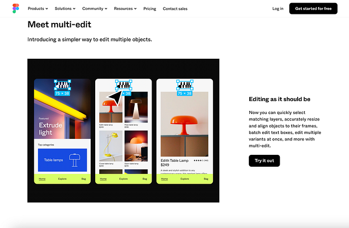
Kuwamoto, S., & Klein, N. (2024, March 6). Behind the Feature: The Multiple Lives of Multi-Edit | Figma Blog. Figma. https://www.figma.com/blog/behind-the-feature-the-multiple-lives-of-multi-edit/?fuid=768244674400796816
Malewicz, M. (n.d.). Neubrutalism is taking over the web | SquarePlanet. SquarePlanet; https://twitter.com/hype4academy. Retrieved March 30, 2024, from https://hype4.academy/articles/design/neubrutalism-is-taking-over-web
Moran, K. (2017, November 5). Brutalism and Antidesign. Nielsen Norman Group. https://www.nngroup.com/articles/brutalism-antidesign/
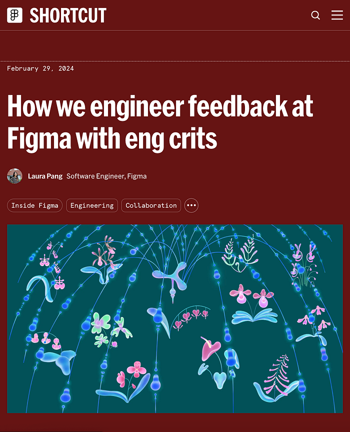
Pang, L. (2024, February 29). How We Engineer Feedback at Figma with Eng Crits | Figma Blog. Figma. https://www.figma.com/blog/how-we-run-eng-crits-at-figma/
Patel, N. (2024, March 18). Cyberpunk is out and solarpunk is in, according to Figma's CEO — The Verge. The Verge; The Verge. https://www.theverge.com/2024/3/18/24104890/figma-ceo-dylan-field-cyberpunk-solarpunk-trends-sxsw-2024
Republic of the Bees. (2008, May 27). From Steampunk to Solarpunk | Republic of the Bees. Republic of the Bees; https://www.facebook.com/WordPresscom. https://republicofthebees.wordpress.com/2008/05/27/from-steampunk-to-solarpunk/
The Solarpunk Community. (2021). A Solarpunk Manifesto (English) — ReDes — Regenerative Design. ReDes — Regenerative Design — Permacultura, Sociocracia, Solarpunk. https://www.re-des.org/es/a-solarpunk-manifesto/