Recently, designers on the platform formerly known as Twitter flexed their skills and turned typically stoic brands into something a bit… cuter. Inspired by the design language of VTuber logos, sober industry mainstays like iBuyPower and Facebook were turned into kawaii, whimsical icons.
This trend was kicked off by an ice cream-themed VTuber named Aisu Asai when she posted a marketed departure from her usual VTuber asset commissions and uploaded a cute, parody version of the Pizza Hut logo. The post blew up, currently enjoying some 13 million views and countless replies with VTuber versions of other company logos. This garnered the attention of some brands in question, which then produced their own updated logos or asked to be VTuber-ified themselves.
This viral trend speaks to both the proliferation of VTubers and their unique design language as well as the power of "kawaii computing."
What are VTubers?

VTubers are virtual influencers, the term coming from "virtual YouTuber." Rather than filming themselves in live action, VTubers are animated characters "piloted" by a personality. A VTuber is not limited to any one style or platform, but in the current zeitgeist a typical VTuber is an anime-inspired character with a specific theme (ice cream, sharks, mythical creatures, fruits, etc) who streams interactively. Elaborately designed VTubers have become a staple of platforms like Twitch and YouTube, and each faces the challenge of differentiating themselves from other VTubers. This is why their logo designs are so crucial.
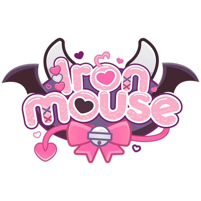
Their distinctive design language is playful, colorful, and communicative. The logo has to illustrate more than just who the VTuber is — what are their unique offerings? What is their theme? Their personality? What can be expected from one of their streams? This is why VTuber logos will often feature
- aspects of their costume/look
- icons related to their content (ex. music notes for a singing VTuber, bandages for a doctor VTuber)
- mascot illustrations
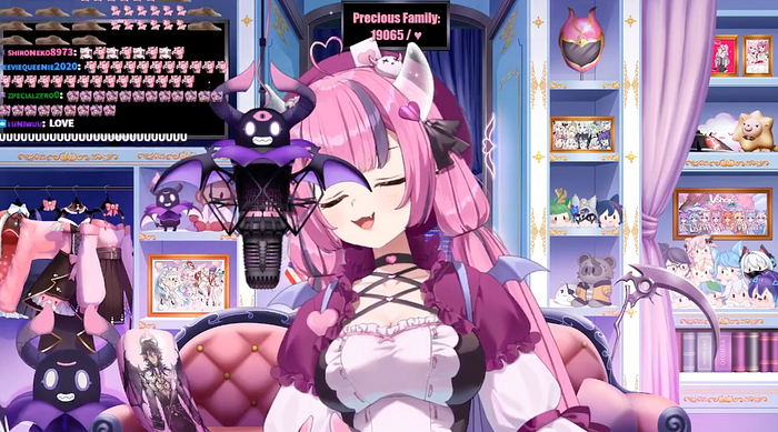
It is important for the design to be more communicative than a typical logo because sometimes the name of the VTuber isn't truly indicative of what kind of content they have on offer. For example, one of the most popular VTubers in the English-speaking world is Ironmouse who is neither iron or a mouse. Her name is a callback to a character from Sailor Moon, but her design can be described as a pink-and-purple demon. Her logo reflects her character's design with horns, bat wings, and a bell she wears. In that original VTuber-ization of the Pizza Hut logo, the name is surrounded by pizza slices and pizza ingredients to clearly communicate what Pizza Hut does.
VTuber logos are colorful, bouncy, and above all, kawaii. "Kawaii" means "cute" in Japanese, but kawaii has its own connotations. As described by Chen Ji et al. in The Cuteness Factor: An Interpretive Framework for Artists, Designers and Engineers, "Kawaii is not only the feature of the design of a robot, virtual agent, or interface, but also emotion that occurs in the interaction between human agent, human robot, and human-interface (and perhaps between people with a facilitating computer)." So kawaii goes beyond mere cuteness — something that is not cute in appearance can become kawaii via actions or circumstances.
What is "kawaii computing?"
The study of so-called "kawaii computing" is in its early days, but can essentially be described as looking into the effects that cute things have on human-computer interaction. A Japanese cultural understanding of what is "kawaii" has spread via Japanese media and the internet at large; just look at the undeniable popularity of Hello Kitty and Pokemon. This is why all these aforementioned VTubers are anime-style characters that have behaviors and designs in line with
- the "Baby Schema" described by Konrad Lorenz (things that look like babies, i.e. big heads and eyes, round face, are instantly recognized as cute)
- chizimi shikou or love of small things
- friendly, welcoming, playful personalities
Researchers that have dug deep into the concept of "kawaii" like Katie Seaborn and Hiroshi Nittono focus on the positive emotions that are elicited by kawaii designs and interactions. Though the field is nascent, there is some indication and anecdotal evidence that "kawaii" can have a super powerful impact on the way people interact with digital experiences.
So what effect do cute things have on human computer interaction?
The Power of Kawaii
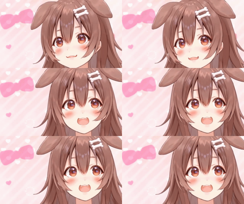
"Let us not forget that the desire for cuteness as a need for solace or reassurance in turbulent times can be helpful but it can also be mere amusement, taking us away from considering more challenging, weighty, and urgent matters." — Aaron Marcus, HCI and User-Experience Design: Fast-Forward to the Past, Present, and Future
Obviously, cute things grab attention and adoration. It's theorized that we are wired to love cute things so that we will protect and care for babies with their big eyes and round, delicate heads. (Lorenz's Baby Schema!) When we take this into the realm of user experience, cute designs can similarly induce positive feelings and thus positive interactions.
Cute images make users more forgiving when facing errors
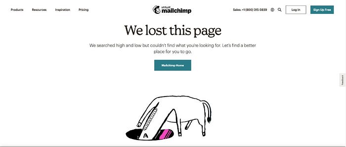
One 2020 study by Yue Cheng et al. has found that "avatar cuteness can significantly reduce users' perceived severity of software errors taking place during human-computer interactions." The researchers pulled from existing information regarding anthropomorphized interfaces. This follows with UX practices regarding error pages: having a cute or humorous illustration softens the blow of the error. It's key to have an indication of how the user can rectify the error or where to go next, and many sites provide this information alongside something cute.
Amazon's 404 page has images of dogs. (Cute.) YouTube has an illustration of a monkey with a magnifying glass. (Adorable.) MailChimp has a drawing of horse with its head inside a hole. (Love it.)
Cute images increase user focus, motivation, and care
In a study by the aforementioned Hiroshi Nittono and his colleagues, it was discovered that participants had increased focus, motivation, and attention after looking at pictures of baby animals. After viewing cute critters, participants had more precision and care when playing the steady-hand board game Operation. They had more accuracy with visual searches and better reaction times on a Novan task. The participants experienced these effects after viewing images of adult animals too, but to a lesser extent. It is believed that viewing adorable bitty babies triggers a boost in mood and an increased focus — gotta be careful with the little ones!
Cuteness soothes anxiety
Further studies have indicated that watching videos of baby animals reduces blood pressure and anxiety. In a study at the University of Leeds, Dr. Andrea Utley treated participants to a video montage of adorable animals like kittens, puppies, and baby gorillas. Following the video, participants reported feeling less anxious, even in the midst of winter exams. The heart rates and blood pressures of the participants also dropped into a more ideal range as a result of the of the cute treatment.
Considering all this, kawaii or cute design should be a part of a user experience designer's toolbox. Cute avatars or designs can be utilized in experiences that might otherwise make users anxious or frustrated.
Here on Medium, Duolingo is frequently cited as a case study in good UX design. The cute, green Duolingo owl, aptly named Duo, can be extremely demanding at times, imploring users to remember to practice their foreign language of choice. If it's getting close to midnight and the user has a streak hanging in the balance, the illustration of Duo on the Duolingo widget glares threateningly. It wouldn't be out of character for Duo to brandish a knife. (It doesn't… for now.)
Even with how unhinged Duo can get, we forgive and even adore it because it's cute. If something un-cute or without personality badgered me to remember my Korean lessons I would have deleted the app by now. But the owl is kawaii, so it gets away with harassing me.
TL;DR — Cuteness is anything but trivial
VTubers have taken the internet by storm, their kawaii design language proving that cuteness grabs attention, adoration, and interest. UX professionals learn from their success by strategically utilizing cuteness in their experiences. Things that are kawaii or cute (baby-shaped, small, playful, etc.) make users feel at ease and even improve focus and motivation. Studies have shown that viewing pictures or videos of baby animals improve user's performance on various tasks and make them more patient with error messages. Therefore, cute mascots like Duolingo's owl can be instrumental in creating calm in otherwise stressful situations — like badgering users to open the app.
Cuteness is anything but trivial in these turbulent times. Anything that can help ease some anxiety is worth consideration in user experience.
