

Probably, no introduction is needed.
GOV.UK — a website where copy and common sense are queen and king. If you don't remember it, you should just visit. You'll see what I'm talking about. It might not be the most exhilarating copy in the world or the most "juicy" one, but one thing is clear — you will get everything.
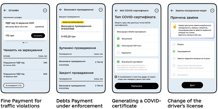
Government websites usually suck. Government apps too, unless you're blessed to be using Ukrainian Diia, which is GOV.UK meets Revolut:
Why is the British government site — which is supposed to be "meh" (hmm, did she mean the site or the government?) — considered a writing staple? Because they got lucky with a Content Designer. Sarah Winters, founder and CEO of Content Design London, essentially revived GOV.UK.
It's really hard to find a website more self-aware of how little people want to read it.
In their writing guide, they mention that:
- people only read 20 to 28% of the text on a web page anyway (I like the soberness of this "anyway")
- the pressure on the brain to understand increases for every 100 words you put on a page
Content design is using evidence and data to produce content your audience needs, at the time they need it, on a channel they are on and in a way they expect. — Sarah Winters
How did Sarah Winters and her team transform GOV.UK?

Before GOV.UK, UK government departments maintained thousands of separate websites, each with its structure, design, and content. Finding the right information was confusing and inefficient. Departments had their own way of writing content, often prioritizing internal approval processes over user needs. Legal and policy teams overruled content designers, creating slow, frustrating workflows that could take months just to publish a single page.
Sarah Winters and her team at the Government Digital Service (GDS) took a bold, user-first approach to content design. The key strategies were:
- To create a single, centralized platform
Instead of scattered departmental sites, all citizen-facing government information was consolidated into one domain.
2. Build user-centered design
Content wasn't just written — it was designed using evidence, data, and user research. The focus was on answering real user questions in the simplest way possible.
Content should mean content, not words…
…we decided on the term 'content designer' for the British government.
The 'design' bit of it was the important bit. Previously, government confined most of its editors to words only. (To be fair, the tech we had totally supported this way of working.)
Now we were using more data and evidence, defining and working to user needs, defining, testing and iterating formats. This iterative way of working was more like a design process, than the content process government was used to. The way the content was set out, the way content and design worked together on call-outs and action elements etc; we were changing the whole way we worked, from top to bottom.
3. Use plain English over bureaucratic speak
Complex, legalistic phrasing was replaced with short, clear sentences. Accessibility was prioritized to ensure everyone, regardless of reading ability, could understand government content.
4. Faster, more efficient publishing
The approval process was streamlined. Departments could no longer dictate content in isolation. Everything had to meet GOV.UK's usability standards.
I said:
- users need it,
- we create it,
- it's fact-checked by experts (not 'signed off'),
- we publish.
Functional standards writing style guide is the crème de la crème
If I had just one hour to turn a copywriter into a UX writer, I'd make them read the GOV.UK Writing Style Guide.
Why? Because it's one of the clearest, most practical guides on writing for real people. It strips away fluff, jargon, and confusing language, focusing on what truly matters.
The Functional Standards Writing Style Guide follows the same principles. It teaches you to:
- Write in plain English. Say exactly what you mean, using simple words. The key to effective writing is to keep it simple. It is about using everyday language that helps people understand your message from a single reading.
- Be clear and direct. No guessing, no vague instructions.
- Structure content for quick reading. Short sentences, bullet points, and clear headings.
- Use consistent language. So everyone understands the same way.
People don't read on the web unless they want information
Writers on GOV.UK are perfectly aware that people read differently on the web. People do not usually read text unless they want information. When you write for the web, start with the same question every time: what does the user want to know?
Meeting that user need means being:
- specific
- informative
- clear and to the point
For example:
Let's say I'm an expectant mom interested in getting free childcare. I Google "childcare" on GOV.UK, and this is the page I get.
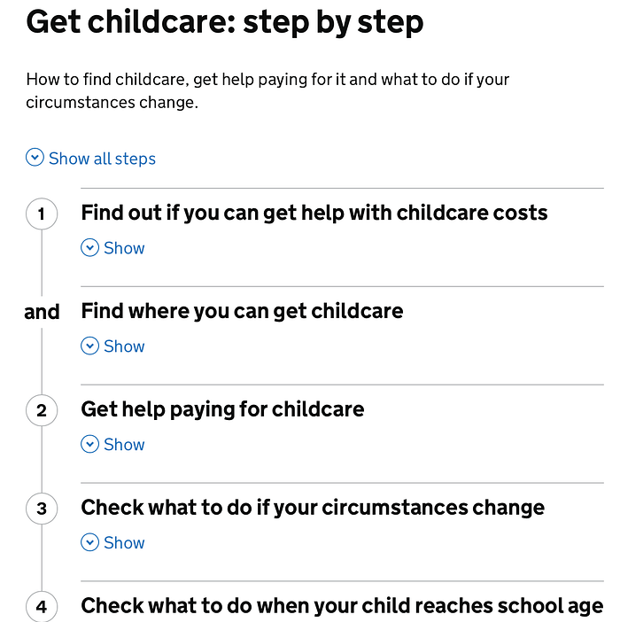
This example perfectly illustrates how GOV.UK understands how people read on the web and structures content accordingly.
- In this case, an expectant mom searching for "childcare" wants clear, actionable information on how to get childcare and financial support.
- The page follows a step-by-step format, making it easy to scan. Key actions — finding help with costs, locating childcare, and checking eligibility — are broken down into separate steps, so users don't get overwhelmed.
- Language is simple and direct. Each heading answers a real user question. "Find out if you can get help with childcare costs" → directly addresses financial concerns. — "Find where you can get childcare" → provides practical information.
- Users can choose what they need to read by expanding sections relevant to them.
On Content Design London's website, there is also a nice article on how to pair with a lawyer to write good, comprehensible legal text.
People have a special algo of finding information on the web
A person's process of finding and absorbing information on the web should follow these steps, states the website:
- I have a question
- I can find the page with the answer easily — I can see it's the right page from the search results listing
- I have understood the information
- I have my answer
- I trust the information
- I know what to do next/my fears are allayed/I do not need anything else
A website only works if people can find what they need quickly, complete their tasks, and leave without having to think about it too much.
For example:
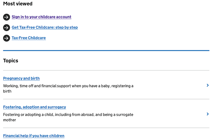
- I have a question
- A user, such as a parent looking for childcare support, searches for "tax-free childcare" or "financial help for parents."
2. I can find the page easily
- The most viewed links section immediately surfaces relevant content.
- The clear headings and categories help users quickly spot the right section.
3. I have understood the information
- The page is structured logically, grouping related topics (e.g., pregnancy, fostering, financial help).
- The use of plain language ensures users grasp the key points immediately.
4. I have my answer
- Clicking on a link takes the user to a step-by-step guide or a specific answer, making it easy to digest.
5. I trust the information
- GOV.UK is an official government source, giving users confidence in its accuracy.
- The concise, no-fluff content reassures users that they are not being misled.
6. I know what to do next / My fears are allayed / I do not need anything else
- Clear calls to action (e.g., "Sign in to your childcare account") guide users to their next step.
- The step-by-step structure reduces uncertainty and provides a clear path forward.
Also, the pages don't contain duplicate information.
Answer the user need once. Point to it many times but don't waste people's time and don't duplicate.
Good online content is easy to read and understand
Great online content doesn't make users work to understand it — it delivers information quickly, clearly, and without friction.
It does this by using:
- Short sentences. Because people don't read online; they scan. Long, complex sentences slow them down.
- Sub-headed sections. So users can jump straight to the part that answers their questions. No hunting, no guessing.
- Simple vocabulary. Because clarity beats cleverness. If a word makes someone stop and think, it's probably the wrong word.
When content follows these principles, people find what they need faster, understand it instantly, and move on with confidence.
There's no excuse for putting unnecessarily complicated writing in the way of people's understanding. — GOV.UK