

This week marks the 25th anniversary of the original Sony PlayStation's release. It's one of the most successful and influential video game consoles of all time, and while it may be best known for ushering in a new era of 3D gaming, perhaps its finest artistic achievements were rendered in flat 2D art.
It's a bit ironic. From the start, the PlayStation's hardware was optimized for 3D graphics, to the point where Sony Computer Entertainment America even limited the release of 2D games in North America, believing they would make the PlayStation look old fashioned. But despite the concern, the PS1 still wound up with one of the finest libraries of 2D games. There's a wealth of classic digital artwork on display in these titles, many of which have gone overlooked in the decades since their release.
Gunner's Heaven (1995) looks like a cross between Gunstar Heroes and Metal Slug (but it's actually older than Metal Slug by a year!) with its intense run and gun action. Because of its lack of polygons, it was released in Japan and Europe, but not North America.
Hermie Hopperhead (1995) was the first 2D mascot platformer for the PS1, but remains obscure in North America, where it was also never released. It showed off the power of the PS1 hardware by ramping up the detail in its sprites (look at all those gradients!) and using many layers of parallax scrolling in its backgrounds.
The very first Rayman (1995) was a launch title for the PS1 in North America. It flexed its next-gen power through its generous use of color. 16-bit consoles worked within very limited palettes. The Sega Genesis could only display 64 colors on screen at once. The Super Nintendo managed a whopping 256. Meanwhile, the newly launched PS1 clocked in at a max of 153,600 colors, and oftentimes it looks like Rayman is trying to use them all at once.
Early RPGs like Beyond the Beyond (1995) and Suikoden (1995) experimented with putting 2D sprites on top of simple 3D backgrounds, which at the time looked high tech enough to secure their release in North America. This mix of 2D on 3D would become something of a standard for PS1 RPGs moving forward.
Arc the Lad (1995) stood out for its beautiful 2D art style, which bucked a lot of these trends. Instead of overwhelming players with every color in the rainbow, or fancy new 3D tricks, Arc the Lad decided that less could be more. It leaned heavily into the sumptuous, painterly aesthetics of late 16-bit RPGs and brought them into the 32-bit era with more lush animation than had ever been attempted with this detailed sprite style.
The game was particularly noteworthy for how much effort they put into using sprite animations for storytelling. Rather than employing videos for every important cutscene, the developers of Arc the Lad took advantage of the increased storage capacity of CDs by filling the game with tons of unique animations. The integration was visually pleasing, and all the character action happening in-game through beautiful sprite work stands out as a novelty to this day.
The results were powerful and even heart-wrenching at times!
Another notable RPG series to debut on the PS1 was Popolocrois (1996). Similar to Arc the Lad, its sprites were packed with personality. There were so many unique character animations playing out through these sprites, which aimed for the look and feel of an anime series. Rather than ramp up the detail and colors, Popolocrois dialed them back and put a greater emphasis on clean, legible line art and extremely efficient keyframes (much like TV anime).
These sublime character-building touches occur during actual gameplay as well. For instance, look at what happens when the magic-user of the party casts her spell. The two other characters brace for impact—with the main character clutching his head adorably—a detail that most games today wouldn't take into account. And the expression on the enemies when they get toasted is priceless!
While Popolocrois managed to combine anime and sprite art sensibilities, Dragon Ball Ultimate Battle 22 (1995) took a much more literal approach. This game employed the actual animators of the Dragon Ball Z TV show to draw every frame of animation by hand, which was then digitized and shrunken down into sprites. There's no denying the game has aged terribly, but it was the ultimate act of fanservice for Dragon Ball Z fans in 1995.

Of course, we can't discuss the history of 2D on the PS1 without bringing up one of the most important and influential games ever made: Castlevania: Symphony of the Night (1997). This game took many breaks from series tradition, most notably eschewing linear levels for a continuous open world, giving birth to the "Metroidvania" format and inspiring countless indie games decades down the road.
Symphony of the Night is also effectively a time capsule for the evolution of 2D games of this period. It is a direct sequel to the PC Engine CD game, Castlevania: Rondo of Blood (1993) and reuses many sprites from that 16-bit game. The old sprites have appealing art and efficient, low framecount animation. Meanwhile, Alucard had one of the most beautifully silky smooth sprites the world had ever seen.
The old sprites (minotaur and werewolf) and new sprites (Alucard) mixed together very well:
In addition to the traditional sprites, Symphony of the Night also innovated with its huge boss characters made out of segmented sprites. While this technique goes way back to the 8-bit days, the extra horsepower of the PlayStation's 32-bit processor allowed for much more seamless animation than was possible on previous generations of consoles.
This technique was pushed even further in Gundam: The Battle Master (1997), which marked one of the first instances of the segmented sprite approach being applied to player characters with this degree of sophistication and success. The game had incredibly huge, detailed, smoothly animated robots that could even show damage as the fights progressed. It's one of the most visually impressive titles in the entire PS1 library. The style is timeless, and it was prescient: Skeletal animation became the norm for most 2D games today.
The PS1 era also saw great advances in pre-rendered 3D animation. Real-time 3D during the mid-90s was extremely limited, so the most cutting edge 3D imagery of the time was actually best expressed in 2D games.
Oddworld: Abe's Oddysee (1997) came out the same year as Final Fantasy VII and had the high production values to match. It had amazing creature designs, art direction, and graphics that seemed nearly photorealistic at the time, feeling more like stop motion than CG.
Another notable pre-rendered game of the time was Sol Divide (1997), which had gorgeous character designs by legendary illustrator Katsuya Terada. This game really leaned into the stop-motion aesthetic, intentionally recalling the works of VFX and creature design legend Ray Harryhausen.
The following year would see the release of Skullmonkeys, a 2D platformer made with actual stop-motion animation. It was an incredibly unique-looking game with its tactile clay aesthetic.
The PS1 is especially beloved for its vast library of classic RPGs, many of which were still sprite-based.
Final Fantasy Tactics (1997) is one of the finest games ever made. In addition to its stellar story, gameplay, characters, and music, it was also one of the first games to truly perfect the use of 2D sprites on 3D polygonal backdrops.
This same team would go on to make Vagrant Story (2000), which many — including myself! — consider to be the most beautiful 3D game for the PS1. They were able to push the envelope for low poly 3D precisely because they approached it as if it were sprite art. The handcrafted textures in that game are legendary. They literally are sprite art, lovingly painted across surfaces:
Xenogears (1998) also used hand-drawn sprites on top of 3D environments to great effect. It had one of the most epic stories that anyone had ever attempted in games, combining classic giant robot tropes with Gnosticism of all things. Not just another edgy jab at Christianity, these visuals were well-considered to convey the game's ambitious scope.
Saga Frontier (1997) has aged much less graciously. Its graphics were a mix of pre-rendered CG and real-time 3D, which sometimes came together into a compelling game world and sometimes fell apart.
Saga Frontier 2 (1999), however, is another timelessly beautiful feather in the cap of PS1 RPGs. It takes a far more mature and assured approach to its visuals, dropping the pre-rendered 3D CG of its predecessor for beautiful watercolor paintings. Due to the increased storage capacity of CDs, developers no longer had to use tilesets to save memory and could start freely employing large, unique images for backgrounds.
All of these advanced 2D techniques coalesced into perfection with Legend of Mana (1999), one of the most visually splendorous games ever made.

The sprites are a culmination of a decade of refinement stretching back to the first Seiken Densetsu for the original Game Boy. Over the course of time, they've gotten more detailed, but never lost their sharpness and legibility.
The same goes for the backgrounds, which are now mostly hand-painted illustrations, yet they still have the tidy "pixel perfect" appeal of sprite art. In fact, many of the environments are made up of tiled sprite art—it's just that the artists have gotten so good at making the grid disappear.
Legend of Mana also features some of the finest segmented-sprite bosses whose pieces come together seamlessly to create weighty, naturalistic movements. The translation of individual sprites never draws undue attention to itself, largely because each fragment has several frames of animation. This results in bosses that read as gigantic sprites and not paper cut-out puppets.

What makes this all the more impressive is that the PlayStation really wasn't optimized for 2D games. The PS1 only had 2 MB of RAM, which wasn't enough to perfectly port the best 2D fighting games of the era. This meant that ports of classic 2D arcade games like Darkstalkers had tons of frames of animation cut in order to run on the PS1. However, when Capcom was designing specifically for the PS1, their 2D output was breathtaking.
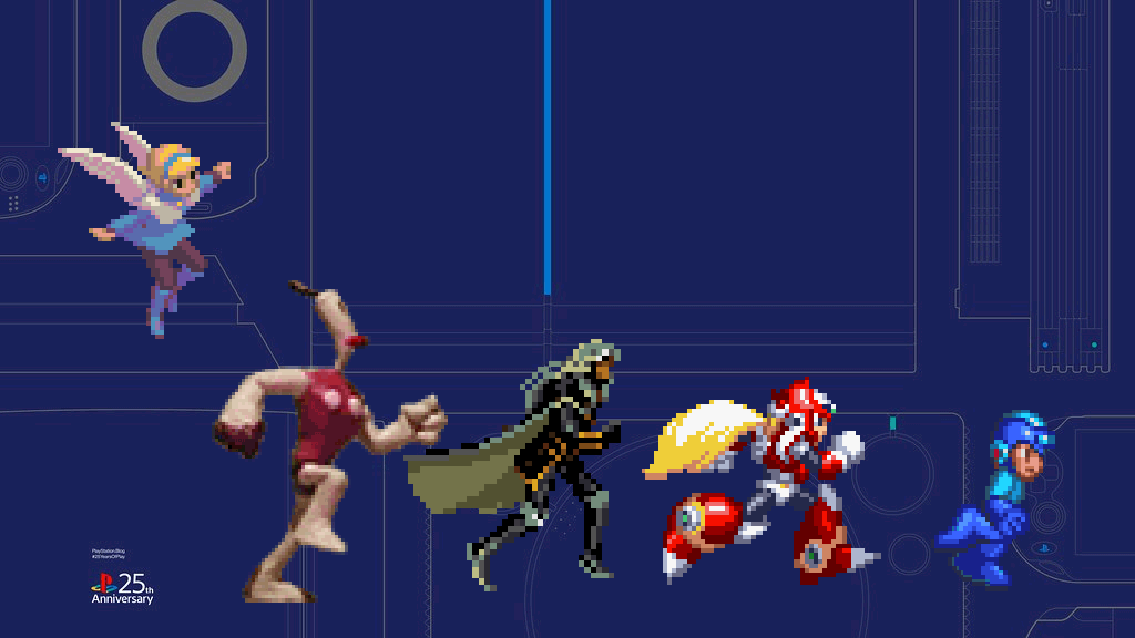
Mega Man 8 (1996) is arguably the most visually beautiful game in the mainline series. With this installment, Capcom was able to take all they'd learned from their wonderfully animated 2D fighting games and channel it into the Blue Bomber, imbuing the game with something close to feature-film quality animation.
Mega Man X4 (1997) also had similar care and polish put into its visuals.
Capcom also soared to new 2D heights with Breath of Fire III (1997) and IV (2000).
Breath of Fire III was the ultimate evolution of the distinct visual style that the series had established for itself on the Super Nintendo. It maintained the vibrant, super-saturated colors of the previous games while introducing far bigger sprites with more animation.
Breath of Fire IV marked a bold new change in the series's direction. It was created when Capcom was at the absolute peak of its sprite-making powers and is full of so many unique, subtle, masterful touches that challenge traditional game art wisdom. The color palette of the game is incredibly subdued. It's full of earth tones, but never comes off as muddy or dreary because there is so much warm/cool contrast going on.
And the sprites! My God, the sprites!
These are some of the most sophisticated 2D sprites ever made for an RPG. They largely avoid having obvious outlines, which up until this point had been a basic tenet of sprite art. Because of this, the artists on Breath of Fire IV had to be far more deliberate with their shapes and shadows. Most 2D games up until this point had very formulaic shading. You work outside to inside, dark to light, in bands of color simulating a gradient. But without outlines, this style is illegible, meaning it was never optimal to begin with. The shading in Breath of Fire IV raises the bar by being planar rather than broadly spherical. It's not afraid to have large swathes of flat color, which, as it turns out, can be even better for legibility and visual appeal. The complexity isn't in the amount of information being thrown at you, but in the decisions behind them.
And, of course, the animation of these sprites is peerless. This is ྖs Capcom, after all: It was responsible for some of the best, most timeless sprite animation that will ever be produced.
Ultimately what makes the 2D games on PS1 such a huge leap from the 16-bit generation isn't the improved hardware — it's the maturation of the artists themselves. While the PS1 may have been revolutionary for 3D gaming, it was evolutionary for 2D.
3D gaming at that time was a wild new frontier, while 2D games already had decades of history behind them. Coming into the 32-bit era, many developers were reaching a point of mastery with 2D art and still discovering ways to push the medium forward. While most of the 3D games for the PS1 look primitive and dated by the standards of subsequent generations, the best 2D games of the era age like fine wine.
Which begs the question: Why don't 2D games look like this anymore? Lots of developers aim for an 8-bit or 16-bit look, but very few even attempt to match the 32-bit 2D classics. The technology to make games and digital art is more accessible than ever, so what's stopping everyone?
Put simply, it's because this approach requires ridiculously high craft, not high tech. Nowadays, anyone with a little know-how can compose a superficially photorealistic game. But to capture the visual flair of the most enduring 32-bit games, it takes deeper knowledge and experience. The allure isn't derived from the power of a lighting or physics engine; the artwork of sprite-based PS1 games is much more personal. They carry a warmth and human touch. Since there's no technological replacement for that, these games will inspire future players and developers for generations to come.