

170 Feature Prioritization Ideas
Updated: Sept 17, 2022 —There's no silver bullet for prioritization. Your team and situation matter. Get inspired with this list of 170 methods. This is the complete list of roadmap prioritization frameworks on the internet and contains tons of linked resources.
Contents: Click links to skip to the section
Note: Jumplinks (🔗) to sections below do not work in the mobile app.
- Grids/Matrices 🔗(39)
- Scoring 🔗(66)
- No-score Sorting 🔗(7)
- Qualitative classification 🔗(20)
- Maps and canvases 🔗(7)
- Activities/Games 🔗(16)
- Processes/Workflows 🔗(15)
- Other prioritization questions 🔗
- Complete list of prioritization techniques 🔗(170 bullet points)
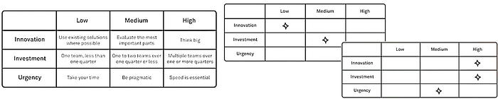
Lean prioritization grids, Matrices, Quadrants, Window Diagrams

Agreement and Certainty Matrix
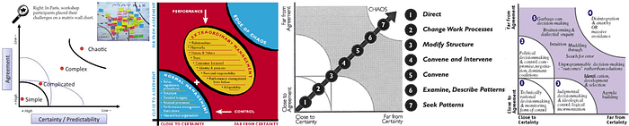
- Vertical axis: Agreement or consensus
- Horizontal axis: Certainty or predictability
In an article for The Liberators, Christiaan Verwijs writes, "The Liberating Structure Agreement-Certainty matrix exists to help groups sort the challenges they face based on their complexity."
This matrix helps us face our inclination to overestimate our abilities while also underestimating the challenge.
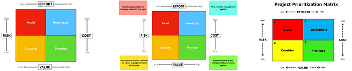
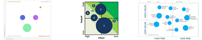
Impact vs. Effort
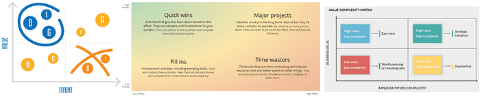
- Vertical axis: Impact/Value/Benefits, etc. (Specify one perspective: User or Business)
- Horizontal axis: Effort/Complexity/Cost, etc. (for Team/Business)
Also known as Value vs. Complexity, Action Priority Matrix, Benefits vs. Cost, Value vs. Cost, "Impact vs. Difficulty," and sometimes simply "The Four Quadrants." This model can help product managers understand whether a feature is for the backburner/filler/nice-to-have, a low-hanging fruit/quick win, or something to discard altogether. The impact effort graph is one of the most commonly cited product management frameworks. Unsure what to do after everything is plotted on the cost vs. value graph? Check out the PACE framework, which proposes how to prioritize requirements from this grid.
Value vs. Feasibility
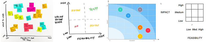
- Vertical axis: Impact/Value/Benefits/Importance, etc. (Specify one perspective: User or Business)
- Horizontal axis: Feasibility
Can Do vs. Should Do
John Cutler strikes again with a mind-blowing new 9-box grid framework to aid problem prioritization.
I cannot do it justice, so just dive into Cutler's, where they explain every box in detail and the difference between this framework and other popular ways of thinking.
Many teams are so focused on what they CAN do, that they forget what they SHOULD do. Sure, at the offsite everyone has amazing ideas (it's almost never a case of not knowing the SHOULD). But then they go back to work on CAN work. — John Cutler
Read more here: cutlefish.substack.com
Short-term Value vs. Long-term Value
Radhika Dutt wrote the book, Radical Product Thinking. Recently on the Product Science podcast, they recommended a 2x2 with short-term vs. long-term value. And, of course, like any great 2x2 solution matrix, the upper right is the best-case scenario. There's no right or wrong answer depending on the organization's goals, but if you can prioritize work that helps the company in both the short-term and long-term, you can't go wrong!
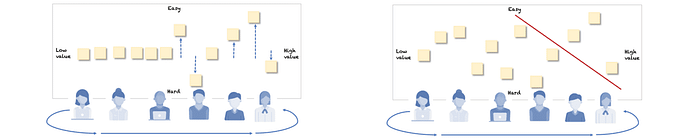
PICK Chart
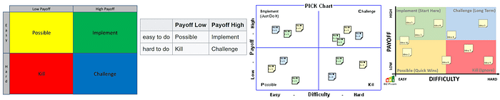
- Vertical axis: Easy, Hard
- Horizontal axis: Low Payoff, High Payoff
PICK stands for the categories that emerge in the quadrants: Possible, Implement, Challenge, Kill. This has the same effect as the Impact vs. Effort grid, with the additional benefit of categories that are easy to remember.
Risk vs. Return
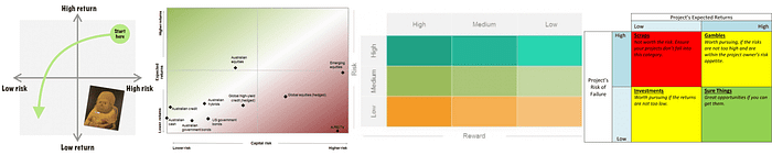
- Vertical axis: Return on investment
- Horizontal axis: Risk level
A great choice, especially when working in a risky area (compliance, reputation, etc.) Will Lord offers this matrix to help managers assess where they can maximize value to the business while having an awareness of whatever risks may be involved in the roadmap.
RVCE Matrix
- Vertical axis: Risk
- Vertical axis: Cost
- Horizontal axis: Effort
- Horizontal axis: Value
This unique matrix on the list uses two vertical axes and two horizontal axes. While we would often use cost and effort synonymously, this model breaks them up. This is also one of the few methods on this list with a risk factor.
Business Value, Effort, Risk
- Vertical axis: Business value
- Horizontal axis: Effort
- Bubble size: Risk
Airfocus wrote up some example use cases years ago. They utilized bubble sizing to make a 3rd dimension available for assessing priorities. Of course, this is similar to one of the most common matrices, Value vs. Effort. However, adding Risk into the equation can be helpful when risk management is a particular concern.
Value, Likelihood, Effort
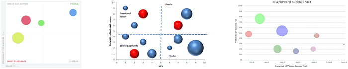
- Vertical axis: Probability of success
- Horizontal axis: Value
- Bubble size: Person months allocated
Another Value/Effort chart but with the added benefit of confidence or success probability. This is a great way to really challenge the ROI claim considering real-world factors of any kind, from team efficacy in a certain technology to competition or market conditions.
Kano Model
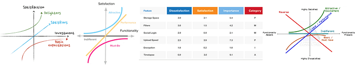
- Vertical axis: Satisfaction
- Horizontal axis: Functionality/Investment/Fulfillment/Sophistication/Realization of customer requirements/Implementation/Degree of achievement
Pronounced "kah-no," there is more to the Kano model than this diagram, and there are different ways folks use this diagram. It can help teams think beyond churning out features in a roadmap and consider which features will have the most bang for the buck for customers.
Importance vs. Satisfaction
- Vertical axis: Importance to the user
- Horizontal axis: Satisfaction with current solutions
Shubhi Vashistha shared this matrix in March 2022. The article is worth a read. Check it out! I disagree with where she says to focus, however. I would suggest focusing on the Opportunity quadrant, where Importance is high, but User Satisfaction is low. Of course, it will depend on your objectives at the time.
Build, Partner, Buy
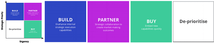
- Vertical axis: Strategic priority
- Horizontal axis: Urgency
Perhaps less about prioritization and more about general decision making and resource allocation, The Framework Bank points out the all too familiar Build or Buy decision and offers this tool for the challenge.
Gusto Prioritization Matrix

- Vertical axis: Customer impact
- Horizontal axis: Expected to Unexpected
Take a stroll down Customer Obsession lane and set aside resourcing constraints and politics, and check out what an innovative roadmap could look like if effort and complexity were not in the way. All ideas will fit into one of the 4 quadrants: Must have, Wow, Neat, Who cares.
How, Now, Wow
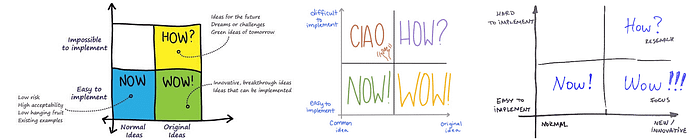
- Vertical axis: Complexity (easy to impossible)
- Horizontal axis: Novelty
The How/Now/Wow 2x2 is similar to the Gusto matrix above. Expected vs. Unexpected (Gusto) is similar to the Novelty axis here; however, the Impact axis of Gusto is replaced with Implementation Complexity. Try this one if you want to stand out in the market but balance the level of effort.
Eisenhower Decision Matrix / Covey's Quadrants
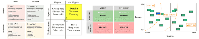
- Vertical axis: Importance or Impact
- Horizontal axis: Urgency
The nice thing about this one is that not only can it help with features, risks, or projects — but also for day-to-day tasks. Covey's Priority Quadrants is another version (simply reversed) in case you happen to run into that one. Impact vs. Urgency is another version where the quadrants turn out pretty much the same in the end. If you have an Eisenhower matrix with many items in multiple quadrants, check out this related ABC exercise as a secondary sorting process to make sense of a busy 2x2. High Medium Low is another way to think about the quadrants in an Eisenhower matrix.
PMAT / Big Bet, Home Run, Small Win
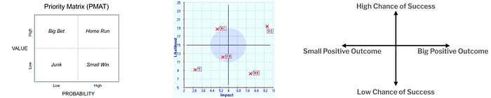
- Vertical axis: Value/Impact
- Horizontal axis: Probability of success/Likelihood
Dubbed the PMAT (Priority Matrix) and related to PRISM method, PMs can use it to determine where they can add the most value. This grid points out those that are most important but have a greater chance of failing and need more focus.
Market Newness vs. Product Newness
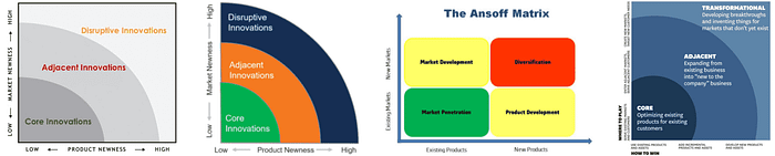
- Vertical axis: Market newness (How established is the market)
- Horizontal axis: Product newness
This one is a bit different in that it uses bands rather than quadrants. The bands are "Core innovations," "Adjacent Innovations," and "Disruptive Innovations."
Called the "Innovation Ambition Matrix," Roman Pichler adapted this priority ranking tool from Bansi Nagji and Geoff Tuff's work in his book Strategize. It is based on the Ansoff Matrix from Igor Ansoff. In this case, "Product newness" and "Market newness" (How established is the market) are your axis labels.
Problem Definition vs. Domain Definition
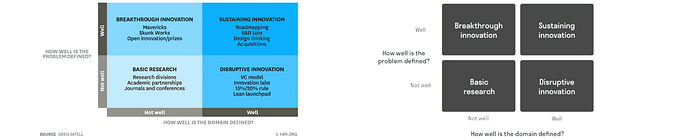
- Vertical axis: How well is the problem defined?
- Horizontal axis: How well is the domain defined?
Perhaps the problem is obvious, but the path forward is not because of constraints in the team or whatever else. This product development framework can help identify gaps and opportunities for your team in particular and what kind of activities are most applicable for moving forward.
Business Goals vs. Degree of Change
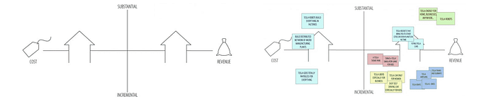
- Vertical axis: Incremental to substantial change
- Horizontal axis: Reduce cost to increasing revenue
After filling in this 2x2, you'll aim for the two quadrants in the top half. The idea is to shoot for significant change (top two quadrants) and choose to reduce cost (left) or increase revenue (right) depending on business goals.
Time to MVP vs. Market Differentiation
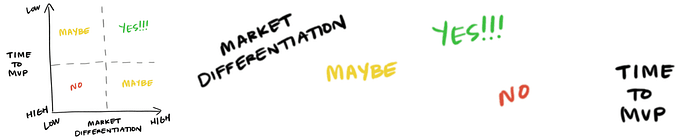
- Vertical axis: Time to MVP
- Horizontal axis: Market differentiation
How fast can you move, and how much will your feature stand out? Although it is not the article's main point, Sarah Gibbons uses this no-nonsense prioritization matrix as a unique example.
Market Attractiveness vs Ease of Implementation
- Vertical axis: Ease of Implementation
- Horizontal axis: Market Attractiveness
Here, the good ole Impact/Effort matrix meets Market supply, demand, and competition considerations.
Read more: Powernoodle.com
Market Impact vs. Tech Newness

- Vertical axis: Market impact
- Horizontal axis: Tech newness
Like the first innovation matrix above, keeping the market factor but pivoting from "Newness" to "Impact" seems to strike a good balance. Instead of only looking at doing something new, do something new that is meaningful and makes a difference in your target market.
Market Differentiating vs. Mission Critical
- Vertical axis: Market differentiation
- Horizontal axis: Mission-critical level
This matrix values standing out and providing a unique value while balancing this with the team's vision for their product or project.
Read more: Cash LeBrun
McKinsey prioritization matrix
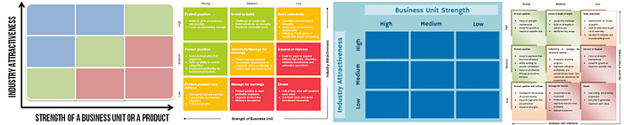
- Vertical axis: Industry attractiveness
- Horizontal axis: Strength of business unit or product
Industry attractiveness and Strength of the product are determined by a scoring prioritization exercise. This is one of the more complicated models and is used more in the consulting world.
Purpose Alignment Prioritization Model (AKA Nickolaisen Model)
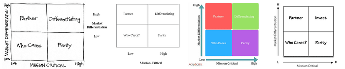
- Vertical axis: Market Differentiation
- Horizontal axis: Mission Critical
If market share is the game, Nickolaisen Model is the name. As with any good 2x2, aim for the upper right, where you'll be differentiating in core areas and gaining market share in your sector.
BCG Prioritization
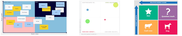
- Vertical axis: Market growth rate
- Horizontal axis: Relative market share
- Bubble size: Allocated resources
Also called the Boston matrix or the growth-share matrix, Boston Consulting Group created this template to help understand a project's potential on a roadmap to increase market share and grow the business.
4 Dimensions!
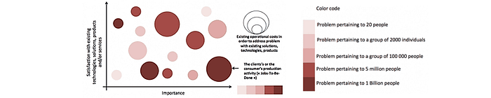
A 2x2 on steroids with two additional dimensions added as colors and bubble sizes. Got some time and need to make a splash? This innovation chart from Guillaume Villon de Benveniste leverages a whopping four dimensions in an easy-to-read scatter plot style chart. One fascinating factor is Satisfaction with existing solutions.
How many, How Often

- Vertical axis: Amount of time users engage
- Horizontal axis: Number of engaged users
Will Lord points out this diagram to help product managers assess a problem's priority in the overall picture. This chart could also serve as a strong communication tool to stakeholders who may not appreciate being told no.
Value Mapping from Intercom
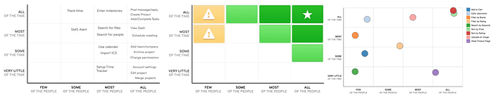
- Vertical axis: How often customers will be using the feature (Very little, Some, Most, All of the time)
- Horizontal axis: How many customers will be using the feature (Few, Some, Most, All)
This is a more structured 4x4/16-box grid version of the "How many, How often" chart. The Intercom Value Mapping approach has a similar axis but breaks up each axis into four levels. If you don't have the precise numbers on hand, this could be a good alternative to quickly get a helpful view.
Red Routes Matrix
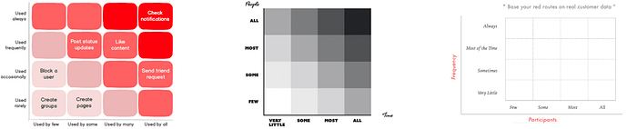
Red routes, as designated by red lines on the streets of London, are the most frequent routes by travelers. This framework from the UX design world brings this idea to product development. This visual map of features and actions that users engage with inside your product can help make more informed decisions on where to spend time investing or where to divest or sunset altogether.
Disruption vs. Visibility Bug Prioritization
- Vertical axis: Disruption/Impact on user experience
- Horizontal axis: Visibility
This bug prioritization framework from Hannah Catania could be a good customer-centric option for PMs where UX and a brand reputation are critical. This one may also help make quick decisions with more qualitative issue prioritization criteria than the above Value/Cost matrix.
Incident Priority Matrix
- Vertical axis: Impact
- Horizontal axis: Urgency
There are several different versions of the Incident Priority Matrix that can be helpful for issue prioritization or IT requests. These will help guide a user in selecting the right priority classification based on the expected impact on users and urgency.
Nine-box Matrix Updated
- Vertical axis: Customer pain
- Horizontal axis: Team efficacy
The nine-box has been used for decades in prioritizing investment in business units or personnel. Eleanor Stribling, however, introduced a way to use a grid with nine boxes in product management by changing the axes. The nice thing about the nine-box is that it adds granularity to the 2x2 in a structured way, but it's still straightforward.
Vision, Sustainability
- Vertical axis: Vision fit
- Horizontal axis: Sustainability
Once a vision and strategy are set with a list of opportunities to consider, this view helps businesses understand how they can balance managing risk with pursuing their long-term vision.
Business Strategy Prioritization

- Vertical axis: Strategic fit
- Horizontal axis: Feasibility
- Bubble size: Economic impact/Value
One of the few on this list to include a strategic alignment piece, this chart is a solid one. It's missing an estimated effort, but feasibility could cover some of that depending on how the user defines it.
House of Quality matrix in Quality Function Deployment (QFD)
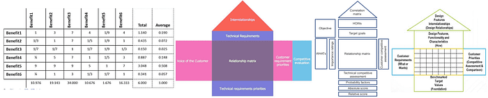
I've seen this show up multiple times in product prioritization contexts in blogs. Although it looks cool, I highly doubt this is ever really used in product management prioritization. It is not traditionally used for prioritization; rather, it is a complex development and design framework.
I wanted to share this article specifically (section: Application in Portfolio Management), however, since it seems to offer a prioritization spin on QFD with a series of scoring matrices using the 1–9 AHP scale.
Business Goals vs. Customer Value

Thiago Brum shared this 2x2 framework that looks like a simple impact vs effort chart at first, but it doesn't include effort at all. This one is simply balancing how much customers would like it and how valuable it would be for the business.
Jeanette Fuccella's Research Prioritization

Made by a user researcher, but for me as a Product Manager, I love this as a way to simplify decision-making when moving quickly and needing to get value to the business as fast as possible. If the improvement fits in the upper left, just move.
MoAR
MoAR stands for Metrics over Available Resources. Related to ROI, this ratio is more versatile — allowing for any metrics/leading indicators to be used (not only Revenue) and more specificity when it comes to Investment.
Read more: UserPilot.com via Dragonboat
Prioritizing with scores and weighted scoring
Bang for the Buck
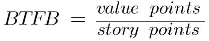
Formula: BTFB = value points / story points
The Bang for the Buck score is simple and related to one of the most popular frameworks — impact/effort. In this case, we will specify that story points are the measure of effort. Calculate value in whatever way works for you and your team.
Read more: codetiburon.com
RICE
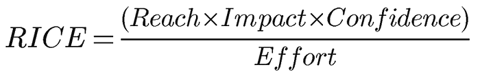
Formula: RICE Score = (Reach * Impact * Confidence)/Effort
What is the RICE method for prioritization? Created by Intercom, RICE is a simple formula and easy to remember. Reach is the number of people who will be exposed to the project or feature in a period. Impact is a rating from 0.25 to 5 (0.25 minimal impact, 0.5, 1, 2, 3 massive impact). Confidence is also a set range of values: 50%, 80%, 100%. Effort is person-months.
Read more: Intercom | RICE Family of frameworks
SU-RICE
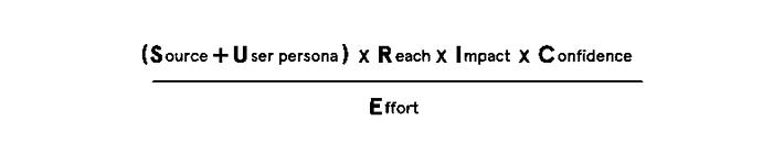
Anup Sheshadri records their SU-RICE prioritization score on Youtube, which involves two additional inputs. Those new "SU" factors are Source and User Persona. He suggests setting up a new list for each that is relevant to your problem space and setting a weighting scale for each. This scale is totally up to you. Anup walks through an example in the Youtube video, so check it out!
See more: ProdUP
Minute RICE
Minute RICE is another RICE prioritization framework. It is similar to the score above but it uses a simpler calculation for easier guesstimation. Reach (1–10), Impact (1–10), Confidence (1–10), Effort (1–10). If you really want to go nuts and have them already, use Fibonacci story points for Effort.
The biggest problem with RICE is how unnecessarily complex it is. Each criterion (Reach, Impact, Confidence, Effort) requires a different method to calculate it. A good prioritization framework should be simple, so if you choose to go with a quantitative formula type method, remember that it will be wrong no matter what, and keep it simple.
LRICE
Ashwith Atluri wanted to use RICE while acknowledging the milestone plan they had to work with. To do this, Atluri added an additional multiplier of "Launch". If you have 4 launch dates on your radar, the nearest milestone would have a value of 4, the one after that would be 3, and so on.
(Launch value * Reach * Impact * Confidence) / Effort
Weighted RICE
Nida Khan- Passion for QUALITY PRODUCT shares a new spin on RICE where they ditch the scores and stick to concrete numbers. Also, Nida introduces weighting for Reach, Impact, Confidence and leaves Effort out completely.
Recommendation: Only apply the Effort factor when data-driven prioritization has been done . . . no matter how much effort is needed we must prioritize that task.
My interpretation is that Effort is used only in cases of tie-breakers.
ICE
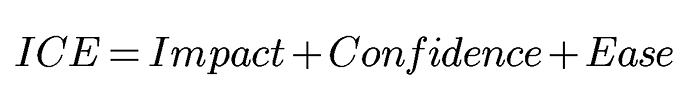
Formula: ICE Score = Impact + Confidence + Ease
What is ICE prioritization? ICE is a simple formula for prioritizing features or product backlog items. It uses Impact, Confidence, Ease on a scale from 1 to 10.
Assuming the Impact rating, in this case, can also take into account "Reach" which is lost from RICE scoring, then there isn't much difference. It is perhaps a bit more subjective since each category is a 1–10 value. Since 3 out of 4 of the RICE categories are subjective, I am not sure it really matters.
Read more: productfolio
ICE
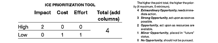
Formula: ICE = Impact + Cost + Effort
That's right, there is a second ICE score floating around the internet. They are actually quite different. Here, C stands for Cost. Also, the calculation is very different. Impact can be either 0 or 2, Cost is either 0 or 1, and Effort is 0 or 1. This way Impact is weighted heavier than the other two. The maximum score being 4 would make this difficult to use for a larger list of features or ideas.
Read more: mmsonline.com
BRICE
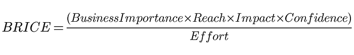
Formula: BRICE Score = (Business importance * Reach * Impact * Confidence)/Effort
Thanks Kasey Kaplan, for the clever way of introducing strategic goals/importance into the popular RICE formula!
Read more: Medium (Kasey Kaplan)
LICE

Formula: LICE score = Lead quality + Impact + Cost + Effort
This is a more advertising/sales-focused approach from Josh Pigford, where Cost and Effort are separated into separate categories. Also, "Lead quality" is a unique factor among prioritization frameworks in this article. However, this could be helpful to PMs who do encounter different Cost and Effort concerns. As for "Lead quality," this could easily be adjusted to account for more use cases by changing "Lead quality" to "Evidence quality" or "Confidence."
Read more: Baremetrics
DIE
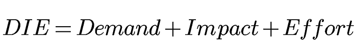
Formula: DIE Score = Demand + Impact + Effort
Could a prioritization scoring system get any simpler than RICE and ICE? Yes. In this case, the idea is to select a number between 1 and 5 for each of the three categories across all of your ideas. Demand is a nice angle since it forces a customer-centric/market consideration.
Read more: baremetrics | Atlassian
PIE prioritization
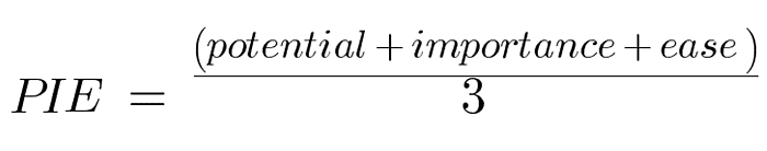
The PIE score is the average of 3 scores — Potential, Importance, Ease. The higher the score, the higher the priority. With potential and importance being two separate categories, importance could serve as a strategic alignment category. The main difference between other simple scores like RICE, ICE, etc. is the absence of a confidence factor.
Read more: widerfunnel.com
Task Score
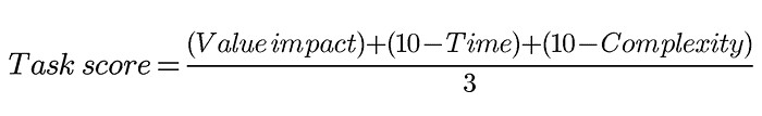
Formula: Task Score = ((Value impact) + (10 -Time) + (10 -Complexity))/3
Startups.co shared this back in 2007. It's made up of 3 scores, which are given a value between 1 and 10. The output is the sum of these numbers divided by 3. The higher the score, the higher the priority. Piece of cake.
Read more: Startups.co
BUC
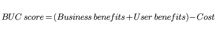
Formula: BUC score = (Business benefits + User benefits)- Cost
With each of the three categories — business benefits, user benefits, cost — is a value from 1–10, sum the first two and subtract the cost. After doing this for each item, sort from highest to lowest.
Read more: productmanagementexercises.com
BREaD
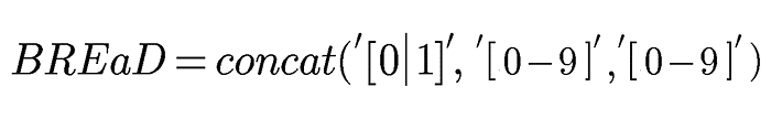
Formula: BREaD = [Blocker, 0 or 1][Revenue/Effort normalized][0–9 relative accumulated Delay since request]
Lost? This took me a second to wrap my head around, but I like it now! This is a bit different from others on this list. I am not sure how to write it mathematically… where these three inputs are essentially concatenated together (not multiplication) to form a three digit number then used to stack rank items (as usual).
Read more: Medium
TIR (AKA Bryan Eisenberg Rules)
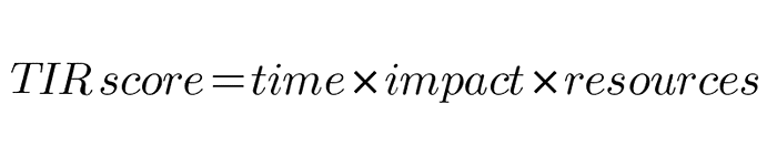
Formula: TIR = Time * Impact * Resources
Also referred to as the "Bryan Eisenberg rules," this is a simple score similar to a basic impact/effort scoring but will guarantee that speed of implementation is given weight. Each factor in this product management scoring framework is graded on a scale from 1 to 5. So this might be a good method when the time to market is a priority.
Read more: endlessagain.com | Bryan Eisenberg
Raveesh Dubey's Resource Availability Priority Score
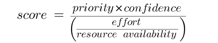
Formula: score = (priority * confidence)/(effort/resource availability)
Raveesh Dubey wrote about their score in detail in 2020 but left it unnamed. Raveesh tells about how they wanted to emphasize resources available, which are left unreviewed in most popular frameworks.
The priority input comes from a weighted scoring framework with a number from 1 to 100. Confidence is a percentage. Effort is between 0 and 1. Availability is also a percentage.
Read more: Raveesh Dubey
Value, Cost, Risk Scorecard
Formula: Value/Cost with a secondary ranking for tie-breakers
Initially, this is simply an impact/effort formula which is probably the most common prioritization scoring technique (referenced above as a matrix).
However, such a simple formula with a 1–10 or 1–5 scale can often result in ties. This author suggests an interesting tie-breaker where value is ranked and the cost is ranked; these two ranks are summed, and from there the lowest number would win. Check out Pavel's Google Sheet calculations.
Read more: Pavel Averin
Weighted Scores
There is no one right way to use a weighted score. This is where you can really tweak a system to your team, organization goals, or product. Use whatever factors are important to you as a product manager. They can be as simple or as complex as you like. Here are some examples of weighted scoring systems:
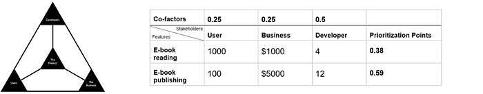
- Product Manager Triangle: Based on the Product Manager Triangle, Sankalp Madaan suggests this one, which focuses on stakeholders: Users, Business, and Developers.
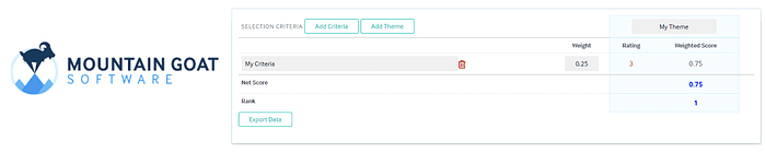
- Choose your own themes: Mountain Goat Software offers this calculator where you can enter any important themes and apply any weight to each of them.
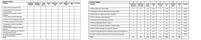
- Karl Weigers Relative Weighting: This one is a bit more complicated but well defined. It has been around since the 90s. Mountain Goat Software also has a handy calculator tool. Karl WeigWeigers'ative Weighting is a comprehensive approach to assessing priority with Value, Cost, and Risk.
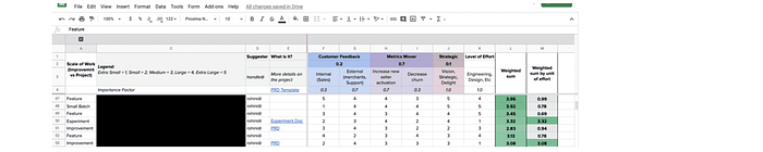
- Modified three feature buckets: Rohini Pandhi, inspired by Adam Nash's Feature Buckets, tweaked the buckets and added weighted scoring. She employs Customer Feeback, Metric Movers, Strategic buckets accompanied with Effort.
- Customer Satisfaction, Business Value, Cost: Although there are endless ways to build a weighted score, I thought this one warranted a shoutout. Agiledigest.com published a thorough article making a case for some specific criteria and sharing a walkthrough of the process.
- Priority Assessment Framework: Michal Wozny has shared a scorecard method that leverages Impact/Effort but also pulls in requirements and stakeholder satisfaction. Weighting is an option that works well here to place more importance on certain requirements or stakeholders.
ROI Scorecard

Formula: ROI = Value/Effort
This is basically a score and table version of the Impact vs. Effort matrix above. Take a list of ideas/features/problem statements. Add a column for value or your impact currency of choice and effort (days, sprints, devs, hours, story points, etc.). Do the math! Simple.
Read more: Open Classrooms
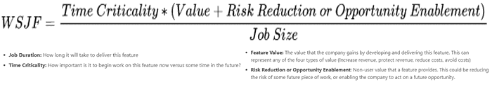
Weighted Shortest Job First (WSJF or CD3)
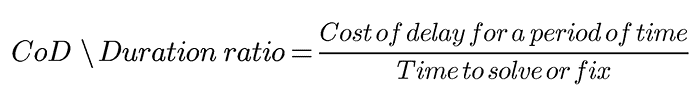
Formula: CD3 = (Cost of Delay for a period of time) / (time to solve or fix)
What is WSJF?
WSJF stands for Weighted Shortest Job First, and it refers to a method for prioritizing work based on a formula. The score is calculated by dividing the cost of delay for a period of time by the time to complete the work.
Sure we can look at a problem or list of problems and their impact on the business, but that isn't very helpful in roadmap prioritization unless we weigh the cost of solving each problem. By creating a ratio between the impact of the problem and the resources needed to fix it, a product manager can prioritize in a way that makes more sense.
Read more: SAFe | OpenClassrooms
Shortest Item First (SIF)
SIF or WSIF (Work Shortest Item First) is a one-dimensional prioritization method where the item that takes the least amount of time gets worked on first.
Read more: Beyond20.com
Longest Item First (LIF)
LIF is the opposite of SIF. It means Longest Item First. This is not very normal and would be pretty narrow-minded to use as a product manager. Perhaps this could be helpful as a part of a larger score or for very specific types of work.
Read more: Beyond20.com
Monster prioritization
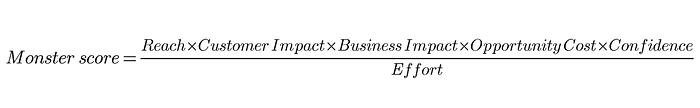
Formula: (Reach * Customer Impact * Business Impact * Opportunity Cost * Confidence) / Effort
Structured similarly to the RICE prioritization framework but with some improvements, Gabrielle Bufrem offers the Monster prioritization. They split Impact into two separate buckets — Business Impact and Customer Impact. The formula also adds Opportunity cost to help us move quickly.
Read more: Monster prioritization
Remco's Prioritization
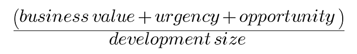
Formula: (Business Value+ Urgency+ Opportunity)/Dev size
Remco Magielse wrote about this formula in November 2019. It uses the Fibonacci sequence up to 21 for business value, urgency, and opportunity. Development size/effort uses the number of sprints for simplicity since this is what his teamed used at the time
Read more: Start It Up
WSJF Arnold Mod
Like the other WSJF inspired formulas, the Arnold method comes with the ability to account for time sensitivity. In addition, this scoring technique includes Risk in the mix.
Read more: Coda.io
5-Pillar-Prioritization-Framework

Formula: Reach + Customer Impact + Business Impact + Validation + Ease
Felix Gerlach has shared this one, and it is effortless. Each category is given a value from 1 to 10. They are all added up. Then the higher the score, the higher the priority. In the article, Felix also recommends weighting as needed (although I did not include this in the separate list of weighted scoring techniques).
Read more: The Startup
Coverage, Magnitude, Cost

Formula: CMC score = (Coverage * Magnitude) / Cost
This is a nice straightforward framework that makes a lot of sense. I see this one sitting next to the familiar RICE score and ICE, where we are dropping the more subjective "Confidence" factor. From the author, "Generally, the more complex the model, the costlier it is to maintain. It helps to make everything as simple as possible, but no simpler."
Read more: Medium
EFQ
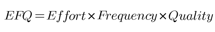
Formula: EFQ = Effort * Frequency * Quality
Vamsi Narla writes about this in Design Bootcamp, where each factor is on a scale from 1 to 5 or something similar. Vamsi recommends a scale of 3–5 values, and that is a nice point — that there is some flexibility here.
Read more: Design Bootcamp
Turn Ideas Into Products Questions

Count up the number of yeses to these questions for each feature or project:
- Innovation: A new way of solving a customer problem (yes/no)
- Customer need: Most of our customers need this (yes/no)
- New revenue: This will enable us to generate new revenue (yes/no)
- Losing deals: We lose deals because we lack this solution (yes/no)
- Product parity: Most of our competitors have this capability (yes/no)
- Increases renewals: This will improve recurring revenue and/or renewals (yes/no)
- Reduces costs: This will reduce our internal costs (yes/no)
- Dissatisfaction: Customers are dissatisfied with the current solution (yes/no)
- Expertise: We have the expertise to deliver this (yes/no)
- Easy to deliver: This is somewhat easy to deliver (yes/no)
- Prerequisite: This is core functionality necessary for other stories (yes/no)
Read more: Reddit | Turn Ideas Into Products
Expected Value
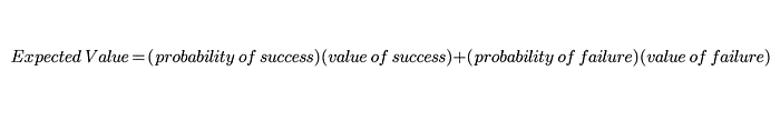
Formula: Expected value = (probability of success)(value of success) + (probability of failure)(value of failure)
As the saying goes, "All models are wrong, but some are useful." As product owners and product managers, we know our estimation of all things is wrong (value, impact, effort, risk, etc.), but we do not know how wrong or where our calculation is most inaccurate.
Read more: The Black Box of Product Management
Opportunity Score
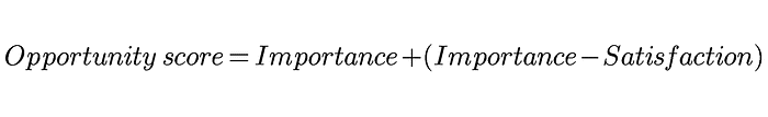
Formula: Opportunity = Importance + (Importance -Satisfaction)
Focused on innovation, Anthony W. Ulwick developed this formula as part of his Outcome-Driven Innovation (ODI) process aligned with the Jobs to be done concept.
Read more: Wikipedia
BACER

Formula: BACER = (Business impact * Customer Adoption * Customer value * Probability of Result) / Effort
Rahul Malik brings this one to the community. The name comes from the Hindi बसर, which means vision. There are many similarities to RICE, assuming Customer Adoption could be represented in RICE's Reach.
Read more: The Startup
Risk-Based Prioritization

Formula: Risk Score = Risk Impact * Risk Probability
Heavy on the risk and testing side of things, this simple formula uses the Impact of failure in production and the probability of failure in production. Each is measured on a scale from 1–3, making the range of the total score for each feature 1–9.
Read more: luxoft-training.com
Pugh Matrix Theme Screening

The Pugh Matrix originated in Six Sigma (AKA Theme Screening or Prioritization Matrix or MCDA Multi-Criteria Decision Analysis). The most interesting part of this method is the idea of a "baseline" theme. We are all familiar with breaking up work to align to strategy pillars and OKRs, but there is a "baseline" theme in this case. In addition to the potential work items being prioritized. The ideas will be scored based on how they align with the secondary theme in relation to the baseline theme with three options for the product manager (0, -1, +1).
Read more: whatissixsigma.net, rndtoday.co.uk
Evidence Score
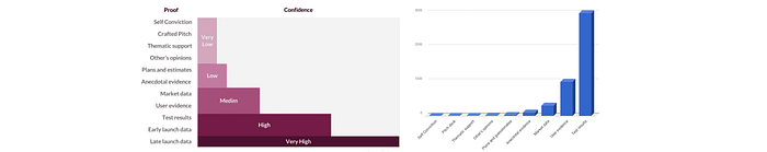
Not all observations are created equal. Itamar Gilad lays out an excellent guide to different types of evidence that product managers or requestors can tie to a business idea. With a series of suggested categories and scores, product folks can be armed with a way to quantify evidence and challenge stakeholder ideas and their own convictions and hunches. Ultimately, this leads to increased confidence in prioritized items.
Fu Fei has also written about evidence scoring and has his own proposal for the types of evidence and their weight.
Read more: Itamar Gilad, Fu Fei
IDEA/E scoring
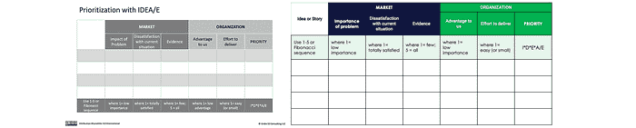
Formula: IDEA/E = (Impact of problem + Dissatisfaction with current situation + Evidence + Advantage to us) / Effort to deliver
Thanks to Steve Johnson for this one. I really like it. It captures some of the more interesting missing factors from other models. We rarely see the level of satisfaction with the current solution included. "Advantage" here does leave room for strategic alignment as well. A lot is captured in a simple framework. Bravo!
Read more: under10consulting.com | roadmap.com
CUP Method
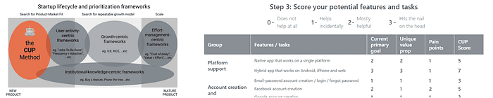
Formula: CUP = Current primary goal alignment + Unique value prop alignment + Pain points
Designed specifically for entrepreneurs and building innovative products, Can Babaoglu created the CUP method. This could be a great fit for startups or entrepreneurs wanting to make a splash on the roadmap with limited data. Can has a detailed guide to get you started.
Read more: cupmethod.com
GUT
Formula: GUT score = Gravity * Urgency * Tendency
JB shared the GUT Matrix which includes some novel prioritization criteria. Gravity is basically how bad the problem is. Urgency is how time-sensitive the problem is. Tendency is how likely the problem is to worsen if left alone.
Each is scored on a scale from 1–5 and multiplied so that 125 is the maximum possible score for any individual item. The highest score wins the first priority prize.
Decision Diamond
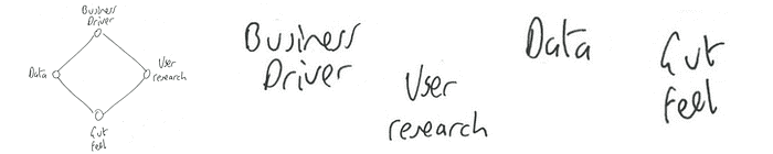
Formula: Decsion Diamond score = Business Driver [1|0] + User Research [1|0] + Gut Feel [1|0] + Data [1|0]
Mr Joe Leech brings us the Decision Diamond. Super simple. Answer yes or no (0 or 1) whether you have each of the four supporting points. Do the item that has all four first, then 3, then 2…
Read more: Mr. Joe Leech
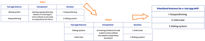
Pairwise Comparison Matrix
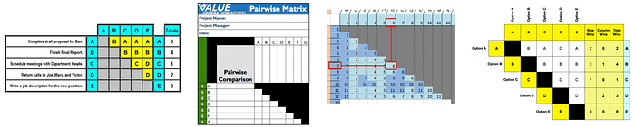
Also called the "Paired Comparison Priority Matrix," the age-old method of ranking many items is incredible. When I first saw this, my mind exploded. It is so simple yet so profound. Line up the same items on a vertical and horizontal axis. Each item gets compared to the other. Check out the examples in the images and below to digest how the scoring works.
AHP (Analytic Hierarchy Process)
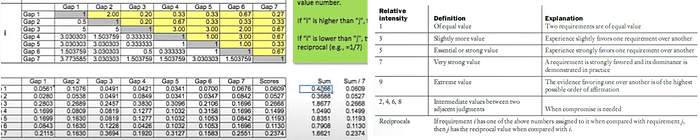
What is AHP prioritization? AHP is a more intricate framework developed on top of pairwise comparison. AHP is one of these techniques where you'd probably want some prioritization software because it is so intensive. The process starts with a pairwise comparison. The entries made during this process are actually at different intensity levels. For example, 1 for equal value when comparing the two options — 3 for slightly higher value — 5 for much higher value, etc. This ultimately leads to a scientific and well-respected way of ranking items and understanding how much more of a priority one is versus another. A Minimum Spanning Tree can be used within this standard AHP process to reduce the number of comparisons needed.
Read more: this video will make it all clear | Article | Thomas Saaty
Hierarchy AHP
AHP has a problem with larger numbers of comparisons. For example, only ten requirements or features would require 45 comparisons! Hierarchy AHP was introduced, so only items at the same level are compared — rather than comparing all items to each other. So broader things are at a higher level while more specific things are at a lower level in the AHP hierarchy.
Read more: Article
Prioritization Eye Test
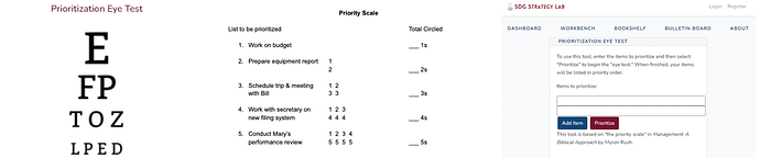
Russell McGuire shares this method apparently from a 1980's book by Myron Rush. The Priority Scale, or as McGuire sees it — a Prioritization Eye Test, guides the user through a rubric-style scorecard. If you're getting overwhelmed while stack ranking your list of items, this Prioritization Eye Test could be just the thing you need to get over the hump. There's a handy prioritization software tool for this also! Russell McGuire has built a nice tool at SDG Strategy Lab to help people use it today.
Value-Innovative Requirements Engineering (VIRE)

A team at Korea University proposes this in-depth, multi-step framework for companies seeking blue ocean prioritization strategies. The process starts by surveying customers along with goal prioritization and definition, then helps discover solutions and prioritize them with customer value at the center. Check out the whitepaper!
Tournament Bracket
Mainly surveying users/stakeholders or conducting market research on large numbers of features or requirements — TRC has introduced a bit of sport into product management with their bracket method.
Read more: TRCMarketResearch.com, Other TRC Prioritization Articles
Impact Estimation Table
Tom Gilb has pioneered this concept involving quantifying the intangible. How can we quantify things such as user experience, fruit, or even love? Gilb teaches that we can begin to quantify complex or even intangible problems and opportunities using decomposition. The Impact Estimation Table is a priority ranking tool to process the decomposition and quantification of value (or "impact"). It is an interesting and useful tool for the prioritization of multiple broad, complex, or even qualitative problem spaces.
Special thanks to Niels Malotaux (malotaux.eu) and Mario Lucero (agilelucero.com) for raising this one.
Learn more from Tom Gilb: Impact Estimation Tables Doc, TEDx Talk, Keynote talk, Campfire talks with Herbie
PXL
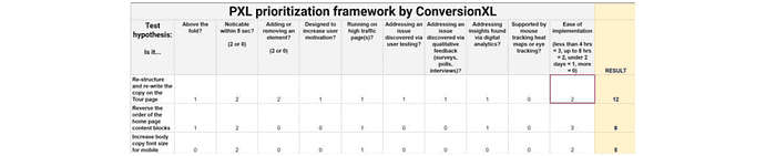
This scorecard comes from ConversionXL. This unique prioritization scoring technique revolves around UX considerations.
Is the change above the fold? Does it align with user testing findings? Questions like these are used to score an idea in terms of user impact and user-based evidence — qualitative and quantitative.
For PMs working with UX and User Research and looking for ways to integrate those learnings into their prioritization process, this framework could be a fantastic place to start.
Read more: CXL.com
Hotwire prioritization model
Pauline Marol, Head of Product at PlayPlay, shared a framework her team used when she was a PM at Hotwire (an Expedia Group travel brand). Since then, it has been dubbed the "Hotwire model" on multiple blog posts on the net. This is another rubric-style method and uses binary grading on a variety of categories. It strikes a nice balance between user impact, strategic alignment, and business impact. This one is a great example of how PMs can create their own custom frameworks that work for their team, organization, and stakeholders.
Monetate
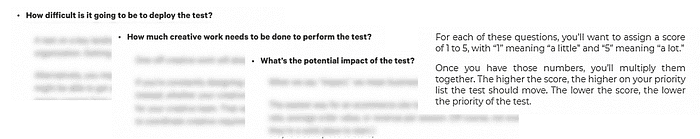
Back in 2014, an A/B testing platform now owned by KIBO, published a basic method to prioritize tests. Answer 3 questions with a score from 1–5. Multiply those numbers. The higher the score, the higher the priority.
- How difficult is it going to be to deploy the test?
- How much creative work needs to be done to perform the test?
- What's the potential impact of the test?
Read more: Monetate.com | web.archive.org (in case other is redirected)
Day's Questions Model
Inspired by three questions posed by George Day, the author of this Credera article proposes turning these questions into a scoring rubric.
- Can we win?
- Is it real?
- Is it worth doing?
VIDEO
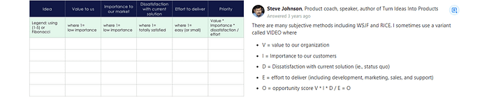
Formula: VIDEO score = (Value to us * Importance to customers * Dissatisfaction with current solution)/Effort = Opportunity
Steve Johnson has contributed multiple scoring prioritization methods over the years. This one. Steve's techniques always include the level of satisfaction with the current solution, which stands out from the rest of the prioritization landscape.
Read more: under10consulting.com | Quora
ASPIRE + SOAR
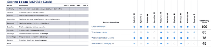
This one is another great model from Steve Johnson. It includes some important strategic elements while balancing complexity and how well-positioned the team is to execute. The scoring is simple. Use 1s and 0s and add up the total.
Read more: under10consulting.com | Quora
User Value Scorecard
Fu Fei proposes the User Value Scorecard, which uses three prioritization criteria that are all centered on the user. Those three are Effect (number of users impacted), Frequency (how often will users engage or how often is it a problem), and Importance (how relevant is this to the user's painpoints). Each of these are rated on a scale from 1–10. The final stack rank would be determined by the sum of each, where the higher the number, the higher the priority.
Fu also advocates for assessing confidence/amount of evidence as well as the development cost.
Read more: User Value Scorecard
HIPE
Initially, I didn't see this as a prioritization framework, but this acronym from Jeff Chang could be a solid contender as a simple prioritization tool.
HIPE stands for Hypothesis, Investment, Precedent, Experience. Below are the different questions that Mr. Chang poses for each part of HIPE. Although he doesn't prescribe any specific way to apply HIPE, it's easy to see how these different pieces could be quantified (0 or 1, scale from 1–5, for example).
Hypothesis: Why will this idea have a significant impact on metrics? Investment: How much time will we have to invest in this project? Precedent: Is there a precedent for this working in the past? Experience: Is this change a good user experience
Read more: growthengblog.com
90/10
Ryan Kaufman sent this tip on Twitter. This isn't a formula out of the box, but could certainly inspire some easy quantitative techniques.
We've heard about the 80/20 rule. This is similar but a bit different. This time we are talking about 90% of the value to the customer (instead of 80% of the value). But the 10% is not about value at all. Look for solutions that can accomplish 90% of what the customer is looking for with 10% of the effort.
Desirability, Feasibility, Viability
This is another one where there are no set rules for exactly how to score it. Rate each on a 1–5 scale, 1–10 scale, binary, or something else altogether.
Artem Fedyurin wrote a great article on prioritization where he suggests questions to help process items for each of these categories.
Read more: Artem Fedyurin | David Tuite | Harsh Vardhan
Zeynip Cansu Yildirim
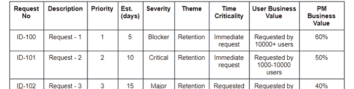
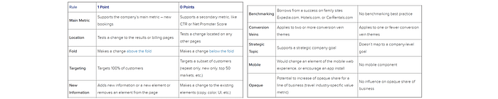
Zeynep shared this matrix on Medium. They do not prescribe any specific priority calculation but have offered a nice set of criteria to lay out for the decision-making process. While there is a lot here, I appreciate they were able to keep it lean. Notice the business value is a high-level one using rough percentages. The estimated days column is a nice touch, taking into account effort but also time and the cost of delay.
Read more: Zeynep Cansu Yildirim
UMed User Story Prioritization
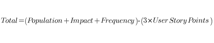
Akira Kakkar from UMed shares how they prioritize user stories. Frequency of use is a criterion that doesn't show up in this list of frameworks as often as you might think. In addition to Frequency, the 3x Story Points (effort/complexity) are also an interesting part that makes this UMed prioritization framework stand out from the rest.
Read more: Akira Kakkar on Medium
Spotahome Prioritization Framework
Not unlike RICE scoring, Spotahome's prioritization scorecard involves effort, confidence, and impact. This one is a bit different, however, and could be helpful for PMs who are looking for something that would output monetized estimates based on specific (and diverse) metrics across different features, projects, or initiatives.
Read more: Spotahome on Medium, Google Sheets Template
Sorting techniques that don't require any math
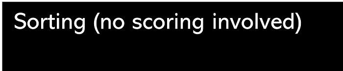
Here are some ways to sort items without needing to do any scoring. Because of the simplicity and intuitiveness, these could be good collaborative exercises to do with a few key stakeholders/partners, but they do not require a group.
Classification Rankings
Straightforward concept and very subjective. To be used in internal discussions only.
Read more: Folding Burritos | Stormotion | ScienceSoft
LIFO (Last In First Out)
Pretty simple. The last (latest, most recent) item added to the list gets worked on first. From a product management perspective, this is usually not the best way to prioritize work. But perhaps you have a certain track/swim lane where items come in and get picked up immediately.
Read more: Beyond20.com
FIFO (First In First Out)
The opposite of LIFO (Last In First Out), FIFO just prioritizes the first item that came up (or the oldest, earliest). For product managers, consider building in something that takes age into account as part of a custom score. Age may mean nothing to you, but depending on the team or product, this could be a relevant factor to consider and linked to delivering value for the business.
Read more: Beyond20.com
Priority Groups

Taking Classification Rankings one step further (and then more), Priority Groups was written about in 1998. Items are grouped initially into three broad groups — High, Medium, Low. We don't stop there, however. From here, each group is then divided into High, Medium, Low subgroups. Then again and again, potentially. The groups are continually split up until there is only one item per group. The stack-ranked priorities can be found by reading left to right.
Read more: Article
Bubble Sorting
What is bubble sorting? Bubble sorting is a simple and intentional way to stack rank ideas. By comparing two at a time and the loser of each round to the next, the most important features or ideas naturally "bubble up" to the top.
Read more: rubygarage.org
Binary Search Tree (BST)

Binary search tree is a sort algorithm that can be used intuitively to stack rank items. Start with any one item in a list as the first node. From there, each item is subsequently compared and placed as a child node on the left or right. If it is smaller/lower priority ranking than the parent node, the child is added on the right. If higher priority ranking — then it goes on the left. For each item assessed, start over at the top and follow the path down. The manager can read the items from left to right at the end.
This video was really helpful to follow.
Binary Priority List (BPL)

Binary Priority List or BPL is pretty much the same as the Binary Search Tree, but instead of placing items left or right (and reading from left to right in the end), BPL is simply top and bottom, which results in a stacked list in the end.
Read more: Article
Prioritizing using qualitative classifications, categories, buckets, themes, or whatchamacallits
These prioritization methods are qualitative and subjective. Consider using these before doing any in-depth qualitative analysis. Cut a larger list down, then re-prioritize. More qualitative methods like those in this list can also be helpful in group activities to reach a shared understanding. These are also great in problem prioritization — starting at the problem and opportunity level.
How do you categorize priorities?
There are many different ways to categorize projects or items in a backlog. The best one to use will depend on the team and product. MoSCoW is one of the most popular methods. There are many others, like Three Feature Buckets and 4 D's
MoSCoW
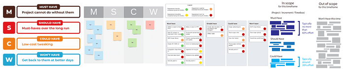
What is the MoSCoW prioritization technique?
MoSCoW prioritization is a popular prioritization method in product management where four buckets are established. The categories are: Must have, Should have, Could have, Will not have/Wish we could have. All items must go into one of these four groups. MoSCoW is a commonly referenced product management framework and is helpful for sifting through a large list quickly. You'll find a MoSCoW method template in tools like Miro and others.
Needs, Wants, Wishes
Mike Cohn is always sharing helpful insights on his blog at Mountain Goat Software. Thanks, Himanshu, for sharing on Twitter. Mike likes Needs, Wants, Wishes as an alternative to MoSCoW. Although it originated in budgeting and wealth management, I agree with Mr. Cohn. I see this framework tackling a few different challenges with MoSCoW. First, what is the difference between Should Have and Could Have? Secondly, the W is used inconsistently (Won't or Wish). Wishes take a stance, at least. What is a "must? What is a "need? This one won't help you there, but if you're looking for an easy, lean, bucketing prioritization tools other than MoSCow — Needs/Wants/Wishes could be a good option.
Wants vs. Needs
Incredibly simple. If you're looking for a group activity, this would be very similar to the In or Out game below in this article. Thinking with just two categories like Wants and Needs could be a good first step into MoSCoW, especially if you're working with a lot of items.
Read more: codechem.com
T Account for Prioritization

Subraya Mallya didn't provide a lot of detail when they shared the accounting-inspired prioritization framework. You're probably familiar with the T Account debits/credits chart from Accounting 101. In reviewing this, I wasn't clear if Mallya is actually putting numbers in here or simply writing in project names.
Planning Game
Kent Beck, in his 1999 book Extreme Programming Explained discussed this activity which is similar to MoSCoW, but the bucket definitions are certainly different.
In Planning Game, there are three categories:
- Critical features or requirements needed for the system to function
- Those that are not as essential but are important for the business
- Nice to have
Ideas are added to one of these buckets. Then simply ranked subjectively within each.
Read more: Article
70/20/10: proven, evolved, innovative
I noticed this one in an Indie Hackers article by James Fleichmann. James references a post by Mike Doom about a feature prioritization framework in gaming. The theme-based technique could be applied in other industries though as well. Mike Doom suggests structuring a feature backlog where 70% of features or work are "proven," 20% are "evolved", and 10% are "innovative."
3D Classifier Framework
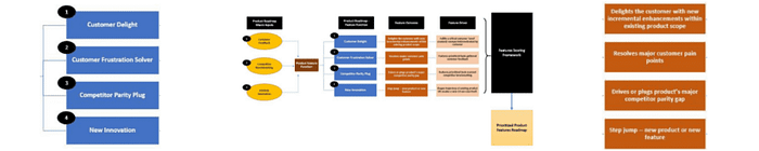
Kaustubh Agnihotri shares their framework, which includes inputs, processing through themes — perhaps inspired by Adam Nash's Feature Buckets — and prioritization. Kaustubh keeps the prioritization specifics as a secret sauce for now, but you can follow them on Medium to keep up on future articles.
The buckets here are Customer Delight, Customer Frustration Solver, Competitor Parity Bug, and New Innovation.
Wow, Neutral, Poor
Abinash Sarangi wrote about this one on Twitter. Abinash suggests assessing each of your experiences and features, classifying them as either Wow, Neutral, or Poor quality experiences. The goal then is to aim to improve each of them until they are at the next level.
data informed prioritization is important. The rule we follow is: any feature/experience either is wow, neutral or poor. 20% are wow, 20% poor, 60% neutral. The effort is to drive poor to zero and shift the neutrals into wow. Sometimes its just better UX, rethought scenario. — Abinash Sarangi
Now, Next, Later
I know, I know. We talked about using Now Next Later as a product roadmap structure. I also like this framework as a lean but meaningful prioritization exercise. Like all these classification methods, it will not get down deep to the "why."
Three feature buckets (sometimes 4)
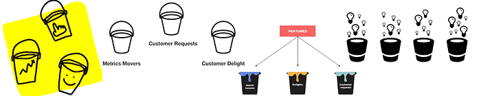
Metric Movers, Customer Requests, Customer Delight. I've seen a fourth bucket introduced sometimes, and that is Strategic. I support this.
Read more: Adam Nash
Candy, Vitamins, Painkillers
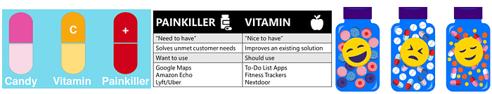
I've heard some people claim there is a write or wrong selection between these buckets. I disagree. I think prioritizing between candy, vitamins, or painkillers is a strategic decision depending on your goals.
4-UP

Greg Coticchia offers his categorization framework from his extensive experience. This method classifies different items as one of 4 categories: Clean UP, Catch UP, Keep UP, and Leg UP. Select based on the needs of the business at the time and consider combining it with a scoring or ranking technique to prioritize requirements within each category.
Read more: Greg Coticchia on LinkedIn
Easy Hard Expensive
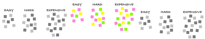
Read more: Article from Matt Homann
Hell Yeah or No
Shreyas Doshi throws cold water on your 15 part weighted scoring framework with this lean prioritization doozy that will blow your mind.
Crediting Derek Sivers, Shreyas tweets, "If it isn't a Hell Yeah, then it is a No… This advice applies to product prioritization: if you're working on a fast-growing product with a tiny team, this is likely the only work prioritization framework you need.
Check out the conversation on Twitter
Better/Faster Question
Cam Sload (@SloanCam) shared on Twitter, citing Peter Suhm (@PeterSuhm). Cam suggests asking the question, "Will building this help someone to use my product better/faster?"
For example, if the answer is a "big yes," we should have done this ages ago.
4Ds
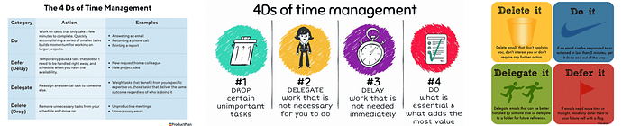
Similar concept to the Eisenhower matrix, where a traditional task/time management tool could also be leveraged for features, requirements, or projects for a high-level prioritization. The Eisenhower matrix would help someone actually reach these 4 D categories. The 4 Ds are Do, Defer (Delay), Delegate, Delete (Drop).
Ice Cream method

Get the scoop on the sweetest prioritization method out there. Justin Zack shares this prioritization technique using ice cream flavor! So when you find yourself on a rocky road, treat yourself and try this new framework, and watch your questions melt away.
If you're looking for something more quantitative, this one can always be a good base, from which you could sprinkle in more rigor if needed.
Chocolate symbolizes the work to keep the lights on or the table stakes. Vanilla is the bread and butter work that pays the bills. Strawberry is the fun stuff. It's immediately urgent, but it could be an important longer-term play. Lastly, Zach leaves room for odds and ends to be considered via a random flavor.
Read more: Design Bootcamp
RABA (Repair And Build Allocation)
E.R. Burgess shares a fantastic framework for helping guide what to work on when there is no shortage of opportunities or ideas.
What is RABA?
The percentage spent on fixing customer issues and improving user experience versus building new functionality into your product.
FE²AR (Fast, Economic, Accurate, Reliable)
Fast, Economic, Accurate, and Reliable. These are the four pillars of a successful product, according to Harish Natarahjan. This would be easily translated into a simple prioritization framework if you agree. For example, use these criteria as things that must be checked off by any proposed feature or use a basic rating scale for each category to stack multiple items. Consider Harish has written a couple of articles about this framework.
Read more:
Rocks, Pebbles, Sand
If you schedule the big things first, then you can fill in with smaller things.
Jason Cohen shared a detailed article to help agile teams maximize the throughput of ROI.
Rocks are high-effort, strategic projects with long-term returns. Pebbles are tactical medium-effort items (a few sprints). Sand is any quick win that can be started and completed in less than a sprint.
There's a lot more to it though and Jason has a lot of wisdom in the article.
Prioritization with holistic visual maps and canvases

With the customer at the center, these are used to get a higher-level view of opportunities. These are generally done interactively with groups.
Priority Pyramid
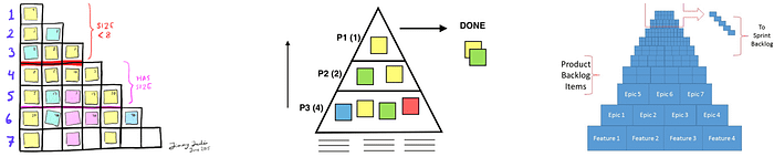
Also called Pyramid Backlog or Pyramid Planning, there are multiple variations on this. Ideally, a single item is at the top as priority 1. That becomes a nice benefit of this model — communicating to the team and aligning on one top priority ranking. From there, multiple items will land in different tiers/rows of the pyramid, with the groups becoming broader and including more items the lower they are on the pyramid.
Bullseye Diagram
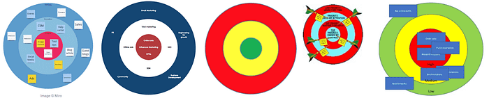
With little need for explanation, prioritizing with a bullseye is a beautiful way to collaborate. The outer ring is a lower priority or just the place to dump everything. The more inward, the higher the priority. Although it sounds simple (and it is), there are some excellent resources out there with tips for real-life application.
Story Mapping
Story Mapping, AKA User Story Mapping, is an interactive way to get a team aligned on how work fits into the larger picture of the customer journey. Individual user stories are organized under steps in the customer journey. From there, work can be prioritized and organized into a high-level roadmap or release plan.
Impact Mapping
While the name is similar to Story Mapping, Impact Mapping is quite different. Impact mapping is more of a tree or canvas style visual that breaks down a Goal — any goal — into actors and how they can support the goal and then the relevant features to support those activities. If you've got the goal prioritization established, this tool could help understand levers and opportunities from there.
Walking Skeleton
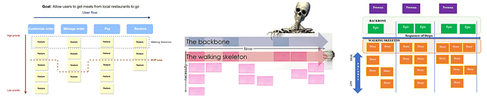
This is really just part of Story Mapping or Impact Mapping, but it can also be referenced as its own concept. The Walking Skeleton is the highest priority set of stories/functionalities and is critical for launch. Depending on your definition — these could make up the MVP of the product or feature.
Read more: Stack Exchange | The Agile Manager
Systemico
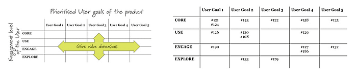
As a JTBD friendly framework, Systemico starts with four levels of user engagement, with which you'll break down several predefined key user goals. It integrates well with user stories or whatever story/problem statement format you prefer.
Read more: Barry O' Reilly
Critical Path
This prioritization tool works well as a visual and could come in handy when there is a hard deadline. While various project management tools may boast complex critical path planning features, this technique can be as simple as a whiteboarding session.
Read more: Parabol | isixsigma.com | projectmanager.com
By the way…
Although these are not for prioritization per se, these discovery maps are a great way to assess opportunities to then prioritize. Check out Teresa Torres on Opportunity Solution Trees as well as the Affinity Diagram.
Collaborative prioritization games and exercises
Taking the fun one step further, the emphasis here is discussing and understanding different perspectives across teams rather than leaving with a concrete decision.
Dot Voting / Cumulative Voting
This cumulative voting technique can be done with dots or without. Dots simply represent a vote, and voting can be done however the facilitator prefers.
With a collection of items (for example, sticky notes on a wall), each person puts a dot (with a sticker or marker) on their favorite ideas. The voting can be done on individual items or themes/collections of items. Cumulative voting can help gauge where people are interested, especially with a large, diverse group — and many ideas. How many votes should people get?
Hierarchal Cumulative Voting (HCV)
HCV works the same as standard cumulative voting (CV or Dot voting), but first specific features or requirements are broken out into broader categories. The cumulative voting exercise is then done on those lower-level features/requirements. Only ideas in the same group are compared to each other in the voting process.
Read more: Article
Multi Voting
Multi-voting can be a good way to make transparent tradeoff decisions where everyone is comfortable. A group of people goes through a series of voting rounds (like dot voting). In the first round, each person chooses their top n items. From there, subsequent rounds of voting are conducted to reduce the list further until the desired number of items remains. In these follow-up rounds, team members could be limited to one vote only or limited to a smaller number of votes.
How many votes should people get? Check out the ideas in the "How many dots to use" section in this article.
Modified Borda Count
Modified Borda Count is similar to Multi Voting. The main difference is that when voters make their n picks, they also award points from 1-n. So if each voter is allowed 5 items to vote for, they will start with their favorite idea and give it 5 points. Their next favorite idea will get 4 points, and so on.
This is a detailed explanation
What Sucks?
Lizzy Masotta wrote about this collaborative activity to develop a shared understanding across functions about the biggest pain points in the product. This process uses a simple prompt ("What sucks about ___?"), ideas collection from a group of at least 10 cross-functional colleagues, and then dot voting to bubble up the biggest suckiness.
Intercom Team Alignment Framework
This looks like a great way to discuss specific projects or initiatives as a team, one at a time. Although you won't see any numbers here, this scorecard-based framework would be easy to translate into a score for sorting multiple projects.
Read more: Intercom
Theory-W
It works because stakeholders get together and first privately rank items from their own perspective and consider which items they could give up. After that, the group comes together to share their rankings and negotiate.
Read more: Requirements.com, Article
Even-over Statements
You probably don't think of even-over statements as prioritization tools, but just as they can help guide a strategy or vision like the familiar Agile Manifesto, even-over statements can be used as a prioritization strategy framework to decide which items in a list are most important.
A good set of even-over statements could serve as a strategy and a practical prioritization framework all in one! Prioritization strategy!
Read more: Parabol
Buy-a-Feature

It's a fantasy football auction for product management. Also known as the 100 dollar game.
Ping Pong Balls
Cited in a 2019 paper from students at Blekinge Institute of Technology, this activity is simple but could require a lot of time and… well… ping pong balls.
The way it works is a group of 12 or so people get together with some ping pong balls. Given one prioritization factor at a time (effort, cost, risk, etc.) the ping pong balls are distributed across all of the items until there is consensus.
TribeRank
Build a Value vs. Effort chart collaboratively as a team.
Read more: Catherine Ulrich (Catherine (Kit) Ulrich)
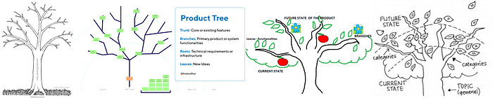
Prune the Product Tree
It is a great exercise to do with customers to gauge where they would like to see investment in your product.
Speed Boat

Assess pain points with your customers.
Read more: DZone
Poker Planning
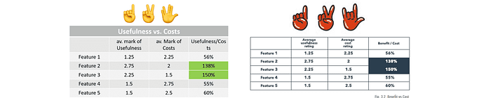
Michael Karpov suggests this PM version of Planning Poker. Instead of devs throwing story points around, the product manager and team vote on usefulness and cost separately. The outcome is a ratio to separate the wheat from the chaff and feed a more in-depth prioritization effort.
In or Out

Get a group together and decide one by one if each item is "in or out." The goal is to plan out work across multiple sprints. The "out" group of one round can then be divided up again with the same process, and so on and so forth.
Read more: Karl Weigers
Family Feud
This game is not a voting exercise. Instead, it is about getting input in order to classify items into three categories. The categories are Broad Support, Conflicted, and Low Priority initiatives. Each participant votes For, Against, or Neutral. These are then used to calculate a Conflict Score and to visualize the team's perspective.
Normally, we are looking for items with the most support, but the most valuable takeaway from this activity will be the conflicts — where there are a lot of votes for and against.
Read more: Mads Johnsen | Product School
General prioritization process frameworks
These are examples where PMs have shared their workflows and mindset going into prioritization.
A, E, I, O, U prioritization
Russell McGuire writes about this loose framework of different types of criteria. This isn't a scoring framework, but something like this could probably be a good foundation for building a custom score for your own needs.
The acronym refers to Affordability, Effectiveness, Impact, Optionality, Uncertainty. Throughout his writeup, Russell suggests various measurements in these categories with visuals of how he might lay out the spreadsheet calculations.
GRIDS
Kate Horowitz offers up this 5-step framework for building product roadmaps and work prioritization. Read the full walkthrough at Product First. GRIDS stands for Gather and group like ideas, Review and Respond, Investigate, Decide, Share.
VICTORY
Suyash Bharadwaj shared the VICTORY framework in April 2022 to help product people ensure they are working on the right things. Vision, Impact, Confidence, Time, Onboard, Risk, You.
Ian McAllister
This old Quora response by Ian McAllister has been shared a lot in the product management community. Check out these 6 steps from the Chief Product Officer at Crowd Cow and former Director at Amazon.
Intentional vs. Accidental Tech Debt
Vishal Soni wrote up their approach to tech debt in this practical tech debt prioritization guide. Soni points out that there are two types of tech debt. In one case, the tech debt arises from an intentional decision. In other cases, it is accidental or is realized later after the work was done. Soni shares their approach for both cases and a helpful decision flow.
Mariano Capezzani 4 Step
Mariano Capezzani has developed a 4-step framework that starts with the critical first step of "Know the context." Check out this article from Product School with the rundown.
Ruthless
This post by Brandon Chu is definitely worth a read. Brandon separates the approach between prioritization of projects vs. prioritization within a project. The framework(s) call out some interesting considerations like the importance of constraints and building dependable systems for prioritization within a project. Check out the article at The Black Box of Product Management.
KJ Technique
The KJ Technique is hard to track back to the origin, but apparently, it has been around for some time. Jared M. Spool outlined the process well in this article. Starting from a single question, a group can brainstorm, group similar items, create themes, and rank the items and the themes. This is a great way to get in alignment with a large group.
Prosono's Priority to Action Framework
Published in the early days of the COVID-19 pandemic, the framework from Prosono places emphasis on acting quickly when there is a clear problem. The process starts with a meeting set up where listening is crucial, then ends with action items being defined. Check out the article on Medium.
GEM model
Gibson Biddle writes about this metrics framework he used for prioritization at Netflix. GEM stands for Growth, Engagement, and Monetization, although Biddle doesn't prescribe any specific formula. His team targeted a metric in each of the three different categories and then ranked projects accordingly.
Ranallo's
In a Medium post, Anthony Ranallo outlines a perfect example of how several frameworks can work together. After understanding the business goals, Anthony organizes themes into the four Eisenhower categories. This PM determines the value and combines the value with the Eisenhower importance/urgency category.
Kareem Mayan
Kareem Mayan emphasizes listening to customer feedback and understanding business goals clearly and early on. This is the core of KareKareem'step process, a detailed step-by-step guide at The Startup.
USER Framework
Michael Furst shares this solid framework for processing the importance of product initiatives or ideas. The steps Michael lays out start with understanding the problem. I love that it then moves to ensure the item in question is strategically relevant.
Three Pain Point Factors
Sritama Sarkar's May 2022 article recommends collecting as many pain points as possible and shares 3 considerations for deciding which pain points are the highest priority.
- Severity: How painful is this issue for users?
- Frequency: How often is this causing pain for users?
- Unsolved: Do users have a way to get around this yet?
Bobby's 3-Step
I noticed this in a JustAnotherPM newsletter edition. You can find more content at https://justanotherpm.com/ or by subscribing to their newsletter.
Be sure to check out the full article but the three steps are:
- Maximize impact
- Maximize ROI
- Align with strategic goals
Why is this comprehensive list important?
My hope is that this article serves the community in a few ways:
- Helps managers spend less time reinventing the wheel
- Inspires managers to improve their prioritization
- Provides ideas for improving communication with partners
- Spotlight contributions that so many have made from the 1980s to 2021
How to prioritize: What I learned
I wrote about some of my learnings while putting this list of prioritization techniques together.
- Prioritization and sequencing are two different things
- There are more ways to prioritize than I thought
- Prioritization frameworks are not dead
- One framework may not be enough
- Important prioritization criteria are often missing
- Grids and scores are not being leveraged to their full potential
Questions

What is a prioritization framework?
A prioritization framework is a broad term for any kind of structured technique or method to process a list of items to identify which items are most important and which are least important.
What are prioritization techniques?
There are many different types of prioritization tools. At a high level, prioritization techniques are processes or methods that enable someone to identify the essential work items so that tradeoff decisions can be made to align with business goals.
What are the best Scrum prioritization frameworks?
The Scrum Guide does not recommend any particular framework. All prioritization methods are just as valid regardless of the product development framework/process being used. So whether you are using Scrum, XP, Kanban, a mix of these or anything else — there is no standard prioritization framework.
What are prioritization techniques in agile?
Agile prioritization techniques are any methods used to identify the most important items for informing a roadmap in an agile work environment, where teams acknowledge uncertainties and unavoidable inaccuracies while remaining determined to make informed, data-guided decisions.
Is prioritization an important skill?
Prioritization is one of the most important skills and one of the hardest skills for product managers. However, the prioritization process can be made easier by having a clear vision and/or objectives for the business and developing a strong framework with stakeholder input.
What does "prioritize" mean?
That's deep. Indeed, what is "prioritize"? When we talk about defining prioritization as product managers, it can be easy to forget that prioritization in product development doesn't always determine what comes first. Keep in mind that sequencing and prioritization are different. Priorities are what is most important. The sequence is the order in which they are done.
How do you prioritize a list?
There are well over 100 documented methods for prioritizing a list of backlog features, requirements, or projects. Some of the most common techniques are RICE scoring, MoSCoW, Impact Effort graph, but the best technique will vary by team depending on the goals and market.
What are the most commonly use prioritization techniques?
The most commonly used prioritization techniques are RICE scoring, ICE, MoSCoW, and Impact vs. Effort. However, these methods may be missing some important criteria, depending on the team. For example, value from the customer's perspective, strategic alignment, and confidence or evidence level.
Who prioritizes the backlog?
Usually, the product manager or product owner is really the one owning the backlog and product roadmap. This should not be done in isolation, however. There should be a close relationship with internal partners, customers, engineers, user experience designers, and analysts.
What's a product backlog?
A backlog is any list of things that are set aside and designated to come next — whatever that means in the particular environment. The backlog should be kept relatively short and should be kept up to date. A common mistake is that backlogs can become overrun with outdated or poorly thought-out ideas.
Who creates the backlog?
The product owner or product manager usually creates the backlog of work but works closely with partners in other teams to ensure it is the most relevant, impactful, and up-to-date.
What are the three prioritization methods?
There are well over 100 methods that have been used by product managers to rank features, projects, bugs, or brainstorm ideas. Two or three are discussed the most: MoSCoW, RICE, and Kano. This doesn't mean these are the best methods, however. They are missing key criteria such as user value (vs. business value), level of evidence, and alignment with business goals.
What is the difference between task prioritization and prioritizing product features?
Task prioritization optimizes value output from a single person's time and energy. Feature prioritization optimizes value output from a team as a part of a strategy of business goals.
Certainly, both task prioritization and feature prioritization is important for product managers. Task prioritization is more personal and very near-term. Professionals who leverage task prioritization frameworks and mental models at work usually optimize their time hour by hour, intra-day, and then within the week. These are smaller decisions and less strategic.
Define prioritization. What's the "prioritization" meaning?
Don't get confused between prioritization and sequencing. Usually, prioritization is about what is most important. What is important isn't always what teams should do first, however. There are usually dependencies of various kinds that cause teams to need to plan the sequencing of work in a very fluid way as the environment around the product evolves.
Is it spelled "prioritize" or "prioritise"?
Prioritize is the widely accepted spelling. It's what the cool PM kids are doing. You can spell it with an "s" if you are from the UK but even in the UK people are coming around to the better version.
Got one to add or feedback? Let me know!
You may also like these other frameworks posts:

The full list of prioritization frameworks
List of all lean prioritization matrix, quadrant, grid, or chart prioritization techniques (details down below):
- Agreement Certainty
- Impact vs. Effort
- Can Do vs. Should Do
- Value vs. Feasibility
- Short-term Value vs. Long-term Value
- PICK Chart
- Risk vs. Return
- RVCE Matrix
- Business Value, Effort, Risk
- Value, Likelihood, Effort
- Kano Model
- Importance vs. Satisfaction
- Build, Partner, Buy
- Gusto Prioritization Matrix
- How, Now, Wow
- Eisenhower Decision Matrix / Covey's Four Quadrants
- Big Bet, Home Run, Small Win
- Market Newness vs. Product Newness
- Problem Definition vs. Domain Definition
- Business Goals vs. Degree of Change
- Time to MVP vs. Market Differentiation
- Market Attractiveness vs. Ease of Implementation
- Market Impact vs. Tech Newness
- Market Differentiating vs. Mission Critical
- McKinsey prioritization matrix
- Purpose Alignment / Nickolaisen Model
- BCG Prioritization
- 4 Dimensions!
- How many, How Often
- Value Mapping from Intercom
- Red Routes
- Disruption vs. Visibility Bug Prioritization
- Incident Priority Matrix
- Nine-box Matrix Updated
- Vision, Sustainability
- Business Strategy Prioritization
- House of Quality (QFD)
- Business Goals vs. Customer Value
- Jeanette Fuccella's Research Prioritization
List of all scoring prioritization models (details down below):
- BTFB
- RICE
- SU-RICE
- Minute RICE
- LRICE
- Weighted RICE
- ICE
- ICE number 2
- BRICE
- LICE
- DIE
- PIE
- Task Score
- BUC
- BREaD
- TIR
- Raveesh Dubey
- Product Manager Triangle weighted scoring
- DIY, Choose your own themes weighted scoring
- Karl Weigers Relative Weighting weighted scoring
- Modified three feature buckets weighted scoring
- Customer Satisfaction, Business Value, Cost weighted scoring
- Priority Assessment Framework
- ROI Scorecard
- Weighted Shortest Job First (WSJF)
- Value, Cost, Risk Scorecard
- SIF (Shortest Item First)
- LIF (Longest Item First)
- Monster prioritization
- Remco Prioritization
- WSJF Arnold Mod
- 5-Pillar-Prioritization-Framework
- Coverage, Magnitude, Cost
- EFQ
- Turn Ideas Into Products Questions
- Expected Value
- Opportunity Score
- BACER
- Risk-based prioritization
- Pugh Matrix Theme Screening
- Evidence Score
- IDEA/E
- CUP Method
- GUT
- Decision Diamond
- Pairwise / Paired Comparison Matrix
- AHP
- Hierarchy AHP
- Prioritization Eye Test
- VIRE
- Bracket
- Impact Estimation Table (IE)
- PXL
- Hotwire
- Monetate
- Day's Questions
- VIDEO
- ASPIRE + SOAR
- User Value Scorecard
- HIPE
- 90/10
- Desirability, Feasibility, Viability
- Zeynip Cansu Yildirim
- UMed User Story Prioritization
- Spotahome Prioritization Framework
- MoAR
List of all sorting & stack ranking techniques that don't require any scoring (details down below):
- LIFO
- FIFO
- Classification Rankings
- Priority Groups
- Bubble Sorting
- Binary Search Tree
- Binary Priority List
List of all qualitative theme categorization prioritization frameworks (details down below):
- MoSCoW
- Needs, Wants, Wishes
- Wants vs Needs
- T Account
- Planning Game
- 70/20/10
- 3D Classifier Framework
- Wow, Neutral, Poor
- Now Next Later
- Three feature buckets (sometimes 4)
- Candy, Vitamins, Painkillers
- 4-UP
- Easy Hard Expensive
- Hell Yeah or No
- Better/Faster Question
- 4 Ds
- Ice Cream Flavors
- RABA
- FE²AR
- Rocks, Pebbles, Sand
List of all map or canvas prioritization methods (details down below):
- Priority Pyramid
- Bullseye Diagram
- Story Mapping
- Impact Mapping
- Walking Skeleton
- Systemico
- Critical Path
List of all collaborative prioritization games, voting or group activities (details down below):
- Dot Voting / Cumulative Voting
- Hierarchal Cumulative Voting
- Multi Voting
- Modified Borda Count
- What Sucks?
- Intercom Team Alignment Framework
- Theory-W
- Buy-a-Feature
- Ping Pong Balls
- TribeRank
- Prune the Product Tree
- Speed Boat
- Poker Planning
- In or Out
- Family Feud
- Even-over Statements
List of broader prioritization processes and workflows from product people (details down below):
- A, E, I, O, U
- GRIDS
- VICTORY
- Ian McAllister
- Intentional vs. Accidental Tech Debt
- Mariano Capezzani 4 Step
- Ruthless
- KJ Technique
- Prosono's Priority to Action Framework
- GEM model
- Ranallo's
- Kareem Mayan
- USER Framework
- Three Pain Point Factors
- Bobby's 3-Step